Press Mute: How one label made record covers into an art
A new book documents the distinctive visual aesthetic of Mute Records, Daniel Miller’s ‘accidental’ record label that’s been home to acts from Depeche Mode to Nick Cave to Goldfrapp

Over 40 years, Mute Records has shaped our musical life, providing a home for distinctive artists ranging from global stars Depeche Mode to Slovenian provocateurs Laibach. Now the label is telling its story in its own particular fashion – through a biography that focuses on its artwork.
Mute: A Visual Document tells the record company’s story from its foundation in 1978 as a home for synth pioneers to its current guise as an eclectic haven for idiosyncratic talents, among them Goldfrapp and New Order. Throughout, the label has remained a bastion for creative freedom, forging careers for the likes of Nick Cave and Vince Clarke. That artist-led ethos applied also to record covers, posters and other promotional material, now gathered in this handsome tome.
Although originally unspoken, it was a policy that emerged early in the label’s life during the post-punk foment of 1979, continued through high-concept projects at its Nineties commercial peak and continues today as a reborn Mute thrives in the digital age.
For founder Daniel Miller, the project looks at his label’s history in a slightly askance manner, something that captures its own outlier stance. “We had been approached quite a lot about doing a general Mute biography, which I never really wanted to do. It takes up too much time and gets too nostalgic. This was a really nice way of doing it without being too wordy and people having to talk.”
Using this visual approach highlights how from the off Mute avoided a recognisable in-house look, as adopted, for instance, by such peers as 4AD’s distinctive record sleeves by graphic designer Vaughan Oliver or how Peter Saville’s industrial themes became integral to the look of Manchester’s Factory Records.
Mainly, this was because Miller had started out as a recording artist himself. Indeed, early on in the book Mute is described as an “accidental label”: its founder had no plans beyond releasing his own single “TV OD”/“Warm Leatherette” as The Normal, though just as that release proved more successful than anticipated – at least as a cult concern – so people took an interest in the apparent label, named ironically by the freelance film editor.
With a friend, trained photographer Simone Grant, Miller had devised his own artwork using dry-transfer Letraset – an analogue precursor to both clip art and standard fonts. From an architectural symbols sheet he found a logo for Mute: the image of a figure walking seen from above.
When the former art school student chose to release a record by fellow home recordist Frank Tovey, aka Fad Gadget, the new signing was given creative control of look as well as sound, Miller remembers. “My natural inclination was to ask, what kind of artwork would you like? It wasn’t a concept. As a sort of recording artist myself, I would never want a label telling me what to do to fit in with their thing.”
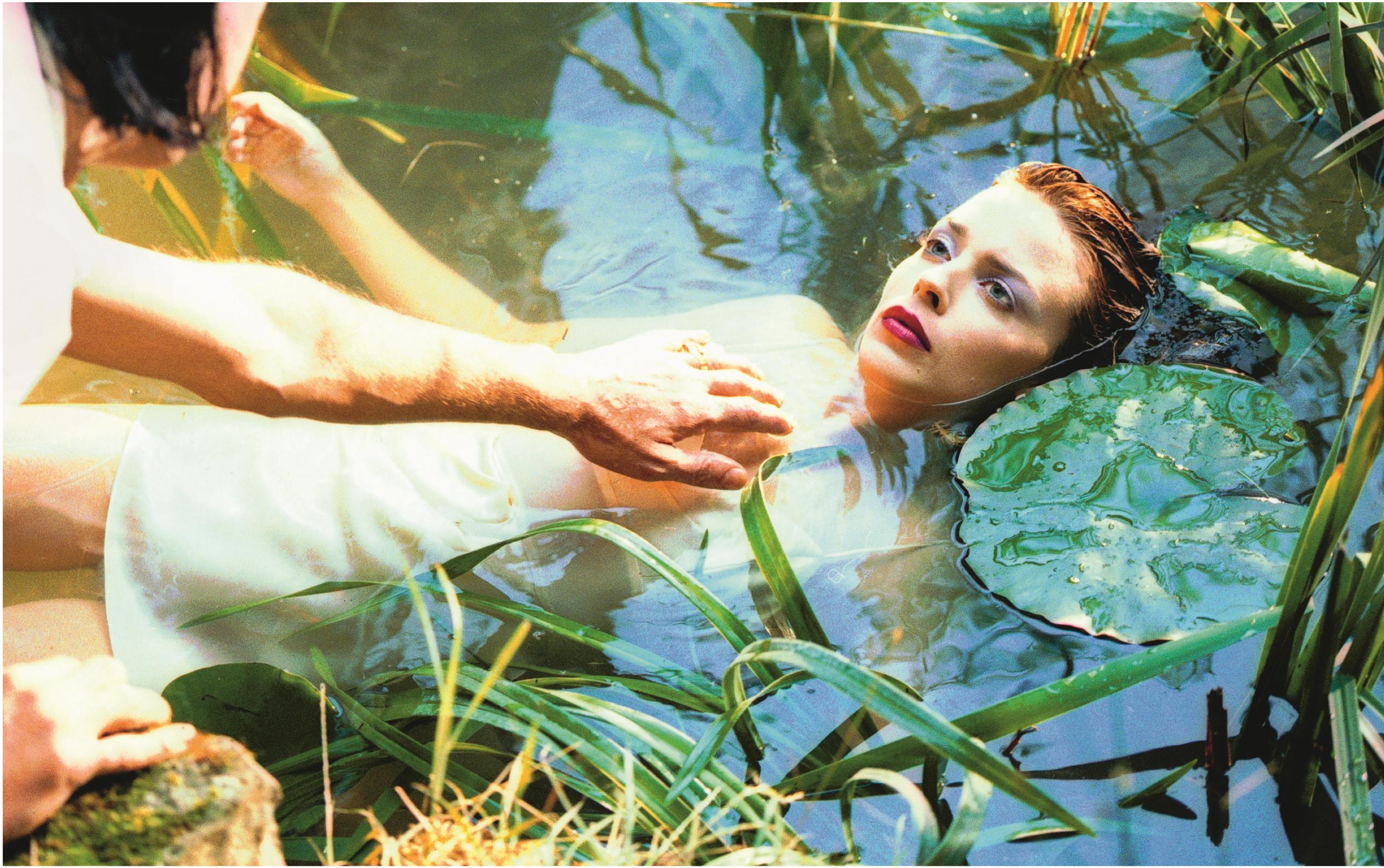
As seen in the book, it is a policy that has served both the label and its artists well, many of which Miller says come from a visual background themselves or have a strong visual sense. “If they feel they have a way of presenting their record, they’re much better equipped to do it than I or a graphic designer are to impose something.” In this regard, Miller is especially impressed with Alison Goldfrapp.
Enjoy unlimited access to 100 million ad-free songs and podcasts with Amazon Music
Sign up now for a 30-day free trial. Terms apply.
ADVERTISEMENT. If you sign up to this service we will earn commission. This revenue helps to fund journalism across The Independent.
Enjoy unlimited access to 100 million ad-free songs and podcasts with Amazon Music
Sign up now for a 30-day free trial. Terms apply.
ADVERTISEMENT. If you sign up to this service we will earn commission. This revenue helps to fund journalism across The Independent.
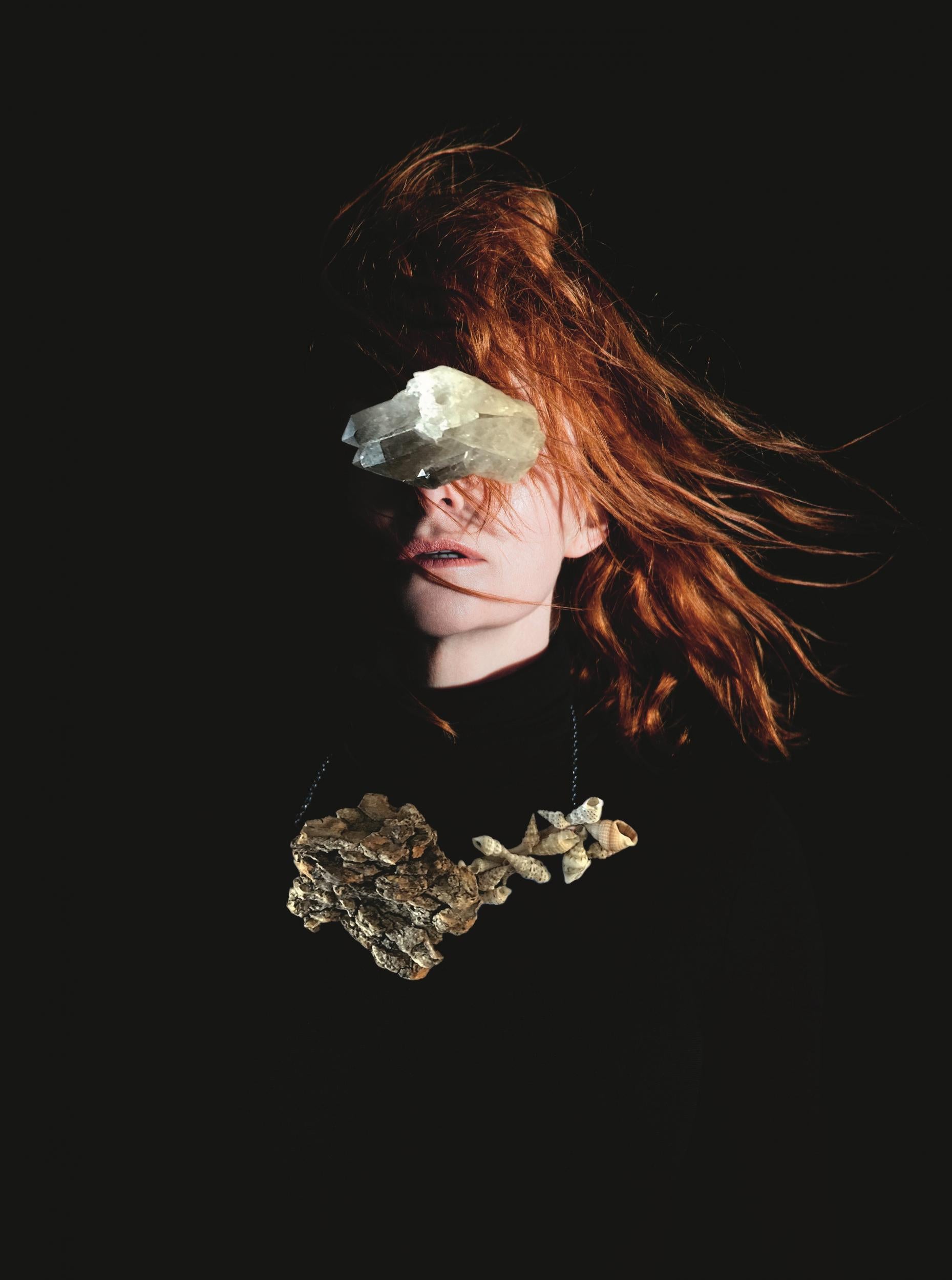
Just as every Goldfrapp album she records with Will Gregory has a different sound, each has a distinct visual identity largely down to her input, often with Alison’s own artwork or photography, as on current album Silver Eye.
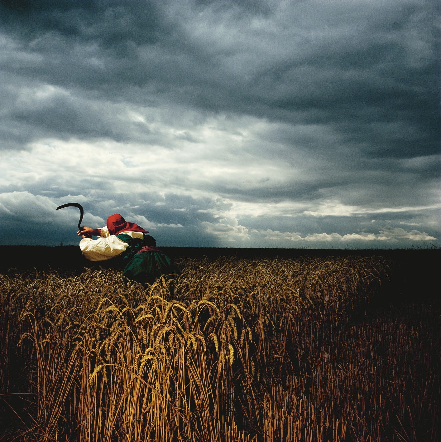
Other acts have forged long-term relationships with creatives they have come to trust and rely on over many years, as with Depeche Mode and photographer-turned-filmmaker Anton Corbijn. The Control director became an early associate of the label, having shot several of its acts for NME. He first prospered in collaboration with the theatrical Tovey, though more famous was his work with the Essex-formed synth group, going on to cut his teeth in video production.
“Depeche don’t have many visual ideas, so you have to understand the band and interpret them in a way they are comfortable with,” Miller says.
Even with this set-up, Mute still needed an in-house production team to liaise with printers to ensure the finished product met expectations. Through its members generating their own ideas, say for designers, that unit morphed into an in-house art department, led by art director Paul A Taylor, who started at Mute in 1990 but was only officially appointed to the role a decade later.
“In the early days, things just happened; there was no plan, no job titles.” Miller admits. “Everything was done on the hoof and none of us really knew what we were doing. Paul was in the production department, very young, and as we did more and more releases it became clear we needed that role.”
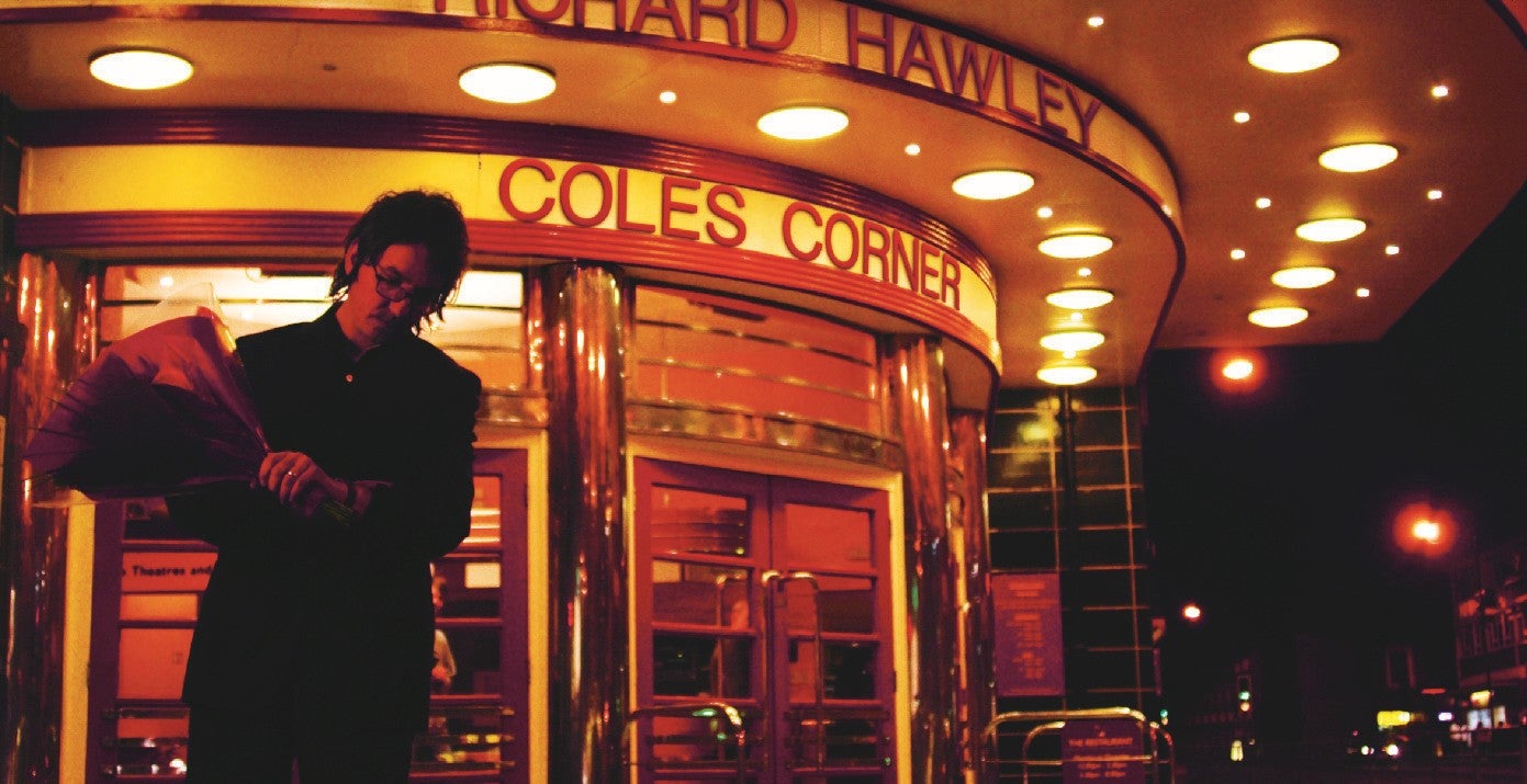
Leafing through the book, you get a sense of individual acts finding their own styles or changing over the years, whether its is Richard Hawley on melancholy Sheffield streets or Erasure’s technicolour fantasies. While electronica is dominated by nerdy bedroom recluses and stern futurists, there is a surprising amount of playfulness, albeit somewhat warped, something that connected Corbijn and Depeche Mode, Miller found. “Anton understood that and interpreted it through his visuals. There is a dark humour in there and that runs through the music as well. I found that the darker the music, the funnier, in an amusing sense, the people who make it.”
It is remarkable that Mute’s artist-led policy has worked so well, given pop’s propensity for overinflated egos, something that Miller believes is down to the clients themselves. “I don’t think anyone has asked for the impossible, partly because they are aware of the process. Of course, we have a budget and sometimes you have to come up with other ideas. If something is too expensive, it is better to start with something new than a cut-down version of the original.”
Having said that, it is clear record companies once had more money to play with. For Mute, you could place its high point somewhere in the late Nineties. For Depeche Mode’s hits collection The Singles 86 > 98, designer Mat Cook, working for graphic supremo Adrian Shaughnessy, led a team photographing LED units around American locations connected to the band. In A Visual Document, Shaughnessy remembers Miller already warning: “there would never again be that sort of budget for cover art”.
So it came to pass. In 2002, Miller sold his label, then in financial difficulties, to the major EMI, which in turn fell into its own decline. Eight years later, the founder extricated Mute from the deal and revitalised it as a smaller, newly independent concern.
Miller is still palpably enthused by music and getting it out there in whatever format suits, even with less money for PVC sleeves or CDs packaged like hardback books. “The quality is not down to the budget necessarily. It’s more about the ideas and how they are executed.”
Even in the digital sphere, his artists still stand out, pointing out how most acts on download sites are illustrated with face or band shots. “It was a long time before we had an artist on the cover of an album. That wasn’t a deliberate choice, it was just what they wanted. At certain labels, that wouldn’t be acceptable. ‘You have a pretty face, you have to have it out there’.”
Depeche Mode never wanted their faces on covers, so they could still walk down Basildon high street. It was a decision based on the principle of artist control, something that still serves Mute well today.
‘Mute: A Visual Document’ by Terry Burrows with Daniel Miller is published by Thames and Hudson
Join our commenting forum
Join thought-provoking conversations, follow other Independent readers and see their replies
Comments
Bookmark popover
Removed from bookmarks