Party Cannon eschew cliched black metal logo for something a little less brutal
Only Comic Sans would have been better
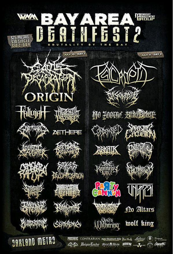
Metal band logo lettering got completely out of hand long ago - with band names becoming so scrawled and splintering and gothic that they gleefully went into self-parody.
At the recent Bay Area Deathfest 2 in California however, the band Party Cannon decided to go in the opposite direction.
Their bounce house-esque colourful lettering stood in such stark contrast to the other acts, that I'm sure they drew a sizable crowd from the poster alone.
They still had the utmost respect for the other bands though.
"Bay Area Feathfest was incredible and there wasn't one bad band there," Party Cannon's Mike wrote on Twitter.
Asked if anyone gave them shit for not conforming to the "unreadable, undecipherable font" tradition, he replied: "Nope - the opposite.
"People in the brutal death metal community don't prescribe to the elitism some other genres do, which makes it all the better. Plus they're kinda playing in to our hands by getting pissy about the logo; that's the point."
Party Cannon are from Dunfermline in Scotland, and this happens to them a lot.
"Every time it goes viral we definitely gain legitimate fans that listen to the music, attend shows, buy merch, and properly get what we’re about which is awesome," they previously told BuzzFeed.
You can listen to the band here.
Join our commenting forum
Join thought-provoking conversations, follow other Independent readers and see their replies
Comments
Bookmark popover
Removed from bookmarks