The new Netflix logo (well, icon) is a thing people have strong feelings about
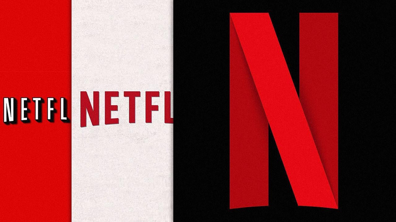
The mark of a successful brand isn’t hitting a revenue target or performing well in an IPO, it’s people getting irate when you make a tiny change to your logo.
Users were previously in hysterics when the original white-on-red Netflix logo was switched out for red-on-white, and now there’s equal praise and dismay over the streaming service’s new app icon.
One Twitter user declared it “SUAVE AF” this morning, while another pronounced it “garbage”.
Is the ’N’ evocative of a film reel? Is it a ribbon? Does it’s foreground/background aspect reflect the comings and goings on its service? Whatever the case, design geeks might enjoy its 3D aspect, given app icons are usually flat.
The move is almost certainly down to ‘Netflix’ showing up a little too small in icon-size, similar to how Facebook started employing a simple ‘f’ on mobile.
"We are introducing a new element into our branding with an N icon. The current Netflix logo will still remain, and the icon will start to be incorporated into our mobile apps along with other product integrations in the near future,” a spokesperson said.
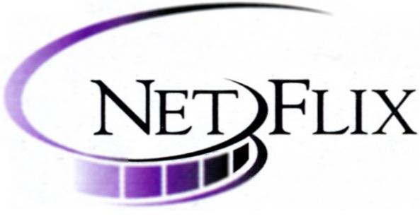
Personally I'm hoping for a return to 1997's logo:
Join our commenting forum
Join thought-provoking conversations, follow other Independent readers and see their replies
Comments