Pattern play: How to pick the right wallpaper – and what to avoid
With so many beautiful options available, it’s important to make the most of your choice: Adele Cardani with top tips from the experts
I’ve just returned from Bath, which is in many ways a visual feast for those of us who prefer ornament over simplicity. Named for its ancient Roman spa, the city’s wisteria-clad Georgian architecture and splendid interiors serve as the backdrop to some of Britain’s best-loved period dramas – most recently, Shondaland and Netflix’s newly released prequel series, Queen Charlotte: A Bridgerton Story.
As I wandered the halls of No 1 Royal Crescent and feasted on the famous buns (made to the same recipe since the 17th century) at Sally Lunn’s tea house, decadent wallpapers in macaron hues quickly became a recurring theme. From repeat damasks and chintzy florals to large-scale scenes like hand-painted murals, Bath’s walls favoured the feminine and frilly, offering a perfect antidote to the weekend’s drab, soggy weather. In that spirit, this week I’ve asked four interior design experts to share their tips on picking the right wallpaper for your space and what mistakes to avoid.
Martin Waller, founder of global design house Andrew Martin, tells me: “Walls are the largest surface area in your home so adding interest and expressing personality there is key. Smaller scale patterns work well in big rooms but can overwhelm compact spaces with busy visual clutter.”
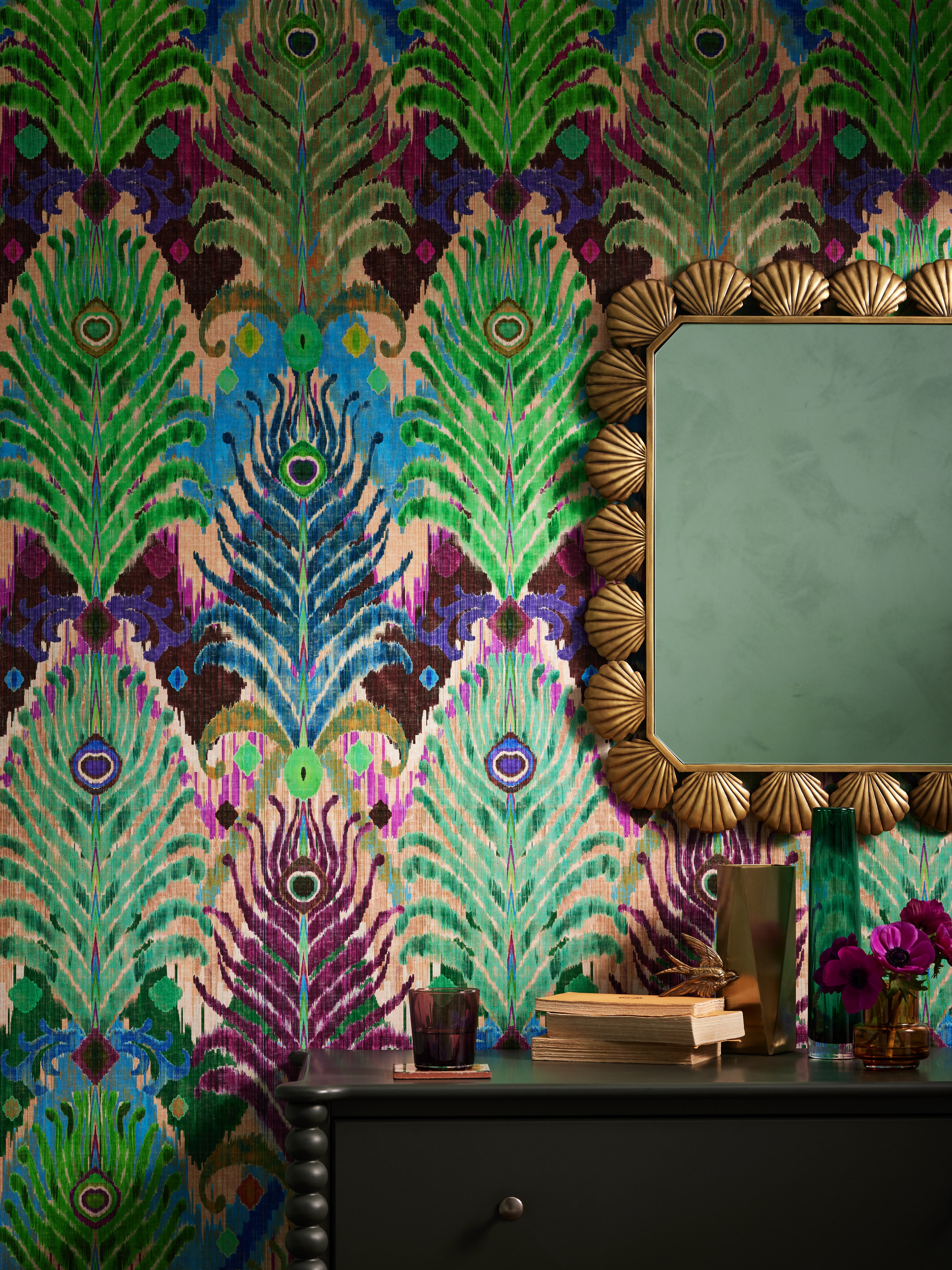
Tiny patterns will only make a room look smaller, while “larger scale patterns work well in most rooms, drawing the eye outward and upward, ultimately making the space look more expansive”. Consider the brand’s Tulips wallpaper. In the style of botanical illustrations popularised by Pierre-Joseph Redoute and WH Fitch in the early 19th century, each larger-than-life bloom lines up next to the other, displaying its delicate petals and graceful leaves.
If you happen to have long expanses of uninterrupted wall space, panoramic papers can act like a painted portal. They offer vistas that seem to stretch beyond your walls, prying you from the clutches of everyday life. In the style of American folk art, where detailed realism is mixed with dusky fables, Andrew Martin’s plaster pink Mythical Land design leads you through a captivating realm as characterful vignettes unfurl before your eyes, like a giant snail sliming its way up a tree or a spotted creature leaping in celebration of the branch in its mouth. On a large scale, this blushing wallpaper acts as a mural and can be seen adorning the dining room of Kit Kemp’s Whitby Hotel in New York City.
Also bringing the enchantment of nature inside, luxury London-based interior designer Naomi Astley Clarke often incorporates hand-painted wallpapers into her designs. She tells me: “I love to recreate the panorama of someone’s favourite places or memories with scenic walls. I once commissioned a mural where a client’s childhood home is nestled in the lush painted landscape.” To do so, she partners with London-based mural artist Frederick Wimsett, whose exuberant designs are often inspired by 18th-century chinoiserie, as well as bespoke, highly coveted wallcovering brand, de Gournay, known for its vivid reimaginations of garden scenes, filled with whimsical oriental birds and flowering plum blossom trees.
If, like myself, you have a penchant for Regencycore style, look to de Gournay’s Pineapple Silk Damask wallcovering in the shade Summer Sky, which echoes that of the Bridgerton family’s signature powder blue drawing room. The range also includes opulent tones of Raspberry, Honey, Amethyst, and Emerald, each creating a luminous backdrop for Lady Whistledown-approved swooning, angsting and gossiping. Or immerse yourself in Jane Austen’s heady world of candlelit ballrooms, long-awaited proposals and frantic letter writing by dressing your walls in Andrew Martin’s Pride & Prejudice design, which takes the first few pages of the novel, allowing you to paste them – typed in a delicate light grey serif font on a creamy taupe background – across your walls.
Don’t be afraid to combine different patterns. Mix classic wall designs like stripes or florals with exotic accents, such as ikat and kilim cushions, rugs and lampshades – varying size is key
Astley Clarke advises: “If you choose an eye-catching wall design, then incorporate a few of the pattern’s accent colours into the rest of the room using plain textiles to give your scheme space to breathe.” British interior designer known for his kaleidoscopic maximalism, Matthew Williamson, echoes this, saying: “Consider your wallpapers artworks in themselves. A patterned wallpaper provides something of a list of colour ingredients you can apply to the rest of your space. Pluck colours from the repeat and use these to choose your soft furnishings and accessories.”
Waller chimes in: “Don’t be afraid to combine different patterns. Mix classic wall designs like stripes or florals with exotic accents, such as ikat and kilim cushions, rugs and lampshades – varying size is key when mixing patterns. You can avoid making the space look too busy by establishing a curated palette, choosing designs in a small range of colours that complement each other.” Then even the most unlikely patterns can be perfect mates.
Mick Wells, founder of London-based specialist wallpaper installation firm, Wells, says: “You might think choosing your wallcovering from a cornucopia of beautiful options is the hard part, but correctly calculating wallpaper quantity is equally important. No one wants to spend more than they need to, but failing to buy enough meterage can negatively impact precise pattern matching or even cause major delays to your refurbishment if you order short.” The Wells website’s Knowledge Hub details precisely how to calculate just how much wallpaper you’ll need.
Wells continues: “Never scrimp on wallpaper quantities! It’s often best to order a good 15 per cent extra to give your installer as much flexibility as possible and to secure the best finish. The more paper available, the more layout options your installer will have, which will allow him or her to balance the overall look of the walls better and work around any colour or pattern irregularities.” He concludes: “Always check and double-check your measurements! And before you place your order, ask your installer to double-check your quantities too for added peace of mind.”
Join our commenting forum
Join thought-provoking conversations, follow other Independent readers and see their replies
Comments
Bookmark popover
Removed from bookmarks