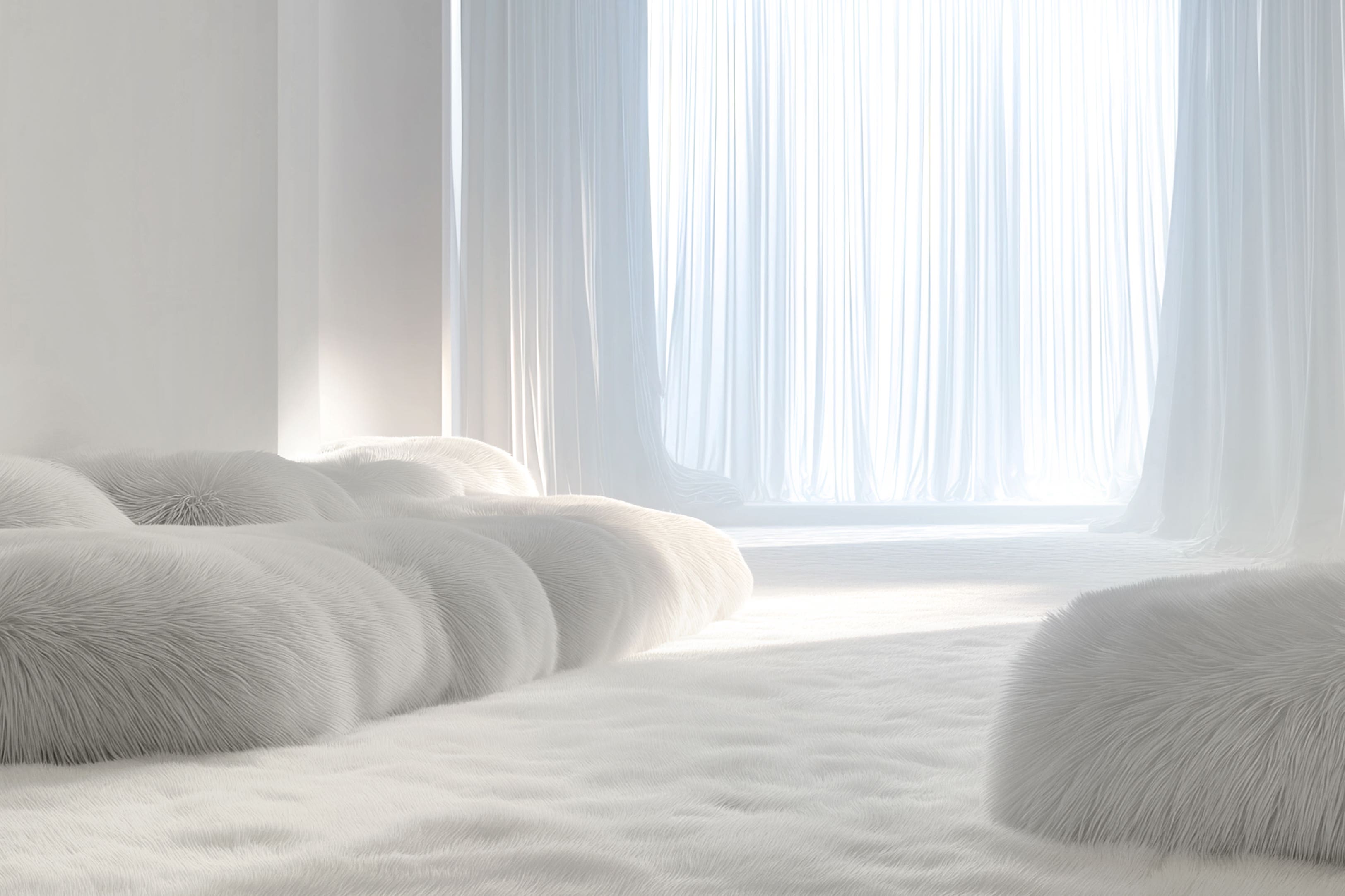
How to style Pantone’s Colour of the Year 2026 – Cloud Dancer
This calming white is a win-win with creatives and decor enthusiasts, says Sam Wylie-Harris.

Soft, graceful and easy on the eye, the background behind Pantone’s Colour of the Year for 2026, Cloud Dancer, is about providing a sense of calm – and cited as a “perfect blank slate” in the worlds of interiors, fashion and design.
Described as a “billowy, balanced white imbued with a feeling of serenity,” experts at the colour institute describe Cloud Dancer as a “symbol of calming influence in a frenetic society rediscovering the value of measured consideration and quiet reflection.”
Similar to a blank canvas, Jane Boddy, creative director of Pantone Colour Institute says one of the key strengths of Pantone 11-4201 is its versatility.
“It can be used to make a big statement or to create a more understated, calming environment,” highlights Boddy.
“Unlike older approaches to all white interiors, which often felt stark or overly pure, the focus now is on softness – that’s why a soft neutral white works so well.”
It’s important to build texture into it, too, underlines Boddy. “Think of an interior that layers soft clays, textured walls, natural cottons, pulled concrete or warm woods.”
“The interest comes from the materials, all working within one gentle colour family,” she explains. “The shade also works beautifully on a single standout piece.
“You can imagine a large comfortable sofa in this shade, something you can sink into and feel held by,” suggests Boddy. “Even as one item in a space, it delivers the same sense of calm and comfort you would get from an entire interior done in this colour.”
Moreover, Boddy says Cloud Dancer represents a softer, more human approach to minimalism. “It’s a clean white, but with a gentle, milky softness that takes away the harshness we sometimes associate with pure whites.”
Instead of feeling cold or clinical, she says “it reads as a calm, approachable neutral. In a time when people are increasingly overwhelmed by visual noise and digital overload, this kind of softened white offers a sense of ease and clarity.”
Tellingly, the trend forecaster and colour expert says there’s a shift in how minimalism is understood. “It’s no longer about stripping everything back to the point where spaces feel empty or impersonal.
“The new direction is about creating environments that feel intentional, warm, and supportive – Cloud Dancer fits into this mindset perfectly.”
“It provides breathing room without feeling stark, and it allows other elements – textures, materials, and forms – to come through more clearly.”
Perfectly placed to update your furnishings and accessories, she says its gentle presence makes it a reliable foundation across interiors, fashion, and digital design.
“It reflects light softly, helps open up a space, and brings a sense of balance without demanding attention.
“Overall, Cloud Dancer works as a reset tone: Simple, clear, and steady,” she explains. “It brings focus and calm, offering a more accessible and relatable version of minimalism – one that feels grounded and genuinely useful for how we live now.”
As Boddy points out, one of the most important details in this white or neutral is its milky softness.
“It has a gentle warmth beneath the surface that gives it a more approachable feel.” She continues. “A colour that works really well in the home because it stands for longevity.”
Perfect for those who like a cohesive scheme: “It’s not a shade you’ll want to change after a year or two,” says Boddy. “It adapts easily and suits different climates, styles and whatever else you bring into your home.”
She says another key aspect is that it’s a colour for everyone. “It fits into any interior style and can be taken as far as you want in terms of making a design statement.”
“It enables choice, giving you the flexibility to use it in subtle ways or across larger areas. The calming aspect is a big part of its appeal, but from a commercial design point of view, its longevity is just as important.”
A colour that lasts, both emotionally and practically, Boddy says, COTY 26 works beautifully with softer, fuller shapes, “whether in furniture or textiles – because these rounded forms help express the core message of Cloud Dancer, which is comfort.”
Building on its versatility, she says Cloud Dancer can act as either a backdrop or bold statement…
“With powdery pastels – pale blues, soft yellows, gentle pinks – it sits comfortably as a supportive partner.
“Pair it with black and you get a strong, high-contrast look. I also love how it works with bright colours; it sharpens them and gives them a more defined, confident effect.”
Overall, she says its flexibility is what makes it so effective. “Whether subtle or striking, Cloud Dancer adapts easily to whatever direction you want to take it.”
Boddy continues: “What’s brilliant about this colour is that it genuinely works with almost anything. You can take it in a glamorous direction, and personally I’m excited to see it paired with metallics such as silvers, bronzes and golds.
“That combination gives Pantone 11-4201 a sleek, high level and slightly futuristic edge,” she says confidently.
Bookmark popover
Removed from bookmarks