Design secrets of Apple Watch Series 7 revealed
Alan Dye, Apple’s Vice President of Interface Design, and Stan Ng, Vice President of Product Marketing, tell The Independent how they designed a smartwatch that ‘empowers you to do things that really could never have been done before from a watch’
Alan Dye and Stan Ng have been involved in Apple Watch since before the first model launched in 2015. With a bigger display and a brand new design, the pair have now revealed the challenges of designing the latest Apple Watch Series 7.
“After seven years, Apple Watch has become something, that keeps you connected to the people and things you care about most and motivates you to be more active and fit and has become this intelligent guardian for your health, all right from your wrist,” Ng, who serves as Apple’s vice president of product marketing, told The Independent.
“It empowers you to do things that really could never have been done before from a watch. Many of the health features have been so meaningful, like taking an ECG, something that just several years ago, was only possible in a hospital or a care facility and now you can see your results in 30 seconds.”
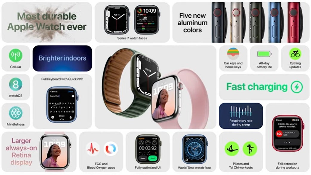
The new Watch has a bigger display than ever, which has consequences for design.
“The size limits the amount of information that, that can be shown and so every single pixel counts,” Ng said. “The re-engineered display on Series 7 is a major technical innovation. Growing the display is such a huge benefit to users, but only if it doesn’t compromise any other part of the experience, such as comfort or aesthetics or battery life or band compatibility.”

So, the design team were faced with questions such as how you maximize screen area without significantly growing the overall case size. “It’s a unique challenge. It required completely re-engineering the display, the front crystal, the internals and the internal enclosure. And these changes resulted in reducing the border from 3mm on Series 6, to just 1.7mm on Series 7.”
The new design saw the case size grow by 1mm, but the display by nearly 20 per cent.
“We did this by integrating the touch sensor into the OLED panel allowing the height of the product itself to remain the same,” Ng revealed. “So, to all intents and purposes, we’ve been able to expand the viewable area without significantly growing, to overall case size.”
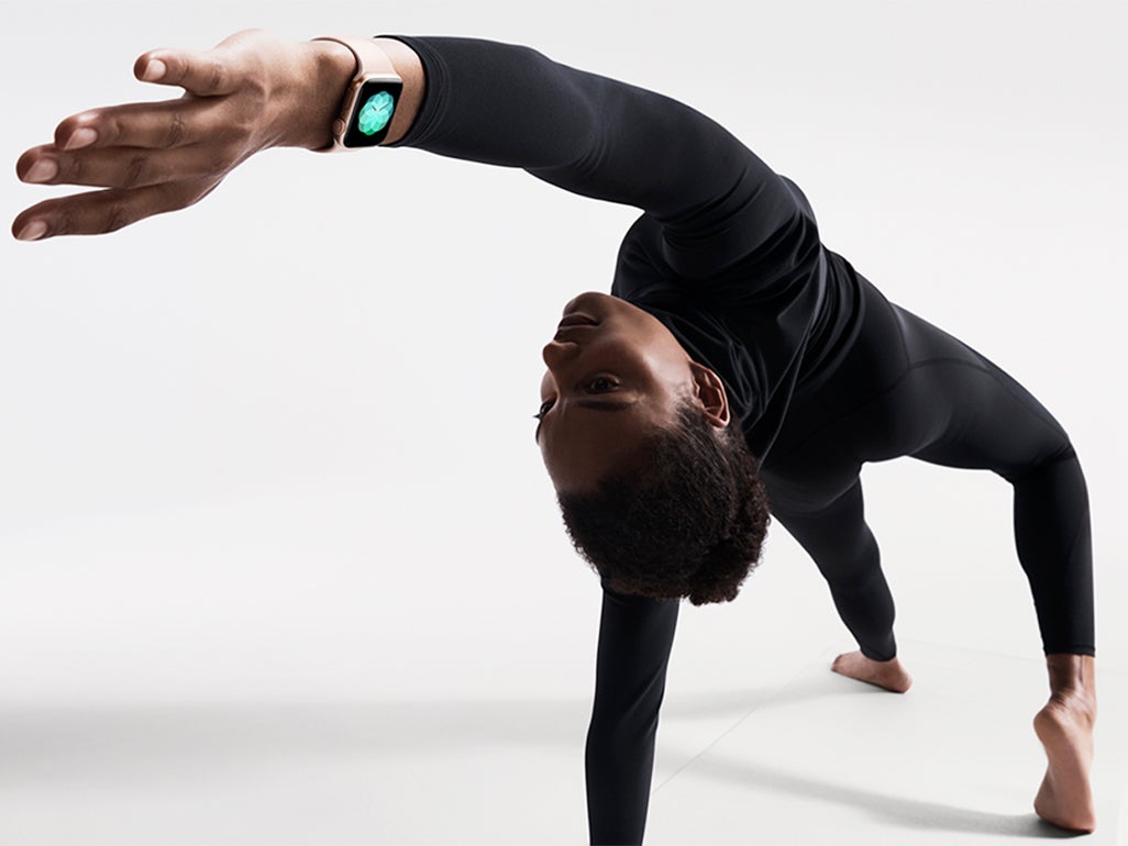
It’s certainly true that the new Watch face is easier to see, for everything from glancing at the time to reading a text message. Alan Dye, Apple’s Vice President of Interface Design, explained how design is all-encompassing.
“At Apple, we’ve always thought about design as how our products work, not just how they look, and the work we did this year for Series 7 was really just such a great example of this. Our goal for the new display was to make the user experience more clear and more accessible,” Dye said.
“We knew this was an opportunity to optimize the design of the entire experience. So, we went about over the past couple of years reconsidering and recrafting every element, making hundreds of really small but we think important and impactful changes to make the UI to work in harmony with the new display design and making the UI even easier to use.”
This new design included for the first time a QWERTY keyboard onscreen for text entry.
“Since the first Apple Watch, text input has been critical and a huge challenge,” Dye said. “We always wanted a QWERTY keyboard and this new display enabled that and enabled it in a way that we think we could deliver the feature in incredibly usable and powerful way. Designing the new keyboard was really quite a challenge. So, we made some important decisions. One thing we did was we removed the bezels from the keys, those little outlines to help make it feel a little less cramped. And to imply that precision isn’t critical with your taps because of the intelligence behind the keyboard.
“After designing the new display, we built this grid system based on the curves of the hardware. And then we used this as the foundation for the new typeface that we designed.”

This new typeface shows up in something called the Contour face where the numbers are squeezed out into the corners of the display and change in size according to the time, with the current hour shown in a bold face.
“The new typeface is actually a variable font and what that means in general is, instead of having a fixed set of weights for the fonts, like light, regular and bold available font has millions of options in between those, so a designer can fine-tune the appearance of the text reducing or increasing the weight, just a hair at a time,” Dye said. “What that allows for, and what you can see, when rotating the digital crown is this fluid moving between the different states.”
When asked just how they decide how small a font or other element can go, Dye said: “I think everyone felt like we could go a bit larger in terms of the hardware, but we never wanted to compromise what is a foundation principle of the Watch which is the interchangeable strap system. It was quite a huge process to get those two goals to work in concert. Typography is something we obsess over. I’m lucky enough to have an amazing typography design team built into my team and we really started that with Apple Watch because we understood the huge challenge of getting as much content as possible on a small display. I think we had pretty good instincts on the team but we do work with others throughout the company, to get a feel for just how small we can go with the typefaces. You’d be surprised, some people really appreciate very small text. So, we kind of pushed the boundaries.”
Stan Ng had thoughts about the size of the Watch, though he doesn’t give anything away about what a future Watch might do: “The wrist has unique challenges, you can’t just slap a huge display on your wrist and assume that someone can wear it all day long, or wear it to any occasion, that’s not going to work. This small size really puts a constraint on what and how much information can be shown at any given time and there can’t be any wasted space. Alan and his team really innovate in this area to make sure that the user experience is so phenomenal. And we’ll continue to innovate in all of those areas. In addition to those key functionalities with the Watch in terms of connecting people, fitness and it being that intelligent guardian for your health. All of what we believe has been so impactful.”
Join our commenting forum
Join thought-provoking conversations, follow other Independent readers and see their replies
Comments
Bookmark popover
Removed from bookmarks