Make your friends green with envy with the new colour du jour
Adele Cardani speaks to fashion designer turned interiors expert Matthew Williamson on why everyone should decorate their home with a splash of green
Fashion designer turned interiors expert Matthew Williamson – renowned for his distinctive, eclectic style and use of intricate pattern and vivid colour – has unveiled his latest project: the Design Kitchen, located at the Design Museum in Kensington, London. Inspired by the space’s lush view of Holland Park, Williamson worked closely with UK-based artisans to create a green-drenched, cosy lounge that contrasts with the building’s otherwise minimalist, industrial aesthetic.
According to Google Trends, “green decor” and “green walls” are breakout search terms (meaning the topics have recently grown more than 5,000 per cent in search volume). From whisper-soft sage and punchy pistachio to opulent emerald and organic avocado, green has become the colour du jour. In both the Design Kitchen and his new book, Living Bright, Williamson makes the case for living cocooned in this hue. He explains: “Green is such a life-affirming colour. Taking references from nature, I rarely design a room or a product without at least one shade of green in it.” Here he tells us why it should continue to be a go-to tone for decorating.
“From cacti to palms, parrots to peacocks, the natural world – and exotic flora and fauna in particular – has always been at the forefront of my mind when designing,” says Williamson. “Nature’s patterns lend themselves so easily to interiors because we innately recognise and feel comfortable with them. After all, we’ve been looking at versions of them in the world around us for all our lives, and they often repeat at different scales, making them perfect for fabric and wallpaper designs.”
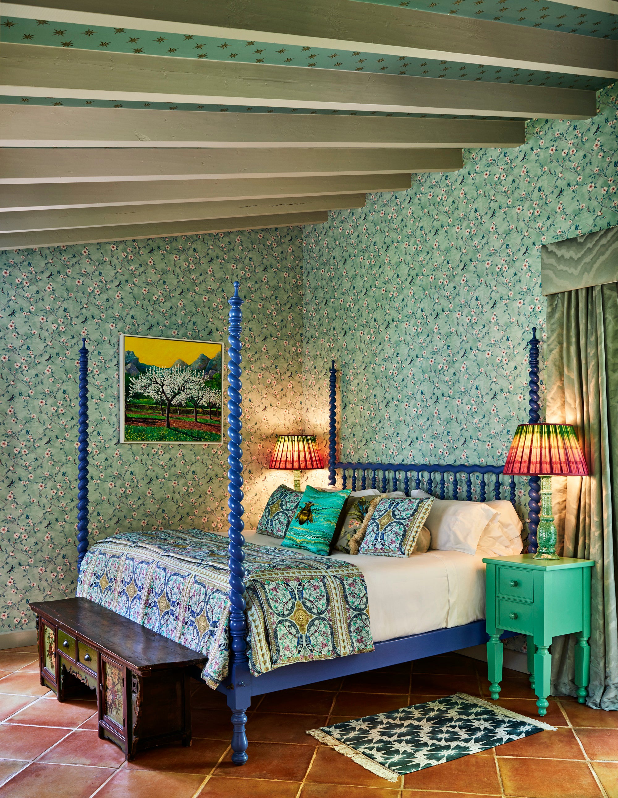
He explains: “While deep, jewel-toned greens project luxury, glamour and decadence, the softer, more calming green tones crop up in my work in equal measure. Pale greens are perfect for bedrooms as they are tranquil, helping us settle. For example, in a hotel suite I designed in Spain, the walls are clad in a dainty white floral print on a sage-green background. Sat proudly in the middle of the room is a vintage wooden bed painted in a striking shade of blue. This neatly throws aside the myth that blue and green should never be paired together. Soft, subdued green is the perfect shade to aid a restful night’s sleep and combine with punchy, more energising accents.”
Williamson continues: “I am always much happier in a room of colour than a white, clinical space. With that in mind, it’s perhaps no surprise that my own bedroom in London is painted top-to-toe green. The mid-tone of mint, called Tequila Green, is crisp and striking, yet still evokes a feeling of calm. Where the ceiling drops down low, it is painted with a moodier, more intense Basilica Green. An eclectic mix of rugs, artworks, bedlinens and plants all sit in harmony together – unified by the colour green. The soothing properties of this symphony of greens were the obvious choice for a personal space I use every day, where I want to feel restored and well rested.”
He adds: “These small design examples go some way to proving the main thing I’d like [readers] to take away from [Living Bright]: that there’s no need for colour rules or any dos and don’ts. It’s much more fun to go with your instincts and play with tones you love. Consider how you want the space to make you feel, and trust your own judgement.”
Williamson concludes: “No matter what you go for, always remember that colour is one of the few interior design elements that can be changed quite easily, quickly, and affordably if you don’t like it. Paint is not something which, once chosen, must remain forever. So, it’s well worth giving it a go, having fun, and trying something new.”
Join our commenting forum
Join thought-provoking conversations, follow other Independent readers and see their replies
Comments
Bookmark popover
Removed from bookmarks