Retail: What's red, blue, white and all over?
After 19 years, Tesco has canned its 'Value' range. But will the design of its replacement help revive the store's fortunes the way it did in 1993? Tim Walker asks the experts
Tesco first introduced its famous "Value" range 19 years ago, as part of a drive led by its then marketing director, Terry Leahy, to boost market share in the recession of the early 1990s. Among the supermarket's other bright ideas were a loyalty card, a "one-in-front" queue-reduction policy and smaller Metro and Express locations alongside its out-of-town superstores.
With help of £1bn yearly sales of Value products, Leahy led Tesco to a 30 per cent market share, putting it well ahead of its nearest rivals. Since dubbed Sir Terry, he stepped down as chief executive last year and now the firm has decided to discontinue his bold, blue-and-white-striped packaging in favour of a new range, christened "Everyday Value". Rodney Fitch, retail design expert and founder of the Fitch design company, says: "It's always been the most innovative of the supermarkets and it innovated the idea of 'value' at the grocer. The country was a different place 20 years ago, though, and people's perception of value – what they value about 'value' – has changed. Price is still a major component, but value is now a multi-faceted idea."
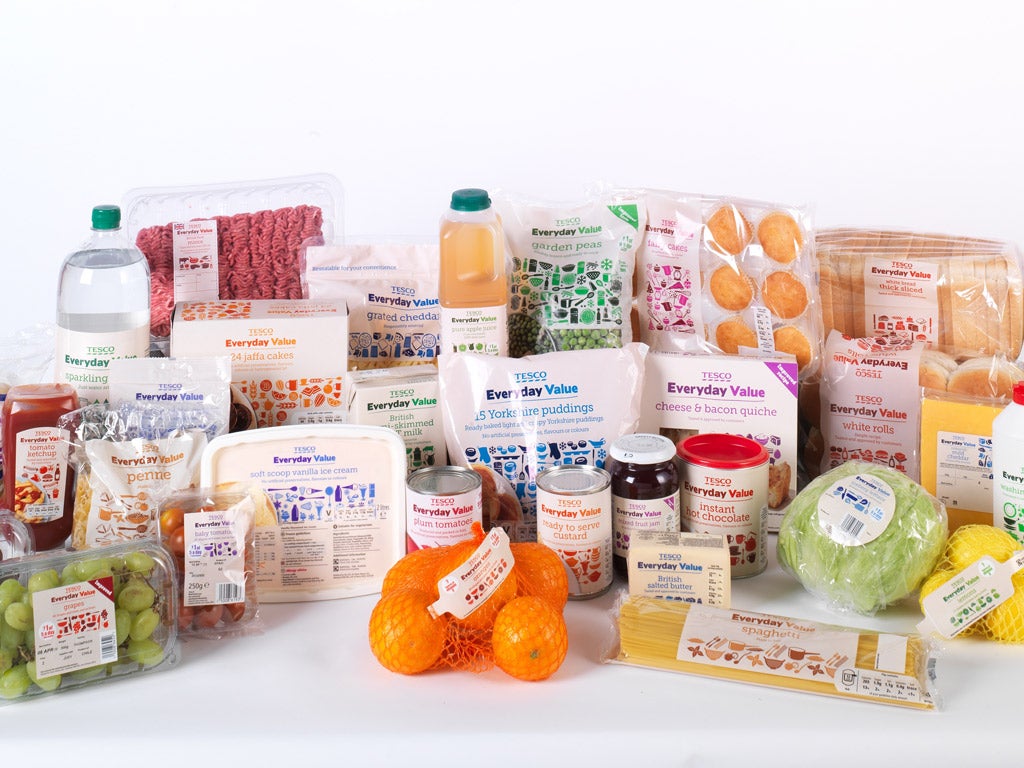
Everyday Value's uniform white packaging is adorned with understated, product-specific coloured type and mini illustrations of food and kitchen equipment. Tesco says its emphasis has shifted from price (though prices remain as low) to health and quality. Thus the 550 Everyday Value product lines are free of artificial colours, GM and MSG. There's 10 per cent more fruit juice in the orange squash, 100 per cent fish fillet in the fish fingers, reduced fat in the mince and "a better grade of pea". The improved packaging includes resealable bags of grated cheese and "easy-open" biscuit packets.
Tesco's UK market share has dipped below 30 per cent since Leahy's departure and Tesco Value has underperformed compared with budget lines at other supermarkets, hence the shake-up.
But not everyone is convinced by the new design. "I don't think the packaging expresses the brand proposition," Fitch says. "It lacks emotional content and the vibrancy of the old packaging. If you're in a 50,000sq-ft store, it's essential these products stand out. But this packaging hasn't the 'shelf-appeal' or the consistency to give it a single message across those 550 product lines or 50,000sq-ft. It's too understated." Angela Wright, colour psychologist and founder of a consultancy that has advised major retailers, says orange is the colour of "food, warmth, shelter and abundance", an ideal choice for the Sainsbury's "Basics" range. Asda's green "is like green in the landscape: it indicates the presence of water and means you're not going to starve."
Traditionally, red is the colour of discounts, which would explain the Kwik Save and Iceland liveries. But Wright is underwhelmed by Everyday Value. "Blue and white stripes were to the point," she says. "Blue communicates reliability, trustworthiness, clarity. But these colours are all over the place; there's no recognisable message. Customers learn a colour strategy and what it means, and they become quite discombobulated if it changes."
Join our commenting forum
Join thought-provoking conversations, follow other Independent readers and see their replies
Comments
Bookmark popover
Removed from bookmarks