Robert Indiana: Pop artist whose 'Love' typographic image helped to define the 1960s
Indiana was part of the generation of artists including Warhol and Lichtenstein, all known for bold visual images drawn from popular culture
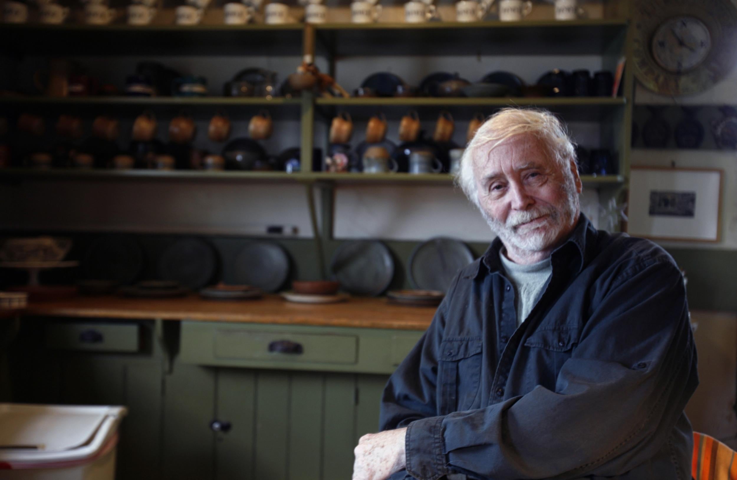
Robert Indiana was the American pop artist whose career was defined – and limited – by one of the most familiar typographical images of the 1960s: the word “love” in uppercase, the first two letters of which sat atop the second two.
It appeared in paintings, sculptures, greeting cards and on postage stamps. He adopted his surname, what he called his “nom de brush” from his home state.
Indiana was part of the generation of pop artists who emerged in the early 1960s – including Andy Warhol, Roy Lichtenstein and James Rosenquist, all of whom were known for their bold visual images drawn heavily from pop culture.
His early work was known for its striking use of graphic design, with circles, stars and other forms, usually accompanied by words or numbers. He first gained wide recognition with the 1961 painting The American Dream, I, which depicts four stars within circles and other geometric forms and is set against an olive-brown background.
One circle is inscribed with numbers; the three others have stencilled words: “Take All,” “Tilt” and “The American Dream”. The overall effect on the viewer is simultaneously one of familiarity and mystery. The painting is part of the Museum of Modern Art’s permanent collection.
Some critics said Indiana’s greatest contribution was in making the visual meaning of his work indistinguishable from the verbal.
During the early 1960s, Indiana produced a series of works showing brightly painted numbers, set inside circles and rectangles of contrasting colours. At the same time, he was creating other canvases that imparted stark messages, including several titled “Eat/Die”.
“My work is almost entirely autobiographical,” Indiana said in 2014. “Everything I’ve done has something to do with my life, especially ‘Eat/Die,’ because ‘eat’ was the last word that came out of my mother’s mouth before she died of cancer.”
For the 1964 New York World’s Fair, Indiana designed a flashing electric sign spelling “Eat”. The sign kept blowing fuses and drawing hungry fairgoers who thought a restaurant was nearby.
His other works – drawn from a childhood spent looking out of car windows, that resembled highway or railroad crossing signs – often featured cryptic messages, including “USA 666,” “USA HUG” and “USA ERR”.
“I feel that I am a sign painter,” he said in 2004. “I mean, I make paintings that are signs, but as far as I’m concerned, important signs, signs that say something, that have very meaningful messages, warnings, celebrations, things of that nature.”
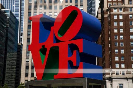
In 1964, Indiana began to experiment with the word “love,” using capital letters, one atop another, with the “O” learning towards the right. The image first appeared on Christmas cards from the Museum of Modern Art in 1965, followed soon afterward by a painting in red, green and blue.
For a 1966 gallery show, Indiana created “love” images in a series of silk-screen prints and a painted aluminium sculpture. In short order, his artwork – which he failed to copyright – became a ubiquitous symbol of the “Make Love, Not War” generation.
A 12ft sculpture was installed at the Indianapolis Museum of Art, and other cities later followed suit. But Indiana had little control over unauthorised versions that showed up everywhere, from posters to coffee mugs to T-shirts. In 1973, the US post office issued an eight-cent postage stamp featuring Indiana’s design. He received a flat fee of $1,000.
After Love, Indiana’s career stalled, and critics began to dismiss him as little more than a commercial graphic designer. New York Times art critic John Canaday suggested that the title of his next work should be “Money”.
Born Robert Clark in New Castle, Indiana, he was adopted soon after his birth. His father held administrative jobs with Phillips 66 and other petroleum companies, and his mother was a homemaker. His parents divorced during his childhood, and he moved more than 20 times throughout Indiana before completing high school in Indianapolis.
After three years in the US air force, Indiana graduated in 1953 from the Art Institute of Chicago, taking advantage of the GI Bill, a law created to help veterans of the Second World War. He later moved to New York, where he became part of a group of artists that included Ellsworth Kelly, with whom he reportedly had a romantic relationship.
He had no immediate survivors. In 1958, he took the name Robert Indiana, as a way simultaneously to honour and shed his past.
“It’s a mask,” he said in 2004. “He who assumes another name becomes a new person. This is really what started all my work, which includes the circle and the legend that goes around it.”
As he developed what critics called a “hard-edged” style, with precise lines and geometric shapes, Indiana was strongly influenced by the earlier 20th century artists Charles Demuth, Edward Hopper and Charles Sheeler. He also used literature as inspiration and collaborated on a collection of works with poet Robert Creeley.
In addition to painting and sculpture, Indiana designed posters and stage sets for opera. In 1964, he collaborated on a film with Warhol, Eat, which shows Indiana, through cleverly resequenced footage, eating a single mushroom for 35 minutes.
Indiana left New York for Maine in 1978 and kept producing artwork, including a series based on paintings by Maine native Marsden Hartley.
In 2013, the Whitney Museum of American Art in New York presented Indiana’s first major retrospective in decades. By then, he recognised how his past and future had been shaped by a single word, in all its many forms: love.
“Love has been probably the best thing that ever happened for me,” said. “And the worst thing.”
Robert Indiana, artist, born 13 September 1928, died 19 May 2018
© Washington Post
Join our commenting forum
Join thought-provoking conversations, follow other Independent readers and see their replies
Comments
Bookmark popover
Removed from bookmarks