House prices map of England and Wales lets you see average cost of homes in your area
Official government statistics have reveled the country's priciest pockets
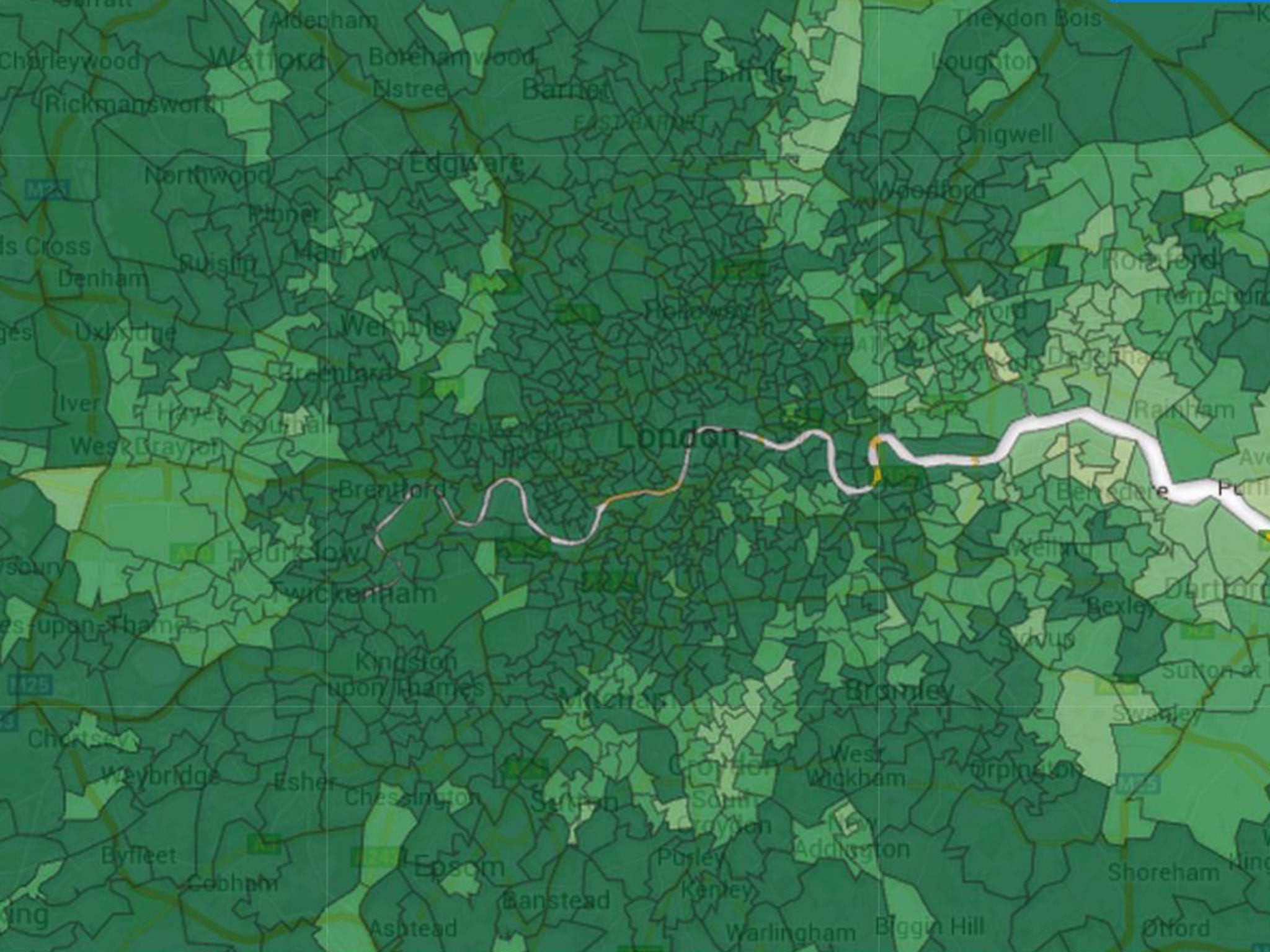
A new map has revealed the stark contrast between house prices in parts of England as Wales, as homes in London average more than £500,000 while that figure in the North-east is little over £150,000.
The Office for National Statistics (ONS) used its data from 2013 to show the most and least expensive parts of the country on a local level.
The average house in the UK now costs £272,000 and prices increased by 9.8 per cent last year, with the affluent area of Kensington and Chelsea being the most expensive place on average.
The priciest category, where homes cost an average of £252,000 or higher, swamps most of London and much of the Home Counties.
High-priced pockets of houses between £196,000 and £252,000 line the south coast of England and the commuter belt around the capital.
The map shows cheaper prices on average across swathes of Wales and the north of England with the exception of desirable rural areas, including around Harrogate in Yorkshire and Windermere, in the Lake District.
Zooming in shows the diversity of house prices in cities as a multi-coloured jigsaw of more and less desirable areas.
Prices in Newcastle range from the ONS’ most to least expensive categories, while the impact of gentrification can be seen in London as previously working class areas now have averages well over £200,000.
All five of the most expensive areas in the UK are in London — Westminster, the City of, Camden, and Hammersmith and Fulham.
The average price for properties bought by first-time buyers also rose by almost 10 per cent last year – bad news but slightly better than the 11 per cent annual increase seen between 2013 and 2014.
A report by the Institute for Fiscal Studies (IFS) suggested that the decline in the rate of home ownership and the rise of private renting has partly been caused by the increase of house prices relative to income.
“The evidence so far suggests that these may well turn out to be permanent differences between generations,” the report said.
Join our commenting forum
Join thought-provoking conversations, follow other Independent readers and see their replies
Comments