World’s oldest unchanged brand finally removes dead lion from logo
The logo was originally based on Samson killing a lion with his bare hands
Lyle’s Golden Syrup has replaced its logo of a dead lion being swarmed by bees with an apparently happier animal and a single bee in its first rebrand since 1883.
The product’s green tin and golden lion packaging was first launched in 1881, and holds the Guinness World Record for the world’s oldest unchanged brand packaging, having remained essentially identical since 1883.
The original design was the idea of the product’s founder, Scottish businessman Abraham Lyle, who decided to include a Christian analogy on the tins.
The Book of Judges details Samson killing a lion with his bare hands before returning to the carcass a few days later to find a swarm of bees had created a hive in its body.
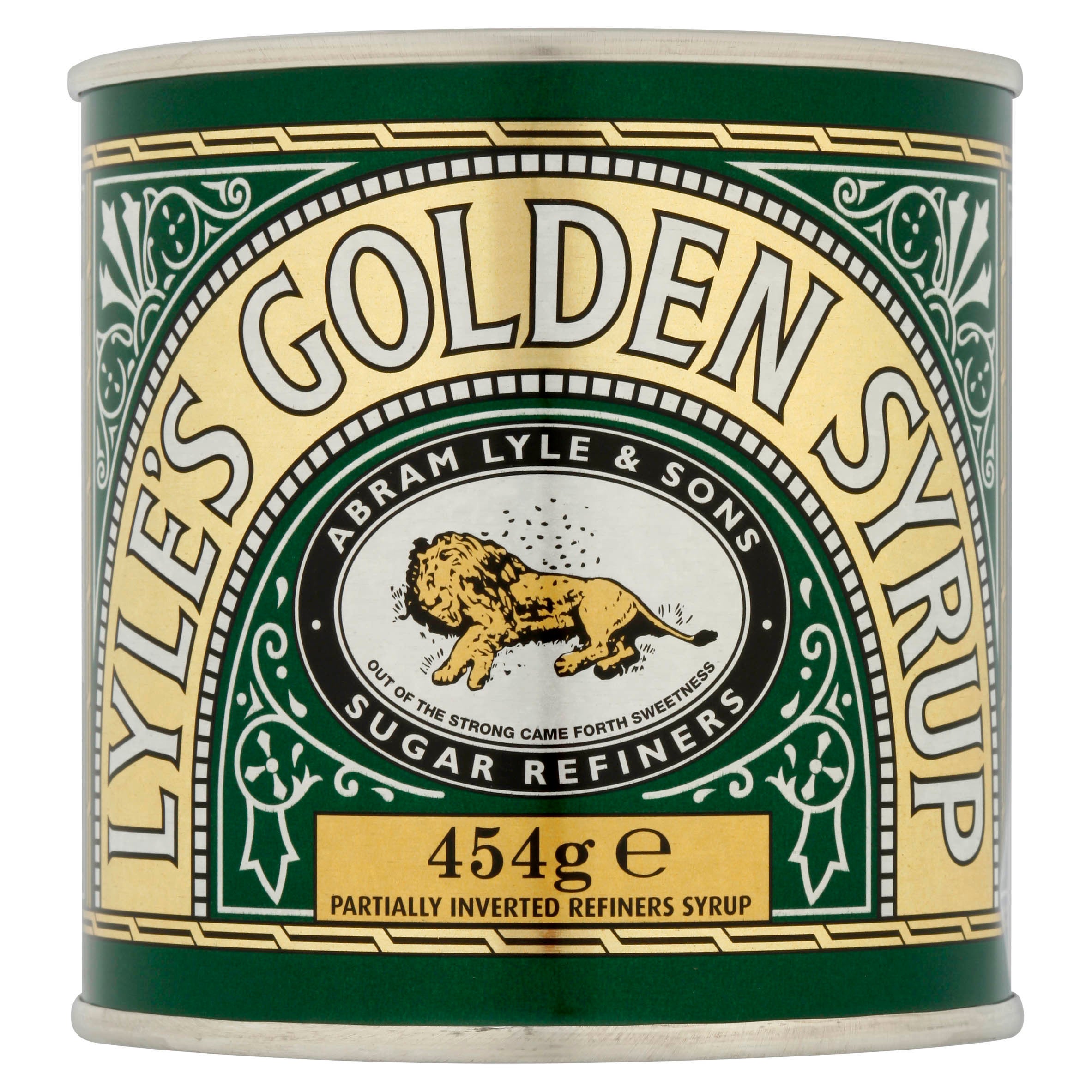
In the story, Samson then took honey from the hive, and fed it to his parents without telling them where he got the honey from.
He later asks guests at his wedding to solve the riddle: “Out of the eater, something to eat; out of the strong, something sweet.”
A version of the riddle: “Out of the strong came forth sweetness” was chosen for the logo of Lyle’s Golden Syrup, and has remained on the tins ever since.
Lyle’s said the branding has been “revitalised for the modern UK family” in a move to “refresh the brand’s legacy to appeal to a 21st century audience”.
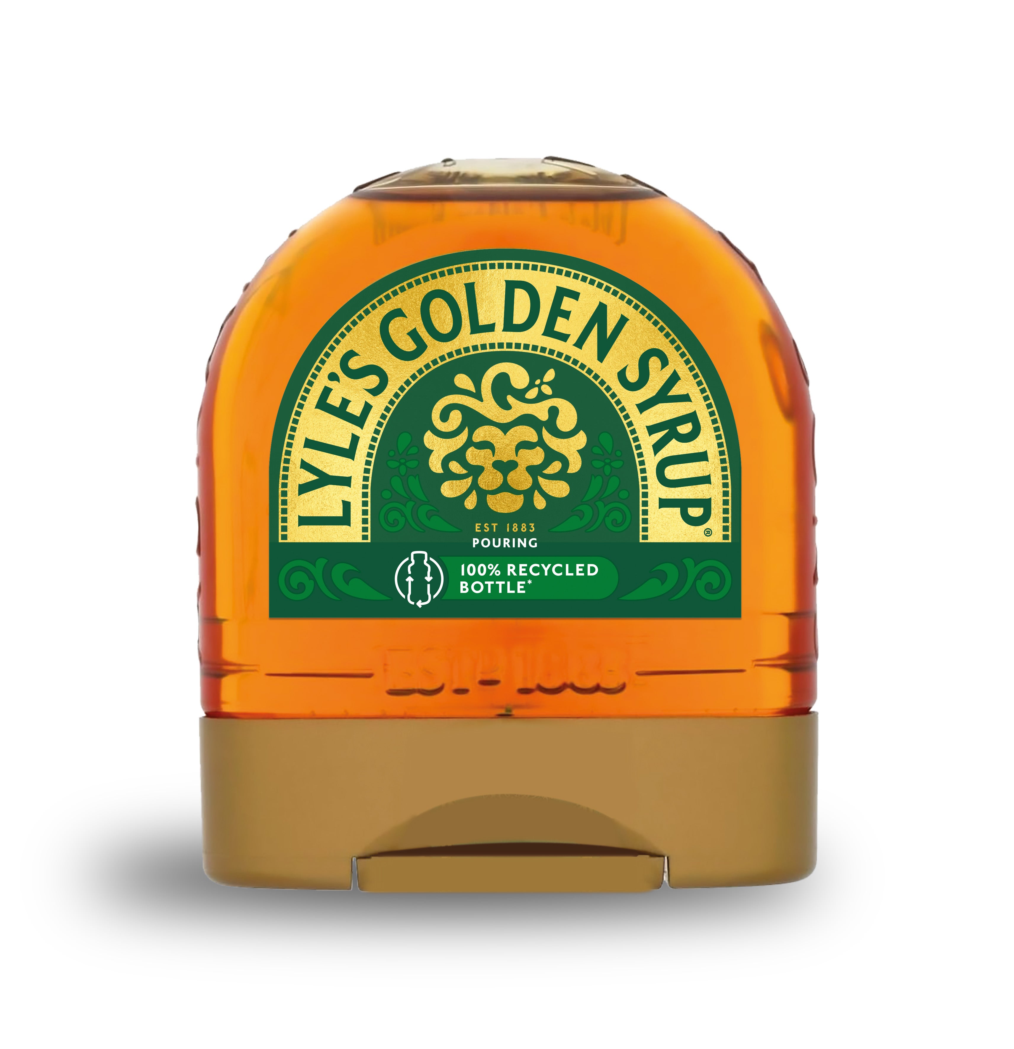
The rebrand will take place across the full product range, excluding the classic tin, which will retain the original illustration.
James Whiteley, brand director for Lyle’s Golden Syrup, said: “We’re excited to unveil a fresh redesign for the Lyle’s Golden Syrup brand.
“While we’ll continue to honour our original branding with the heritage tin, consumers need to see brands moving with the times and meeting their current needs.
“Our fresh, contemporary design brings Lyle’s into the modern day, appealing to the everyday British household while still feeling nostalgic and authentically Lyle’s.
“We’re confident that the fresh new design will make it easier for consumers to discover Lyle’s as an affordable, everyday treat, while re-establishing the brand as the go-to syrup brand for the modern UK family, featuring the same delicious taste that makes you feel Absolutely Golden.”
Join our commenting forum
Join thought-provoking conversations, follow other Independent readers and see their replies
Comments
Bookmark popover
Removed from bookmarks