Sydney Morning Herald newspaper shocks readers with Comic Sans on front page
The comic book-style speech bubbles were deliberate, but that didn't stop a raft of mockery at the decision
An Australian newspaper faced the wrath of font aficionados today after it used the much-derided Comic Sans on its front page.
The Sydney Morning Herald suffered ribbing on social media and questioning on why it could possibly want to feature the font, leading to the editor-in-chief leaping to its defence.
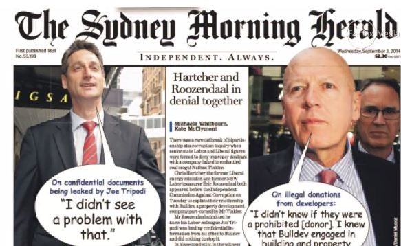
It had used it in the context of creating speech bubbles from two officials who are witnesses in an investigation being conducted by New South Wales’ Independent Commission against Corruption (ICAC).
The quotes were from Eric Roozendaal and Chris Hartcher and were emphasised within clip art-style bubbles.
“The decision was made to match the surreal nature of the shocking revelations at the ICAC - and it was felt the font would best depict the comic-book feel we were trying to give to the front; as if to make a mockery of the appalling displays in the witness box from a former politician and a current parliamentarian,” said Editor-in-Chief Darren Goodsir.
“I am very pleased with the result.”
Controversial Comic Sans was developed by Microsoft in the 90s to emulate a “lettering script similar to the lettering used by the major comic books”, the font’s designer, Vincent Connare, once explained.
He added that Microsoft had a “need for fun fonts”, thus the Comic Sans was born.
Unfortunately, however, the maligned font caused a storm in a teacup for some, including an Editor at a rival outlet who said it was the “beginning of the end”.
In an explanatory video, Sydney Morning Herald’s Matt Martel, one of its Executive Editors, admitted that Comic Sans is a “really ugly typeface” and that the “decision last night [to include it] in a moment of madness… has caused a firestorm”.
“[It is] the biggest type scandal I can recall in my time as a journalist and designer… It is the one time on earth ever that Comis Sans was the appropriate typeface. It’s had its day and now it can go away.”
Writing in a blog, he added: “Chris Hartcher's and Eric Roozendaal's comments to the ICAC were treated typographically with the respect they deserve. And they deserved Comic Sans.”
Join our commenting forum
Join thought-provoking conversations, follow other Independent readers and see their replies
Comments