Football League new logo: Fans react to 'awful' rebranding as 'EFL'
'Is it bio or non-bio?'
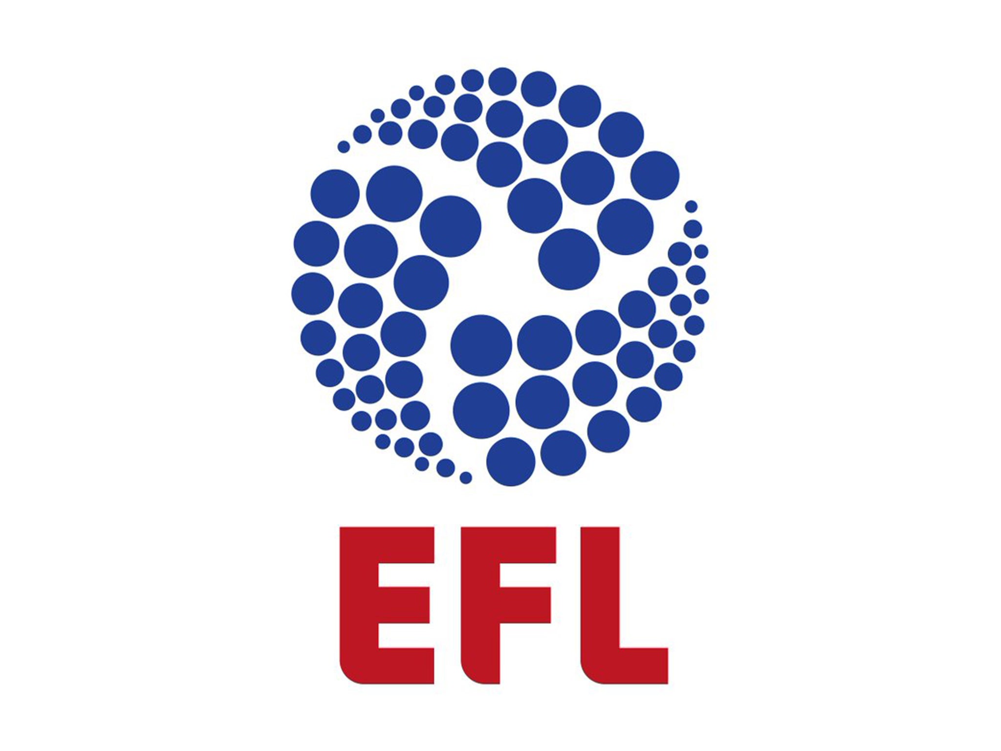
The Football League has announced that it will change its name to the English Football League as part of a major rebranding exercise.
The league’s three divisions will retain the titles of Championship, League One and League Two but a new logo, only the fourth in the organisation’s 127-year history, has been unveiled.
The design is the shape of a football formed of three swathes, each one made up of 24 smaller balls. As a result, the entire logo is made up of 72 small circles, each representing one of the Football League’s 72 member clubs.
The reaction to the new logo on social media has been largely negative, with many unfavourably comparing it to that of an energy provider or brand of washing detergent.
“In an increasingly-challenging global sports market, it is absolutely essential that sports properties can project a modern identity that not only resonates with their regular audience but is also easily recognisable to a broader audience of potential fans, viewers and commercial partners,” said the Football League’s chief executive Shaun Harvey.
The rebrand will come into use at the end of the season, with the shortened ‘EFL’ name designed to tie in with Premier League’s common international moniker ‘EPL’.
Join our commenting forum
Join thought-provoking conversations, follow other Independent readers and see their replies
Comments