With all the faux-inspirational dogma thrown at consumers, did you expect any better from Leeds' new crest?
Every company is trying to thrust an inspirational message upon consumers, writes Jonathan Liew, so why should a football club be any different? At least Leeds United tried
I got a nasty shock yesterday morning whilst preparing breakfast. It was a new box of muesli, and as I opened it for the first time I was confronted with the following message, printed on the inside flap: “No-one ever looked back at their life and wished they’d spent more time at work.”
That was all. How puzzling. My first thought was that it was the handiwork of some bored employee at the muesli factory, fashioning surreptitious snippets of revolutionary wisdom during a stultifying night shift, and trying to sneak them into people’s lives via the medium of oats.
Then it occurred to me that perhaps this was a cry for help. Perhaps the staff of the muesli company were being held there against their will. With all means of outside communication shut off, this cryptic SOS might be their only shot at salvation. I pondered alerting the relevant authorities.
But of course, a moment’s pause revealed it to be neither of these. Instead, it was just a piece of faux-inspirational dogma, the sort you see all over food packaging these days, this one dreamed up by a cereal manufacturer owned by a FTSE 100 company with an annual revenue of £13.4bn, in an attempt to make you like it a little bit better, and perhaps even buy some more of its muesli.
Intrigued, I began to scour the rest of the house, to see what other shrouded messages lurked within its four walls. As it turned out, the kitchen was positively alive with conversation.
“Shake me!” trilled the carton of milk in my fridge. “Eat me within 21 days,” urged a jar of pesto in the cupboard. Even my shower gel was imploring its naked user to “keep me out of the reach of children”, like some repentant, recidivist abuser. Clearly, this has all got just a little bit out of hand.
Part of the reason our muesli and our shower gel have started talking to us, I think, is to do with the way we interact with each other these days. The face-to-face and the voice-to-voice conversation have been supplanted as our primary means of communication by the email and the instant message. Though we are all theoretically closer together, we are actually more alone, and more detached, than we ever have been.
And so into this torrent of words and pictures slide the brands: cleverly disguised as your friends, talking just like the sort of regular people you would meet, if you ever met people, or talked to them. We have replaced genuine human connection with an ocean of talking machines spouting cutesy banter, and when most communication has been stripped of its basic human signals, it’s tempting to wonder: what, really, is the difference?
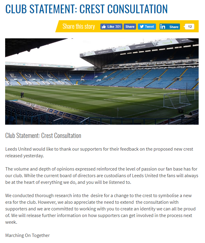
Can I shock you? I don’t find the new Leeds United crest that bad. Of course, it’s definitely bad. No question there. It was bad from the very moment it was unveiled on Wednesday, and reviled on social media just as quickly. The headless figure beating the chest of his white shirt like a man trying to suppress a burp. The terrible, impersonal, building-society font. The computerised shading. No, no, no. None of this is good. The Twitter users who compared it to an early 2000s computer game logo, or perhaps even a packet of heartburn tablets, were not too wide of the mark.
But it’s tempting to inquire of the thousands of Leeds fans who expressed their displeasure: seriously, what did you expect? The new Leeds crest is what happens when brands so thoroughly lose the ability to see people as people, that their attempts at genuinely communicating with us begin to take on the air of the surreal. Like the food in your fridge, they may seem like they’re talking to you, perhaps even listening too. But actually, because it’s only humans who can talk and listen, it can only ever be a slightly warped facsimile.
The irony in this case is that Leeds tried. They really did. They boasted in their promotional material that they had spent six months conducting research into the new crest, consulted over 10,000 people, which strikes me as excessive in the extreme. For this isn’t like choosing a government, where you have a list of options and simply pick one. Rather, it was a process more akin to asking 10,000 people to decide what you should have for dinner tonight. As you stare in bewilderment at your plate of cheesy pasta curry, topped with Thai seafood soup, all served in a jacket potato, you may just reflect that consultation and collaboration are two very different things.
Anyway, we could easily prolong the discussion at this point: into corporate culture’s unquenchable thirst for rebranding and renewal, into the homogenisation and commodification of modern design, into the strange anthropomorphisation of brands on social media, into football’s obsession with the cosmetic. But I hear a carton of juice calling out to me from the kitchen, and besides I read a little something on a packet of muesli this morning telling me not to work so hard. And so, I think I’m going to call it a night.
Join our commenting forum
Join thought-provoking conversations, follow other Independent readers and see their replies
Comments
Bookmark popover
Removed from bookmarks