World Cup 2018 logo 'looks like Roger from American Dad'
New logo for Russian tournament drawing comparisons to sitcom alien
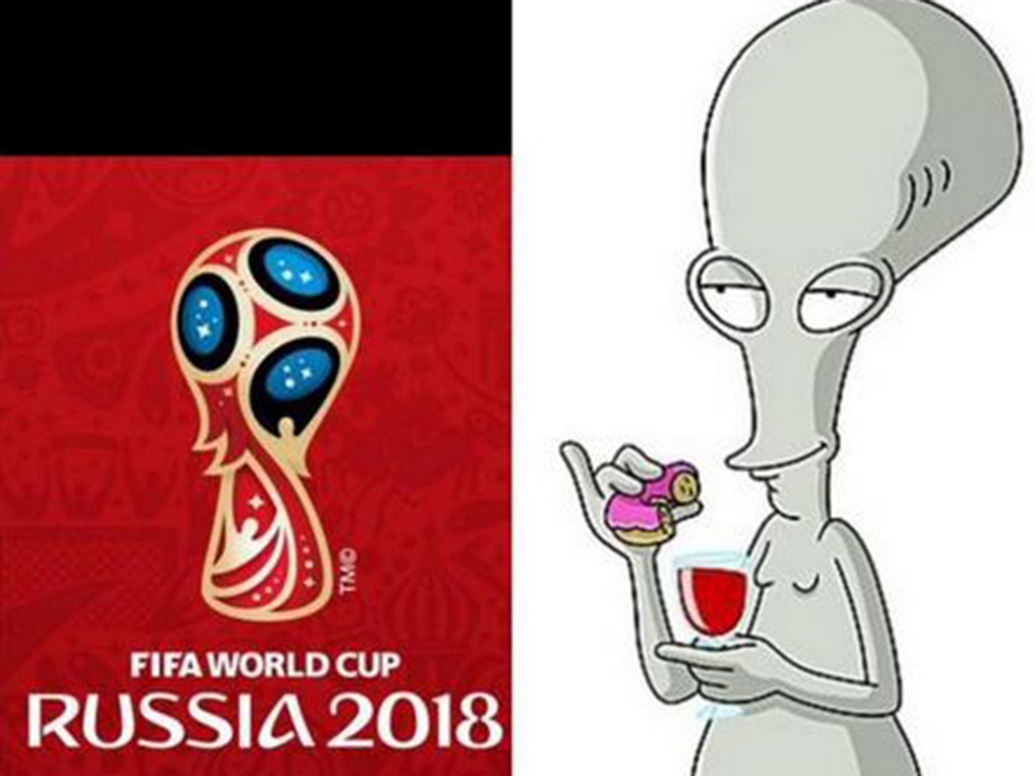
The Fifa World Cup 2018 official logo has been released to much fanfare – having it unveiled on the International Space Station will help.
But the logo for the Russian tournament has also been drawing some strange comparisons, mostly to the alien Roger from Seth MacFarlane's American Dad.
It is said to 'reflect the heart and soul' of the country, while including the cultural traditions it is recognised for.
Though it carries the red, white and blue of the Russian tricolor, not the grey colouring of the Smith’s house guest, the logo certainly has a prominent head and dumpy body.
Does the logo look like Roger? Let us know in the comments below...
Join our commenting forum
Join thought-provoking conversations, follow other Independent readers and see their replies
Comments
Bookmark popover
Removed from bookmarks