Twitter reacts to Columbus Crew unveiling garish yellow and light blue 'Minion' kit
Is this the worst of the season so far?
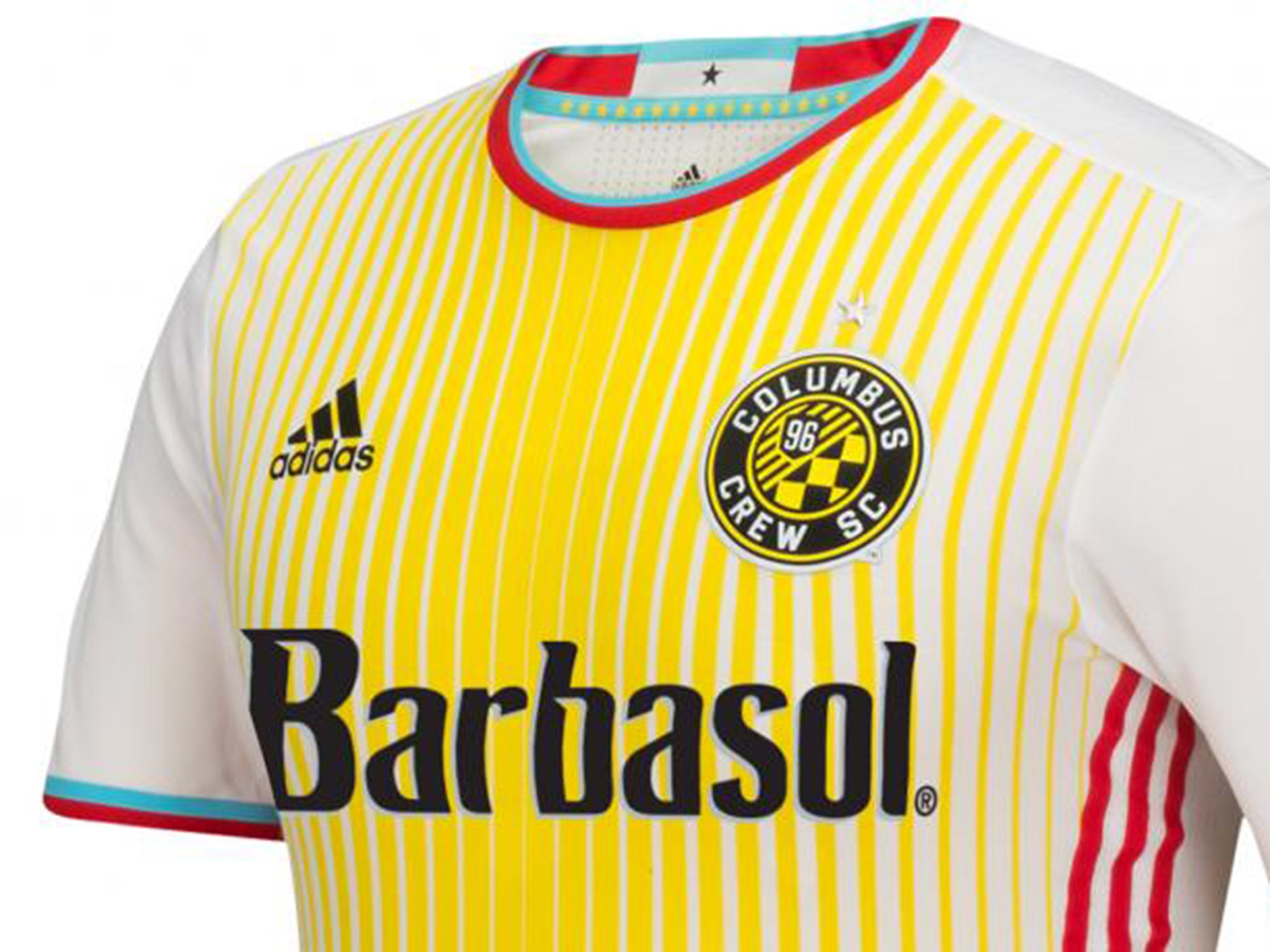
MLS side Columbus Crew unveiled their new kit on Wednesday. Why is that important? Well, because it could be one of the worst of all-time.
The off-white, garish yellow and striking light blue design is apparently “inspired by the Columbus City flag”, according to the club’s official press release.
The kit “creates a powerful and bold connection between the club and the city”, apparently, as if one wasn’t meant to exist already.
Is it bold? Yes.
Is it powerful? Well, you do have to kind of squint while looking at it, so yes.
Inspired by the city’s flag? Maybe, though judging by the reactions on Twitter, there are plenty of other things that share a passing resemblance with the strip.
Here's some of the reaction from social media...
There's a 'bodily fluid' theme to a lot of the reaction, though as the press release would been keen to stress, that "prominent golden tone adorning the centre of the jersey is symbolic of Crew SC's heritage". Yes, of course it is.
What do you make of Columbus' effort? The worst strip of the season, potentially all-time?
Here’s a reminder of some of this season’s most eye-popping numbers...
Let us know what you make of Columbus' choice in the comments section...
Join our commenting forum
Join thought-provoking conversations, follow other Independent readers and see their replies
Comments
Bookmark popover
Removed from bookmarks