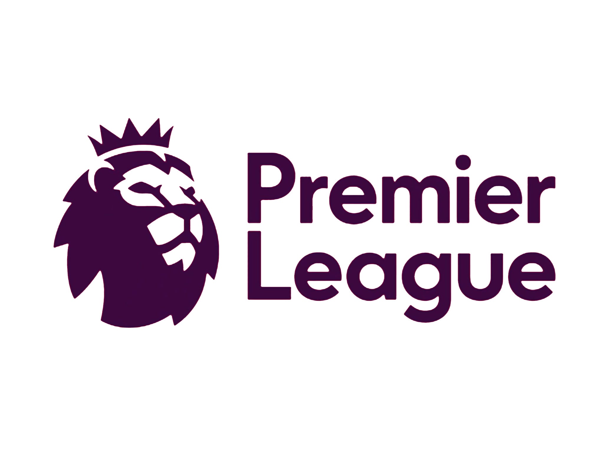
Premier League logo: Blimey! The new design is sleek, clean and clever
COMMENT: Although keeping the lion as a nod to the heritage of the old logo, the new one is vastly and refreshingly different: cleaner, sleeker and more friendly.

As someone who happily let sport in all its forms pass me by, it’s not often I get asked to write a piece for this section of this paper. In fact, make that never. So when our Sports Editor asked me to write about the changes to the Premier League, I thought he was talking to someone else. It turned out he wanted a designer’s take on the League’s new logo which will come into play next season.
I’ve never watched a whole match but am aware of the current Barclays logo in all its masculine and formal glory: blue, white and red with a massive logo and featuring a lion resting its foot on a ball. Although keeping the lion as a nod to the heritage of the old logo, the new one is vastly and refreshingly different: cleaner, sleeker and more friendly. All sponsorship logos have been dropped and there’s no obvious trace of the game it represents (although the lion’s head is distinctly rounded, perhaps to reference the missing ball).
Out, too, go the old colours, replaced with a palette that will be updated every three years and features a zingy and bright yellow, green, blue and red to work across a range of usages. A font set called “Premiere Sans” is being developed to reinforce the look.
Like most redesigns the new look is aimed at maximising impact on digital and broadcast platforms first, so the look is graphic and flat in order to work across many devices at any size. It’s a huge improvement and a confident execution.
However... it’s still not enough to make me want to watch a whole match.
Join our commenting forum
Join thought-provoking conversations, follow other Independent readers and see their replies
Comments