Google has spent 18 months changing its typeface - but can you tell the difference?
Roboto - the system font that's been used on Google's mobile operating system, Android, since 2011 - needed tweaking
"It was bigger than any design project we've ever had," Matias Duarte, Google's vice-president of design, said. But Duarte wasn't referring to the futuristic spectacles or the driverless cars that have generated so much media attention for the company; no, this was the a subtle restyling of a typeface.
Roboto is the system font that's been used on Google's mobile operating system, Android, since 2011. But the world of mobile computing is one that's constantly fluctuating.
Every week, new Android devices of all shapes and sizes arrive on the market, all of them having to display text consistently and accurately, and while the resolution of their screens was growing, Roboto was languishing, technologically speaking, in a bygone era. It needed tweaking.
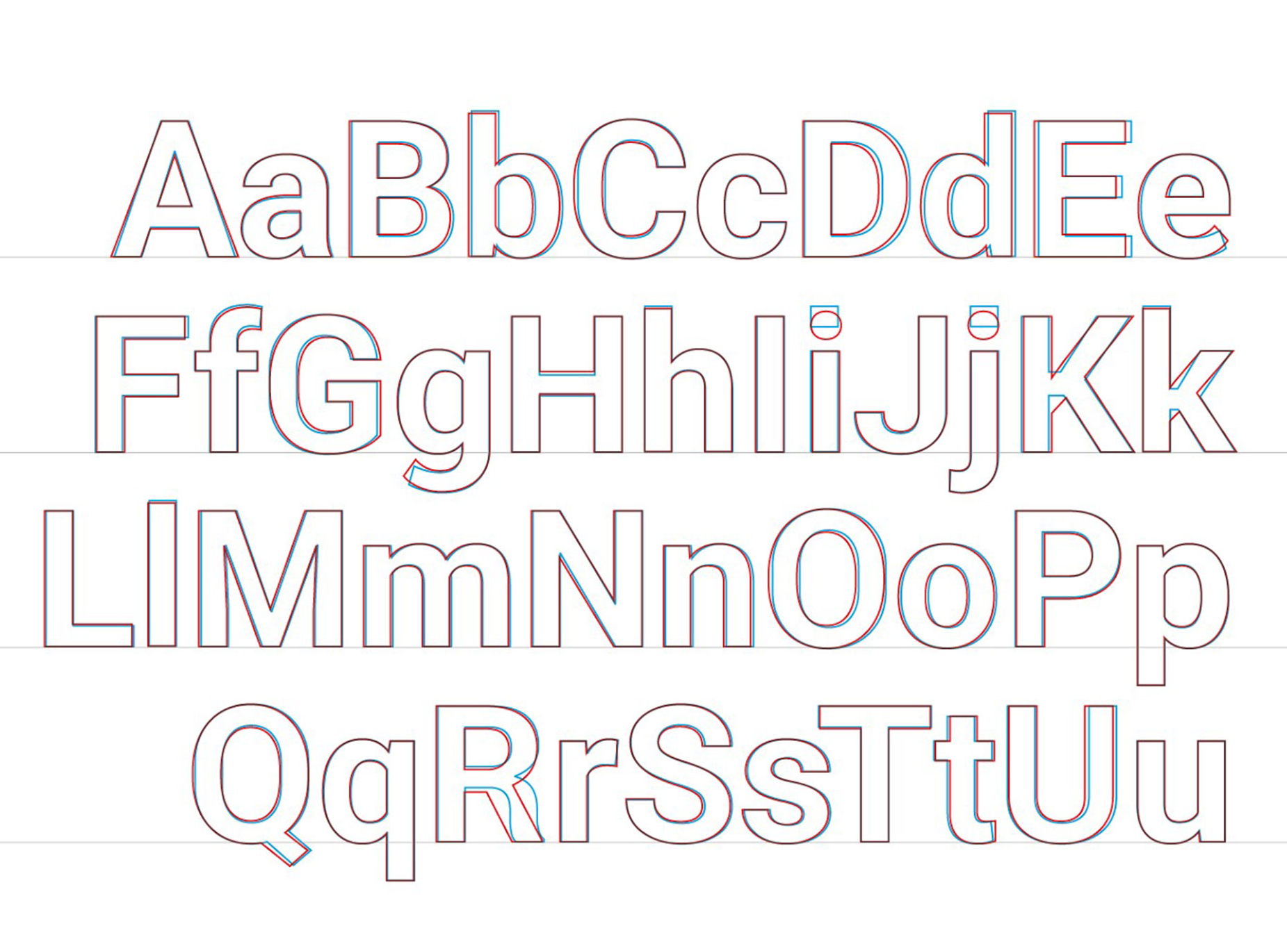
"It's now slightly wider and rounder," Duarte said of the new version (now downloadable for free), "giving it greater clarity and making it more optimistic."
Optimism probably isn't a quality any of us would use to describe a typeface, but you can understand the company aiming for the stated attributes of "approachability" and "friendliness" rather than "hostility" and "surliness". Of course, we're surrounded by corporate entities who've made the decision to rebrand with "friendlier" fonts in an attempt to establish closer connections with customers, but Roboto has nothing to do with corporate indulgence and everything to do with customer satisfaction. After all, typefaces, along with imagery, establish our user experience – something that Steve Jobs was keen to stress very early on at Apple.
The ubiquity of Roboto means that its duty is almost to be invisible; if it's deemed to be overbearing or distracting, we'll be less keen to read, engage and use the products that it's installed on. So, for a company the size of Google to get Roboto wrong would be disastrous, and little wonder it spent a year and a half trying to get it right. The letters i and j now have circular dots, not square; the numbers are all the same width, so they line up neatly across multiple rows; the capital "R" looks quite different. These, along with the other changes, might not be things we'd ever have campaigned for, but we may find ourselves appreciating them on a subconscious level.
Roboto, designed in-house by a team led by Christian Robertson, was met with some stern criticism at its launch three years ago, with the typographer Stephen Coles calling it a "frightening cross-breed creature", a "Frankenfont", an unsatisfying amalgam of other typefaces such as Helvetica and Myriad. But while it might have broken some accepted rules governing terminals, kerning or exit vectors, Roboto stuck around as a work-in-progress, a typeface that's shaped by the way we use it.
"It's very hard to launch any new digital font without people saying, 'oh, they've got the L wrong', and 'the H won't work'," said Simon Garfield, the author of Just My Type, a book about fonts and their cultural context.
"Fifty years ago, of course, we wouldn't have been conscious of these kind of things and we would have been powerless to effect any change. But today we're aware of the pull‑down menu, the power of type, and as a result we're gods of type in a way that we never used to be."
The design of a typeface is largely governed by where it appears. The much derided Comic Sans, for example, was designed specifically to appear in a speech balloon above a cartoon dog in a piece of Microsoft educational software. Much to people's annoyance, it ended up appearing everywhere – but the challenge Google has with Roboto is that it already knows it'll appear everywhere: from watch faces to television screens to car dashboards to your spanking new Android phone.
Google has given its new visual language a name: Material Design. Roboto lies at its heart and it's likely that it'll become the most eyeballed font in the world, if it isn't already. Not bad going, for a Frankenfont.
Join our commenting forum
Join thought-provoking conversations, follow other Independent readers and see their replies
Comments
Bookmark popover
Removed from bookmarks