Google updates its iconic logo for first time in 10 years
One of the world’s most ubiquitous logos is changing to a design that is in line with its AI chatbot Gemini

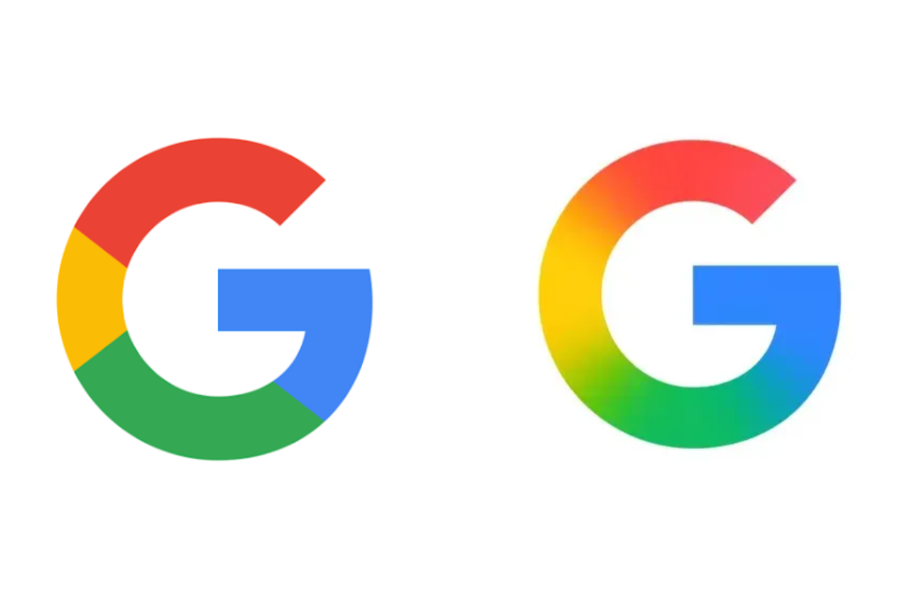
Google has updated its multi-coloured ‘G’ logo, marking the first major update to the brand’s design in nearly a decade.
Billions of users will begin to notice a change to the Google icon over the coming days as the update rolls out across smartphones, tablets and other devices.
The redesign will see the four-tone ‘G’ logo switch colour to a rainbow gradient that blends the original red, yellow, green and blue shades.

The new icon first appeared on the Google Search app for iOS following an update on Sunday, before coming to Android devices on Monday through the latest beta version of the Google app.
Eventually it will roll out to all devices, while also appearing as the new favicon image on web browser tabs.
With an estimated 5 billion people using Google globally, the logo is one of the most ubiquitous in the world.
The last significant change to Google’s logo came in September 2015, when the tech firm switched from a serif typeface to a modern typeface called Product Sans.

The update also saw the introduction of the circular ‘G’ icon, which had previously been a lowercase ‘g’ on a blue background.
Google said at the time that the rebrand was intended to make the logo suitable “for a world of seamless computing across an endless number of devices and different kinds of inputs (such as tap, type and talk)”.
The latest redesign appears to bring Google’s most prominent logo in line with the gradient used for its AI chatbot Gemini.
The search giant has put a significant focus on artificial intelligence in recent years, integrating the technology into all of its major platforms in an effort to not lose ground against competitors.
Earlier this year, Google began testing an AI-only search tool that summarises results in a conversational way similar to Geminin rival ChatGPT.
Join our commenting forum
Join thought-provoking conversations, follow other Independent readers and see their replies
Comments
Bookmark popover
Removed from bookmarks