Daily catch-up: the gap between rich and poor has narrowed (a little) since the banking crisis
Special edition of the daily round-up looks at the evidence on inequality under the coalition Government

The Prime Minister and Chancellor seized yesterday on a report from the Institute for Fiscal Studies, which said that median incomes have at last recovered their pre-crash level.
The report also said that incomes are more equal than they were before the recession, which is such a surprising finding that most people didn’t notice it when George Osborne repeated it on the Today programme.
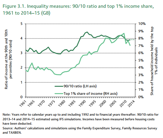
It is worth recapping the latest evidence on this, as it runs so counter to what everyone thinks they know. The IFS chart (above, from p11 of the report) shows two measures of inequality. One is the ratio of the income of the top 10 per cent to that of the remaining 90 per cent (the dark green line); the other is the share of income going to the top 1 per cent (light green).
In both cases the line has gone down since the banking crisis, showing a slightly more equal distribution of income.
This has been shown in different data sets repeatedly, and is repeatedly challenged because it is so contrary to what is widely believed, namely that this government grinds the faces of the poor to benefit its friends in the hedge funds.
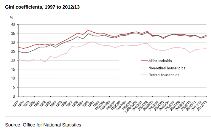
The most recent official figures are from the independent Office for National Statistics, a series called “The Effects of Taxes and Benefits on Household Income, 2012/13”. The graph below is taken from page 19 and shows the Gini coefficient for disposable income since 1977. The Gini coefficient is a statistical measure of how unequally something is distributed, higher values showing greater inequality.
Some people don’t like it, possibly because it doesn’t show what they expect it to show, although they tend to say that it doesn’t capture what is happening at the extremes of the distribution, but as the IFS analysis above suggests other measures show the same thing.*
Another objection to these figures is that they show the picture before housing costs, but a comparison with after-housing-costs figures produced by Declan Gaffney suggests that these do not show a different trend in the short run.
________
The next objection is that the figures don’t show what is happening to the distribution of wealth. Again, the latest evidence doesn’t show what people might expect it to show. Apart from the fact that wealth appears to be more equally distributed in the UK than in Germany or Sweden, the suggestion of a recent increase in wealth inequality in the Credit Suisse Global Wealth Report 2014 (p33), based on just two data points, is not supported by ONS figures from the Wealth and Assets Survey 2010-12.
None of this is to say that the level of inequality in Britain is either acceptable or unimportant. And it may be that this Government’s policies are going to lead to greater inequality. But the debate about equality ought to start with the facts as they are.
________
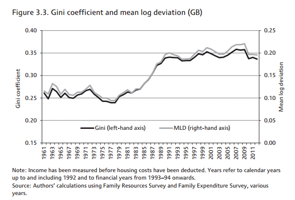
*The IFS does produce estimates of the Gini, and has even experimented with something else called mean log deviation (Living standards, poverty and inequality in the UK: 2014, p38). They all show the same pattern:
Join our commenting forum
Join thought-provoking conversations, follow other Independent readers and see their replies
Comments
Bookmark popover
Removed from bookmarks