Let's turn the page on inappropriate book covers
In the last fortnight Sylvia Plath's 'The Bell Jar' and 'Anne of Green Gables' have had their covers sexed-up to try and appeal to new audiences
“Don't judge a book by its cover”. “It's what's inside that counts”. Who hasn't had these phrases fired at them at some point? While they're usually used to make children look beyond the cat-hair-and-Superking-ash outer fug of an elderly relative to see the kind, sweet person within, say, or try and convince people to remember that beauty is only skin deep, not judging a book by its cover is a good rule for real books, as well as metaphorical ones. I have a shabby black hardback at home that I rescued from a skip. It's a children's book that is now out of print and one of the most searched-for titles online. It looks rubbish on the outside and is magic on the inside. That's also why I love the classics. You can pick up any edition of Wuthering Heights, Pride and Prejudice, Dracula (a classic in my book, at any rate) and despite the cover art or sloppy printing, it will be the same old friend inside.
And yet, and yet. Despite all of this, book covers matter. They move us, they bother us. I felt a warm throb of recognition when I saw a picture of the edition of Cider With Rosie that I'd read at school used to illustrate a news story recently.
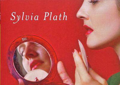
Book covers can have a Proustian effect, taking you back to the moment when you first opened the covers, or triumphantly turned the final page. Yes, it's what's inside that counts, but how much nice when the inner delights are matched by a sympathetic showing on the outside? No wonder there have been so many howls of outrage over two books in the last fortnight. First was the 50th anniversary edition of Sylvia Plath's The Bell Jar, all powder compact and perfect pout. Attractive, true, but it said nothing about the despair within. Then there's a new copy of Anne of Green Gables that has a dust jacket that's all wrong. A busty blonde teenager is plonked on the front, looking absolutely nothing like how the flame-haired, freckle-faced heroine is described within.
Regardless of the (valid) raging about the sexualisation of young girls, this is also offensive because it's wilfully stupid. Why represent Anne as something she's not? It's like whacking a picture of Peppa Pig dressed as Jane Eyre on Charlotte Bronte's masterpiece and wondering why three-year-olds got the hump when they were bought it. Mislabelling, whether it's of lasagnes or literature, does us all a disservice.
Join our commenting forum
Join thought-provoking conversations, follow other Independent readers and see their replies
Comments
Bookmark popover
Removed from bookmarks