Andy Murray's logo: The new dark mark
This will get the kids talking in the playground
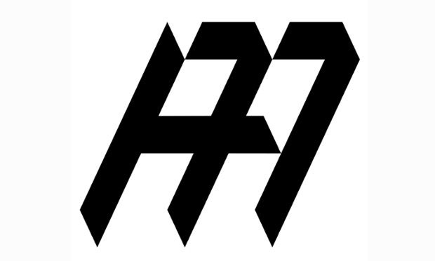
The look isn’t pretty, but at least Andy Murray’s new logo suggests he has a solid team of wizards to back up the work of his coach, Amelie Mauresmo.
Two 7s help to construct the initials, “AM.” This is because Murray won Wimbledon on the 7 day of the 7 month of the 77 year since the last Brit picked up the trophy. According to Dan Caldwerwood of Aesop Agency, who may or may not also be responsible for the design of the Death Eaters’ “Dark Mark”, the logo “subtly references his affinity with the number”.
Do sportspeople need logos? Of course, what other kind of legacy would they leave behind? How else would they mould the minds of young and impressionable children? A “brand identity” is essential – from Gareth Bale’s love heart hand gesture (copyright) to Mo Farah's Mobot. It reminds you of that Tennyson poem, "To strive, to seek, to find, and not to let a good opportunity for personal monetisation pass you by".
Forget school sport. What we need is to introduce a compulsory two hours a week of “reach maximisation” and “reputation enhancement”. Global race? That’d be it right there. Britain for the win. Cheers Andy.
@memphisbarker
Join our commenting forum
Join thought-provoking conversations, follow other Independent readers and see their replies
Comments
Bookmark popover
Removed from bookmarks