Britain’s transport signage is celebrating its 50th birthday
50 years ago, our road and railway signs got a makeover - but while the former have lasted, the latter were a victim of privatisation

For free real time breaking news alerts sent straight to your inbox sign up to our breaking news emails
Sign up to our free breaking news emails
They are icons of the everyday, and arguably one of our nation’s greatest 20th-century design achievements, and yet they rarely get the acknowledgement they deserve. But this year, Britain’s road signs are celebrating their 50th birthday, as is the British Rail logo along with the whole signage scheme that once graced every British station.
It seems that as we rediscover the joys of state-funded architecture from the mid-20th Century – the pleasures of tower blocks et al – it is only fitting that we should pay homage to these other symbols of public-sector optimism.
In 1965, Britain was a confident country driven by a progressive mentality rather than the make-do-and-mend ethos of government today.
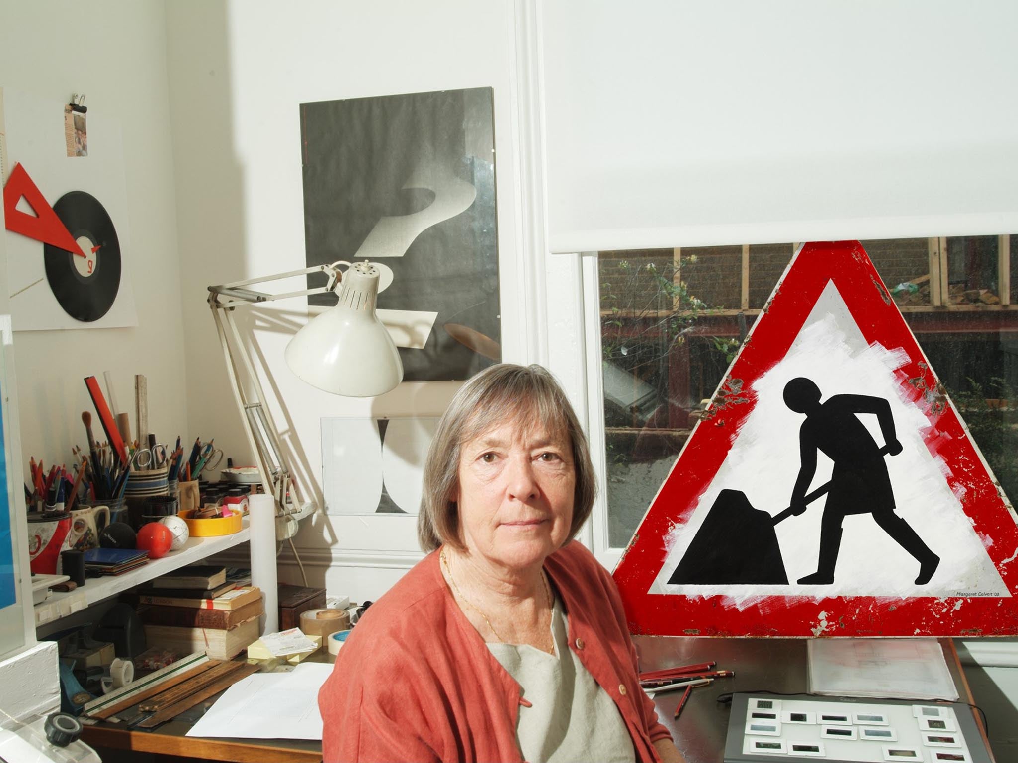
New signs and designs for our roads and railways were meant to underline a future that would be fast and functional. And, in a studio in Knightsbridge, west London, fresh from designing signs for the new airport at Gatwick, graphic designers Jock Kinneir and Margaret Calvert were creating the standard layout for the signs that would be the visual language of the new bridges, bypasses and motorways snaking across a Britain in thrall to technology and the car.
Kinneir set out to make signage that would be legible even from the seat of a car shooting past at 70mph. One trick was to use upper and lower case letters rather than all capitals, plus different background colours: blue on motorways, green on A roads. Meanwhile, Calvert, who was behind the various pictograms, wanted the signs to be friendly, and the characters in them to be warmly human, bringing life to our pavements and junctions.
“The road signs created by Kinnier and Calvert are part of the most ambitious and effective information design project ever launched in Britain,” reckons Patrick Murphy, director of the Made North gallery in Sheffield. They’re not just works of practical design, but art too. Murphy recently curated an exhibition at London’s Design Museum where designers and artists from Sir Peter Blake to Betty Jackson and Rob Ryan created new signs inspired by these 50-year-old originals – a show which will tour to New York next year.
The signs are masterpieces. But they also nag us. They point us in the right direction yet they warn us not to stray. They are poignant symbols of a country that loves rules yet moans about the people who make and enforce them.
They have also suffused our culture, for example: fashion designer Anya Hindmarch’s autumn winter collection this year features bags, sweaters and the like emblazoned with signage she saw on the M25; the KLF’s Jimmy Cauty used the signs more satirically in his recent “model village” at Banksy’s Dismaland; the film-maker Patrick Keiller shoots roundabout signs at length and zooms on in the lichens that live on them in his bravura Robinson films about a Britain on the brink; and children of the Nineties may remember the infamously over-hyped band, Gay Dad, and their appropriation of the pedestrian crossing man on posters that appeared everywhere and were enigmatically devoid of text.
“I think a lot of these pictograms drawn by Margaret are so well crafted and elegant that they’ve become part of the British landscape, whether the digging man, or the school children... or the cattle [warning] sign in which Margaret referenced a relative’s cow called Patience!” jokes Murphy. The girl in the school children crossing sign? Calvert based her drawing on a photo of herself as a child, so immortalising her young self in every British town and village.
As well as creating a new typeface, Transport, which was used on all road signs, Kinneir and Calvert also dreamt up one called Rail Alphabet for use on railway signs in the same year. These signs were similarly clean, crisp and elegant – in 1965 British Rail was building Brutalist signal boxes and Modernist stations, while replacing steam engines with diesel, and its graphic identity had to look forward too.
British Railway also got a new logo – the double arrow and railway lines, which even today is used as a symbol for a train station, although BR has bitten the dust. It’s an instant signifier that says “this is where you catch a train”.
“Like the motorway signs, Gerry Barney’s BR symbol is important because it still works,” says Mark Sinclair, author of TM: The Untold Story Behind 29 Classic Logos, in which it features. He says the typeface and logo “were applied to every part of the railway system – from rolling stock to stations and offices, signposts, posters and publicity material, uniforms and cutlery. Even the shortening of British Railways to British Rail evoked a sense of streamlining and modernisation.”
As the 20th century faded, and the privatisation of our rail network took root, graphic design on railway platforms has turned into a visual car crash of orange and purple, green and yellow, perpetrated by all our dysfunctional rail operators. Every company has its own designs today: most of them are terrible. The unified BR design was simple, clear and continuous, but, like BR itself, that’s all gone.
Still, at least Kinneir and Calvert’s road signs are still going strong. For Chris Marshall, founder of the road-sign anoraks’ online bible cbrd.co.uk, they are “part of your history of good civic design. We place a high value on our surroundings – we’re a nation of National Trust members, of tree preservation orders and listed buildings. When we set about erecting signs and setting standards for our transport infrastructure it matters to us that we get it right, to the extent that we end up with bespoke designs because the designers considered that an off-the-shelf typeface simply wouldn’t be good enough. You can read a lot into us, as a nation, from that."
Subscribe to Independent Premium to bookmark this article
Want to bookmark your favourite articles and stories to read or reference later? Start your Independent Premium subscription today.
Join our commenting forum
Join thought-provoking conversations, follow other Independent readers and see their replies