Richter, Gerhard: 1024 Colours (1973)
The Independent's Great Art series
Also in this article: About the artist
One should never underestimate the power of meaninglessness. Late 20th-century art certainly didn't. The painted void, the wholly meaningless, utterly indifferent picture, became a quest. One common solution was extremely minimal: the "monochrome", the single-coloured canvas. Another, still more powerful, was a bit more maximal. It involved a multitude of colours.
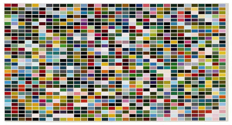
Gerhard Richter's 1024 Colours is a great wall of indifference. It consists of a regular grid of 1,024 coloured oblong units, divided by a network of white lines. It's 32 units high by 32 units wide. Each oblong is a double square, and the picture itself is approximately a double square.
Formally, it's an overtly overwhelming painting. It's very big, for one thing, almost five metres across, with a panoramic format that fills your field of vision. With its layout of repeated flat units, it faces you unremittingly. Its multiplicity is excessive: the number of its distinct bits appears as a sheer ungraspable proliferation. And its all-over grid makes it a completely full canvas, evenly occupied from top to bottom, side to side, without any slackening of visual pressure. But what exactly is there to see?
Put out some preliminary probes. Perhaps there's an image in there? For centuries, Western picture-viewers have learnt how to deal with a chaotic-looking, bits-and-pieces painting: stand back, blur your vision, and wait for something to materialise. But 1024 Colours yields nothing of that sort. These aren't pixels that resolve into a picture, or into any other kind of abstract shape or decorative pattern.
So, what about the colours themselves, do they have a sense? The painting obviously resembles a commercial colour chart. But equally obviously, its colours are not grouped together as on one of those charts. They lie scattered and mixed up, apparently at random. Nor is there any bias in the choice of colours that would establish a particular colour scheme. At a glance, it seems that all the colours in all their variations are present.
What you suspect is in fact the case. The colours have not been selected. They are a "complete" set, 1,024 different colours, devised according to a programme, and covering the full range of hue, strength and brightness. Each unit is a different colour. The large number of near-blacks are simply the darkest shades. There's no arrangement either. The colours are distributed across the grid at random. There are, of course, gazillions of possible permutations. (1,024 x 1,023 x 1,022 x... x 3 x 2 x 1 is the formula for how many.) Richter painted 1024 Colours in four different random versions. This one is the third version.
1024 Colours is, in other words, a painting all made up of colours where the choice and disposition of colours are matters of total indifference. Human design has no role in it. It might as well have been composed by a machine. It might as well have been painted by one, too. It's executed in enamel gloss, the least flexible of paints. The paint is put on uniformly, with no trace of handiwork.
The network of white lines prevents one unit of colour from touching, chiming and blending with another. Even the possibility of chance harmonies occurring among the random colours is eliminated. Colour, famous for being the most passionate element of the art of painting, is reduced to a sequence of separate neutral samples.
1024 Colours seems designed to be mute and blank, a grand negation of painting and its traditional satisfactions. Surely, whatever interest we try to take in it, it will not respond or resonate. But, strangely, this isn't so. Its very indifference becomes a kind of perfection and a kind of force. Its defiant negatives turn out to be almost indistinguishable from painting's traditional qualities.
Random distribution, for instance, is an excellent way of making a balanced composition. A chance scattering of a compendium of colours across a regular grid will generate automatically the kind of equilibrium that hand and eye would struggle to achieve. At the same time, the completeness of the palette, with every colour represented, gives a sense of great abundance, while the unpredictability of arrangement prevents this from becoming a mere glut, produces an impression of inexhaustible variety.
There is a constant dialogue between parts and whole. Presented with a variegated surface, your eye naturally seeks patterns in it, subdivisions, some kind of internal order. With 1024 Colours, it can have a transient success, as it latches on to, say, the undulations and knots made by some of the lighter units. The field of multicoloured bits is endlessly generative of these configurations.
But these patterns can never be fixed on securely. Your eye is always likely to be thrown outwards towards the picture as a whole, with its firmly sustaining structure of rows and columns. Alternatively, your eye falls inwards, upon the individual oblongs of colour, which may be picked out, one by one, each one transmitting its singular identity.
Thus, this wholly indifferent composition performs like a great classical masterpiece. It achieves, without trying, the classical virtues of balance, plenitude, variety, unity-in-multiplicity, inexhaustible richness. Though constructed on the model of a colour chart, it comes to feel like a real painting.
In fact, it's a much stronger work than any actual classical masterpiece. Next to it, every handcrafted, human-designed painting is going to look vulnerable, flawed, wonky. It will be making gestures, having ideas, trying to do things that almost certainly won't quite come off.
1024 Colours has no purposes that can fail, no impulse within it that might disturb its performance. It works by itself. Its magnificence is 100 per cent reliable, 100 per cent risk-free. In fact, it's more like an exposing parody of those classical virtues (balance, abundance, unity etc), demonstrating how they can be delivered, in pure form, with no struggle, just by applying a programme and throwing a dice.
The artist
Gerhard Richter (born 1932) hasn't stopped painting. Though suffering a total loss of belief in his art, he kept going. He has been compared to the Christian theologian who said, "I believe because it is absurd". East-German born, trained in Socialist Realism, he came West and practised a form of Pop Art he called Capitalist Realism. He has painted images transcribed from found photos. He has painted abstractions generated by chance and mechanical operations. He has painted pure grey pictures and colour charts. He tries to detach painting from its traditional values: observational truth, expressive handiwork, creativity. He is a technical wizard, with a genius for self-effacement, so his work acquires the mystery and authority of something that's appeared from nowhere.
Join our commenting forum
Join thought-provoking conversations, follow other Independent readers and see their replies
Comments
Bookmark popover
Removed from bookmarks