Why typography is to blame for the Oscars 2017 Best Picture mix-up
Sizing, positioning, and weight of text can mean everything

Get our free weekly email for all the latest cinematic news from our film critic Clarisse Loughrey
Get our The Life Cinematic email for free
The blame for the jaw-dropping screw-up at the climax of the 89th Academy Awards first landed on presenters Warren Beatty and Faye Dunaway, then was placed solely with the PwC accountants responsible for handing them the envelopes, but maybe it is whoever actually designed the cards inside them who should take responsibility.
Designer Benjamin Bannister posited as much in a post this week looking at the typography used on all official Academy paperwork.
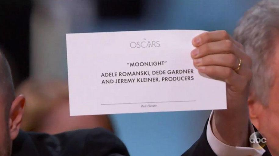
Here’s the correct Best Picture card that La La Land producer Jordan Horowitz eventually held up for all to see:
Now here’s a mock-up Bannister made of what the Best Actress card Beatty was mistakenly given must have looked like:
Any graphic designer, or anyone who has ever written an email in their life, will tell you the importance of emboldening key text.
This is what Beatty would have seen had ‘EMMA STONE’ been emphasised. Would he still have read out La La Land as the Best Picture winner?
“It may not seem like much to a regular person, but changing the sizing, positioning, and weight of the text makes a big difference. A big enough difference that this embarrassing mistake could’ve been prevented.” Bannister concluded.
Finally, here’s his suggestion for next year’s card, although just to be safe the Academy should probably spell it in the sky in fireworks:
(via: deMilked / Benjamin Bannister)
Subscribe to Independent Premium to bookmark this article
Want to bookmark your favourite articles and stories to read or reference later? Start your Independent Premium subscription today.
Join our commenting forum
Join thought-provoking conversations, follow other Independent readers and see their replies