‘I’m sure you can do better, John’: The story behind the Rolling Stones logo
It has become emblematic of the band, and in some ways has taken on a life of its own. Joobin Bekhrad spoke to the designer of the famous tongue and lips to find out how it came to be, and how it almost led to a David and Goliath legal case
It began life as a tiny emblem, something to adorn a 45rpm single or the band’s letterhead. It quickly became ubiquitous and, ultimately, the most famous logo in rock’n’roll.
Over 50 years, the legendary tongue and lips of the Rolling Stones has been emblazoned on everything from T-shirts and lighters to stage sets, appearing in countless variations throughout the decades. And while many who love it are fans of the band, the logo has in many ways transcended the Stones. But when it was commissioned in April 1970, its designer, John Pasche, had little idea how popular – and lucrative – it would become.
The logo was going to be displayed in Revolutions: Records and Rebels 1966–1970, an exhibition set to open at the Grande Halle de la Villette in Paris this April but which has been postponed because of the coronavirus outbreak.
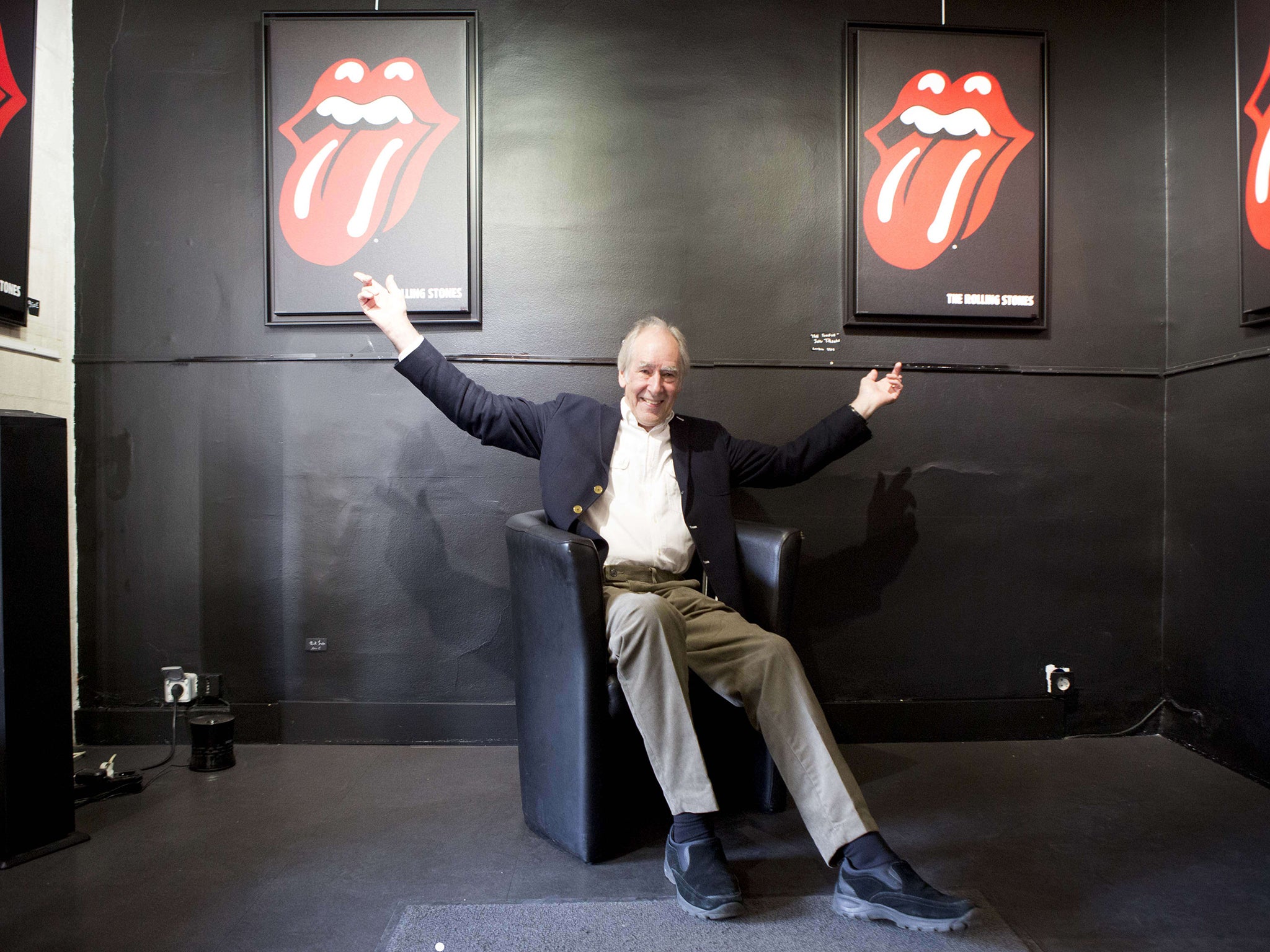
Early in 1970, the Royal College of Art in London was contacted by the Rolling Stones’ head office. The band were looking for an artist to create a poster for their 1970 European tour. The art school recommended Pasche, a Master of Arts student in his final year.
Pasche met with Mick Jagger to discuss ideas for the poster and returned to the frontman with a design a week later. Jagger was not satisfied. “I think it was possibly to do with the colour and composition,” Pasche told the Victoria and Albert Museum in 2016.
“He turned it down,” Pasche recalls with a laugh. “I thought, that was that then. ” But Jagger said: “I’m sure you can do better, John.”’
The second and final version, which harked back to the aesthetics of the 1930s and 1940s but also included a Concorde turbojet, was more pleasing. Pasche was contacted shortly after by Jo Bergman, the band’s personal assistant. This time, in a letter dated 29 April 1970, Bergman specifically asked Pasche “to create a logo or symbol which may be used on note paper, as a programme cover and as a cover for the press book”.
In a meeting with the designer some months later, Jagger was more specific, Pasche recalls: he wanted “an image that could work on its own... like the Shell Petroleum logo. He wanted that kind of simplicity.”
During the same meeting, Jagger showed Pasche an illustration of the Hindu deity Kali, which Jagger had seen in a shop near his home and asked if he could borrow.
Enjoy unlimited access to 100 million ad-free songs and podcasts with Amazon Music
Sign up now for a 30-day free trial. Terms apply.
ADVERTISEMENT. If you sign up to this service we will earn commission. This revenue helps to fund journalism across The Independent.
Enjoy unlimited access to 100 million ad-free songs and podcasts with Amazon Music
Sign up now for a 30-day free trial. Terms apply.
ADVERTISEMENT. If you sign up to this service we will earn commission. This revenue helps to fund journalism across The Independent.
Jagger, according to Pasche, said he was “more interested in the Indian nature of it”, Indian culture in Britain being quite trendy. But the designer was struck by Kali’s open mouth and protruding tongue. “I just immediately picked up on the tongue and mouth,” Pasche says.
Contrary to popular belief, the logo, originally created in black and white and used to create subsequent versions, was not – at least intentionally – intended to represent Jagger’s tongue and lips.
“I said, ‘Surely those were Mick Jagger’s lips!’” recalls Victoria Broackes, a senior curator at the V&A Museum, who in 2008 bought the original logo design online from an auction house in Chicago on behalf of the V&A. Pasche, she says, “looked rather nonplussed and said, ‘Well, maybe subliminally, but no.’”
Pasche contends his logo was also intended to be a protest symbol. “It’s the kind of thing kids do when they stick their tongue out at you,” he says. “That was the main reason I thought it would work well.”
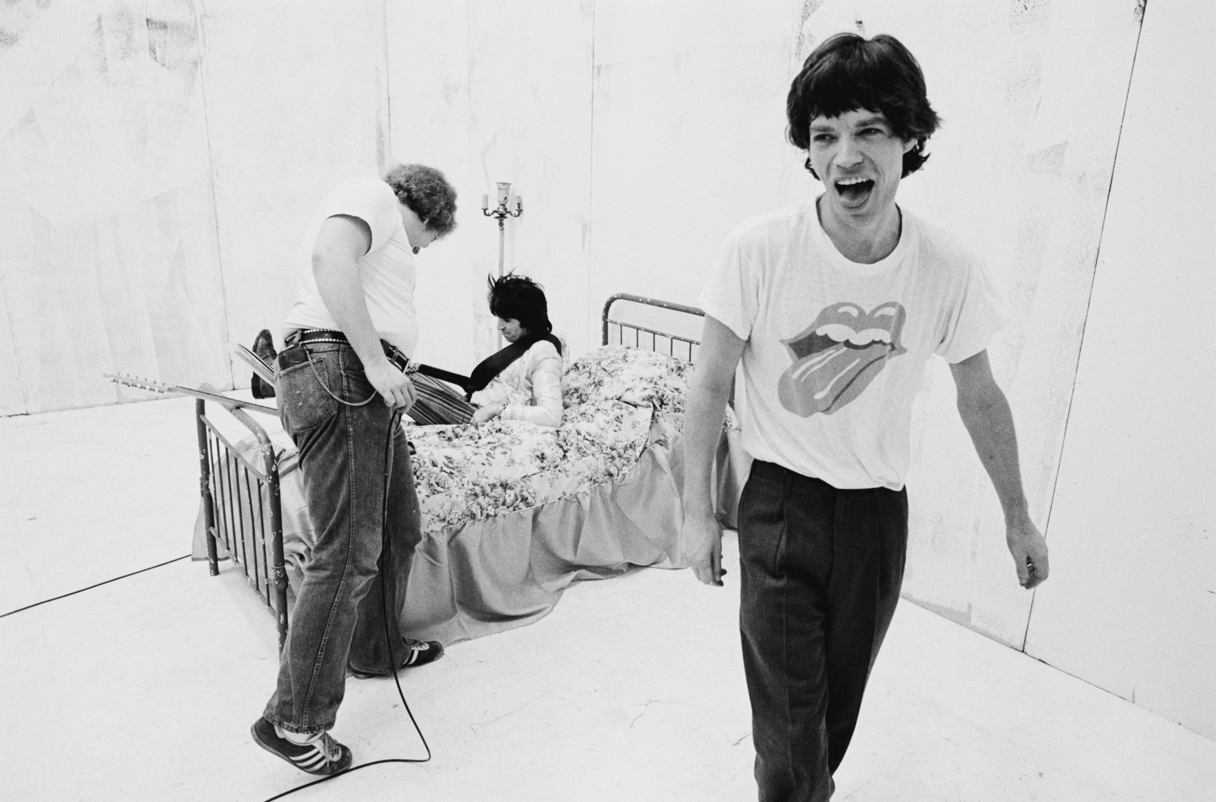
The logo was executed quickly towards the end of 1970. The release of the band’s classic Sticky Fingers album in April 1971 marked its first public appearance. It was used on the back cover, on the label and, most prominently, on the insert. However, an alternate version of the logo was used for the US release – “slightly modified by Craig Braun,” says Andrew Blauvelt, curator at large for design at the Museum of Arts and Design in Manhattan.
Pasche says he’d “probably be living in a castle now” had he retained his copyright
At the time, Braun was working with Andy Warhol to realise Warhol’s idea of a working zipper on the album’s cover. Pasche says that Braun modified the design not because it was lacking in any respect but because it had been faxed to the US in a rush. The fax “was very grainy and grey” – and the logo, Pasche admits, “needed redrawing”.
It is Braun’s elongated version, with extra lines and highlights, that continues to be used officially. In Pete Fornatale’s book 50 Licks: Myths and Stories from Half a Century of the Rolling Stones, Braun says that he was given Pasche’s logo by Marshall Chess, the president of Rolling Stones Records, and “basically outlined the highlights, the lips, and the tongue”.
(Braun and Warhol were nominated for a Grammy Award in 1972 for best recording package for Sticky Fingers but lost to Gene Brownell and Dean O Torrence’s cover design for Pollution, depicting a chick in a gas mask emerging from its shell.)
And Pasche’s logo continues to be attributed to others. “A lot of people think Andy Warhol designed it,” Broackes says, “which of course he didn’t.” She believes it was because Warhol was credited for the rest of the artwork on Sticky Fingers.
According to Blake Gopnik, author of Warhol: A Life as Art, a new biography, the tongue and lips “could absolutely not be by Andy Warhol”.
“It has nothing to do with the look of his art,“ he says, “especially the conceptual framework that he always worked in.”
Why the longstanding confusion? “Warhol’s like a giant cultural magnet,” Gopnik says. “Everything adheres to him. And he made no attempt to clarify matters.” He adds: “He preferred factual confusion to clarity, so the idea that he be credited with the logo would have been something that he would have absolutely encouraged.”
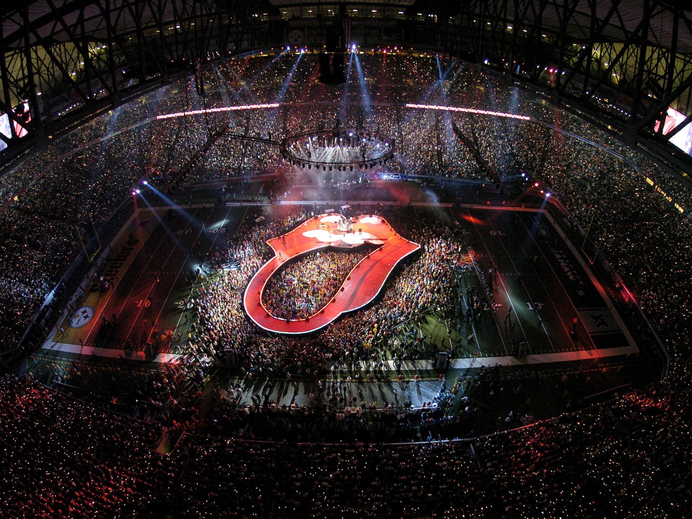
The logo has generated an enormous amount of money for the Stones. British public relations veteran Alan Edwards, who handled the band’s publicity in the 1980s, says the Stones “must have grossed a good billion in concerts, record and DVD sales, merchandising and exhibitions” and also used the logo “all over advertising”. Samuel O’Toole, an intellectual property lawyer at Briffa Legal in London, estimates the logo’s earnings to be in the “hundreds of millions of pounds”.
It sums up the Rolling Stones themselves – the anti-authoritarianism, the devil-may-care attitude – and, of course, the sex appeal
Pasche says he was paid just £50 in 1970 (about £885 today) and also received a £200 bonus. It was only in 1976, when an official contract was drawn up between himself and Musidor BV, the band’s Netherlands-based law firm, that the designer began receiving royalties for his work. Pasche remembers his share as 10 per cent of net income on sales of merchandising displaying the logo. He estimates he made “a few thousand pounds” in total in royalties until 1982, when he sold his copyright to the band for £26,000.
Pasche chuckles when he says he’d “probably be living in a castle now” had he retained his copyright, but says the decision was forced by a grey area in copyright law at the time regarding usage rights – if a company had been using something for a number of years and it was recognised as part of the company, it could try to assume copyright. His lawyer told Pasche he could lose in court, so they negotiated a fee.
O’Toole says Pasche’s lawyer was right to take that road. “There’s a good argument,” he says, that the Rolling Stones had “an implied licence to make use of the copyrighted work”. Had Pasche fought and lost, he would have been “liable for his own legal fees, and also the legal fees of the Stones, which are probably going to be humongous”.
“It’s almost like David and Goliath, really,” he adds. “The one designer up against the Rolling Stones.”
Pasche’s original design can today be seen at the V&A (which has historical ties to the Royal College of Art). Broackes says: “The fact that it was physically designed on the premises and came back to us was in itself a remarkable thing. It’s a star object in a sense for that, not just because it’s the most well-known logo.”
Pasche’s “original and singular design”, as Blauvelt describes it, has come a long way, despite having been done in a low-key fashion and at low cost.
“And with so little expectation for it,” adds Broackes. “It sums up the Rolling Stones themselves – the anti-authoritarianism, the devil-may-care attitude” – and, of course, “the sex appeal”. But she also points to its adaptability as a major reason for its massive success.
“It’s been reworked in so many different ways,” Broackes says. “There aren’t many logos that can be tiny and on a 45 but also be a stage set. That’s pretty amazing.”
© The New York Times
Join our commenting forum
Join thought-provoking conversations, follow other Independent readers and see their replies
Comments
Bookmark popover
Removed from bookmarks