IoS exhibition review: Valentino: Master of Couture, Smoerset House, London
You'd settle for a frock or two, but without the frills
Asurname can be de trop in the world of fashion, rather like the accessory you are advised to take off before leaving the house. Attached to each of several dozen little Louis XV chairs which line one room of this exhibition is a label, inked in a flamboyant hand: "Gisele", "Iman", "Twiggy" ... oh yes, and "La Princesse de Bulgarie". All are audience regulars of the couture shows of Valentino, formerly plain old Valentino Garavani, whose 50-year career is celebrated in a rather over-produced display in the south wing of Somerset House.
The first thing you encounter is a giant lightbox, a reference to the smart magazines that adoringly keep faith with the designer, season after season. The trouble with this piece of kit – several metres square – is that, wherever you stand, you're ill-placed to read the outsize slogans projected on it. I think I saw the words (next to an image of a naked beauty tied up in red beads) "Without Valentino, Rome would be dead". But surely not.
Equally specious are the displays in glass cases, the cases supported by the same chic, painted chairs, affixed to the wall. One is full of thank-you notes and – barely more interesting – expressions of regret that the famous invitee, Meryl, or Liza, could not attend some lavish event. And who knew that Vogue editor Anna Wintour has such enormous unjoined-up writing that she can fit only 20 words on a page of A4? A handwritten fax from Karl Lagerfeld shows he is subject to a similar ego-to-ink ratio.
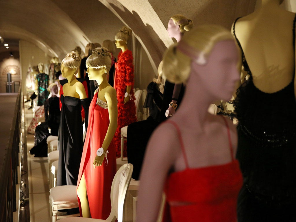
Any cynicism subsides, though, when you reach the upper floor, set out as a 60-metre red-carpeted catwalk on either side of which are mannequins, both standing and seated on those chairs, modelling couture. It's a pity the red-printed brochure is so hard to read (impossible under moody lighting) because it offers the only clue that the mannequins themselves are colour-coded by decade. "Mint" for the 1950s, "mustard" for the 1960s, "ice" and so on. This is crucial information since the clothes are otherwise grouped by theme: daywear here, cocktail dresses there. The randomness underlines the way Valentino's designs do not, on the whole, follow fashion. A neat, navy wool shift from 1959 or a sharply cut collarless coat in black georgette from 1971 are highly wearable today, with or without the "vintage" tag.
The unreadable brochure also tells you when an outfit has had a famous wearer: a velvet and tulle number was worn by Julia Roberts at the 2001 Oscars, while a white gown trimmed with lace appliqué was Jackie Kennedy's on the day she became Jackie Onassis, and from the same year, 1968, a cream organza ensemble bestrewn with tiny white daisies, each individually attached with a pearl, was made for Audrey Hepburn. Interestingly, the one thing that's never mentioned is the price.
More rewarding for the admirer of beautiful things is the element of high-end craftsmanship that goes into each piece of Valentino couture. A glossary is provided to help with such terms as "incrostazione" (the layering of cut lace over tulle) and "crinoline" (not what you'd think) but, alas, these explanations also fall prey to illegibility in the vermilion print of the brochure. A paucity of signage, too, means that the final two rooms in the exhibition risk being missed. Such shoddy attention to detail is not of a piece with the goods.
To 3 Mar (020-7845 4600)
Join our commenting forum
Join thought-provoking conversations, follow other Independent readers and see their replies
Comments