The Independent's journalism is supported by our readers. When you purchase through links on our site, we may earn commission.
Bottoms up: Why millennials love to judge a wine bottle by its label
Lucas Oakeley looks at why we’re shunning classic bordeaux-looking bottles for bright and fun illustrations that have gained traction thanks to natural wines and Instagram
We all know that it’s what’s on the inside that counts, right? But what about what’s on the outside? Well, that matters too – especially when it comes to wine. The average Briton consumes roughly 108 bottles of a wine a year, according to a 2019 report.
We’re a nation that bloody loves the stuff. But how many times have you found yourself overwhelmed in front of a wine shelf only to end up opting for the bottle with the snazziest label? If you’re somewhere between the ages of 20 and 40 then the answer is probably: lots.
In fact, research shows that millennial consumers rely on a bottle of wine’s front package label as their primary purchase factor when determining its worth. Forget about the grape varietal, the producer, or even the country that the wine comes from – more people are buying with their eyes than ever before.
Nic Rizzi is the owner of Modal Wines, an importer of distinctive, often small-batch wines supplying restaurants and customers all across the UK. As a former music marketing mogul, Rizzi knows a thing or two about the power of branding and is all too aware of the importance of a wine’s aesthetic.
“Customers buy with their eyes first and foremost, and a wine buyer or sommelier will always have an initial perception of a wine based on its aesthetic prior to tasting,” he says. “It's sad to say but an incredible wine with a terrible label will typically be a slower mover.”
A lot of really cheap, crappy, industrially made wine is bottled, it’s made to look like bordeaux or burgundy because people associate those labels with quality
Hell, I’m living proof of that aesthetics-driven mindset having recently bought two bottles of an Asterix-themed natural wine shipped all the way from France to my flat in London just because I really, really liked the label designed by Anatole Zangs.
“One of the things with wine labels is that people will associate certain styles of wine label with quality,” agrees Warwick Smith, founder of Renegade – a London-based urban winery that’s working to change the face of English wine. “If you look at how a lot of really cheap, crappy, industrially made wine is bottled, it's made to look like bordeaux or burgundy because people associate those labels with quality. The thing that I’ve realised since I started making wine is that – whether I like it or not – the label is so important.”
Every bottle that the winery produces comes wrapped in a photographic label that shows the eyes and face of a different Renegade customer. The sauvignon blanc, Kyra, lives in Hackney and works for a record label; the pét-nat, Jamie, is a moustachioed barber. Renegade’s bottles are pretty hard to miss – they’re striking, modern and totally individual. However, possessing more than just a captivating bit of design, it’s the tangible personality of these labels that separates them from the crowd of cabernet-soaked castles.

“Forget wine critics, forget sommeliers, forget big buyers,” says Smith. “The most important people to us are those who actually spend their hard-earned money on the bottles, so that’s why we started putting customers on there.” A neat feature of Renegade’s labels is that new photographs are taken every year so that the faces on the bottles can age along with each subsequent vintage of the wine, an idea inspired by Château Mouton Rothschild, which has its label designed each year by a different famous artist.
Whether it’s a bottle of Gut Oggau – featuring a minimalist label designed by advertising agency Jung von Matt – or a special edition bottle of Bordeaux Grand Cru Classe, created in collaboration with Karl Lagerfeld, the visual aesthetics of wine and wine labels have always been an integral part of the winemaking (and wine-selling) process. In France, the first country many think of when it comes to wine, there are strict laws regarding the labelling of wine, which are under the control of the Institut National des Appellations d’Origine. That being said, even traditional bordeaux wines have been experimenting with atypical designs in recent years.
But what is it that makes a certain wine label more appealing than another? If you’re me, it’s a flashy illustration or something I think will look good on my Instagram feed. And I’m not alone in that preference for colourful labels. One study conducted at the California Polytechnic State University in 2012 suggests millennials (like myself) are more attracted to brightly coloured wine logos and sans serif fonts than traditionally made wine labels.
Other studies have shown that millennial wine consumers rate the importance of wine-label appearance for home or party consumption higher than both baby boomers and generation X. The type of wine you drink says a lot about who you are as a person. And with the proliferation of social media in the wine world, it’s impossible to ignore the impact that a specific cuvée’s label can have in marketing it to consumers.
Simply put: slap a cute graphic label on a bottle and you’ve (likely) got a viral sensation on your hands. Scroll through the Instagram feed of any food-obsessive today and you’re likely to stumble on a bottle of Chin Chin Vinho Verde – a wine from Quinta do Ermizio, Portugal, made in collaboration with wine bar and restaurant Noble Rot in London. Chin Chin’s splashy cartoon label was designed in “about five days” by Jose Mendez, a Spanish illustrator and artist based in London.
“The collaboration for this wine came through a long-time working relationship with Dan and Mark [the owners of Noble Rot],” explains Mendez. “I feel that they really trust my work and, because of this, they always give me quite a bit of freedom of creation. For the briefing of the Chin Chin label, they just shared a couple of references of some of my work that I did before and they let me come up with my own vision. I just wanted to make something interesting, a bit different, and with character.”Judging by the positive response Chin Chin has received on social media, it’s safe to say that Mendez succeeded in doing just that.
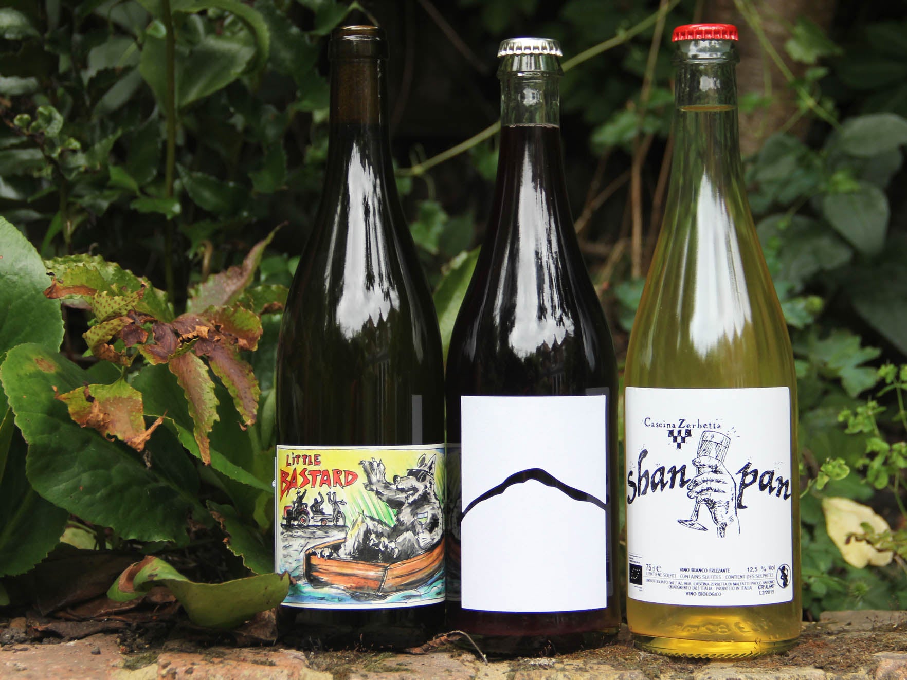
Have a glance around London Fields on a sunny day and it’s plain to see just how easily our drinking choices are influenced by what we see on the ’gram. “There’s so much choice now that I think easily more than 50 per cent of the decision comes from the label when buying a wine,” says Jan Matthias Klein, who is a seventh generation winemaker at Staffelter Hof winery. The German vineyard has been operating in the Moselle wine region for nearly 1,200 years and is renowned for its classic rieslings, yet it’s the estate’s recent forays into natural wine that’s resulted in some of their most exciting creations. Whether it’s a skin contact Little Bastard, a bone-dry Madcap Magnus, or a bright and bold Orange Utan, all of Klein’s wines are exciting on the palate with an eye-catching label to match.
The natural wine scene is pretty wild and experimental and gives you all this freedom. So, I thought, why not just do whatever we wanted?
“When I started making natural wines, I wanted them to look very different to what we usually do and to reflect the personality of each product,” says Klein. Keeping things local, he enlisted the help of his friend and illustrator, Aaron Scheuer, to come up with the designs for each of the labels. It’s a real collaborative process: Klein visits Scheuer’s home, the two split a bottle of wine and, by the end of the night, Scheuer will have come up with a sketch that’s pretty much what you’ll see on the final product.
As Klein is quick to confirm: “There’s always a story behind the label.” The Orang Utan (of which one euro of every bottle sold goes to an orangutan conservation) stemmed from an inside joke about the “monkey business” involved in making orange wine. The Little Bastard got its name thanks to it being a mongrel blend of riesling, sauvignon blanc, muller-thurgau and skin-fermented muscat. While natural wine has been made for thousands of years, this playful preference for graphic labels has become a visual hallmark of the scene perpetuated by listicles.
“Natural wine is a completely different target group and you can pretty much do what you want,” says Klein. “I worked for more than 15 years with all the classic wines and you could never go all out with your ideas or do what you really want to do. The natural wine scene is pretty wild and experimental and gives you all this freedom. So, I thought, why not just do whatever we wanted?”
That freewheeling sense of fun and inventiveness is infectious, and it’s played a huge part in the growth of Staffelter Hof’s online presence. “Social media, especially Instagram, is a huge part of our success,” says Klein. “Everybody knows about these wines through the platform, and I've even got importers contacting me because of the labels.” As Modal Wines will attest, Klein’s wines sell well.
Yet as well as a shift towards displaying more personality in their labelling, the natural wine movement has also brought about a demand for wine labels to be more transparent about the various chemicals and sweeteners involved in the wine-making process. A range of publications, including The Washington Post, has called for there to be greater transparency on wine labels in relation to what ingredients and additives the bottles contain. According to a study from 2019 year by Wine Vine Analytics, 36 per cent of drinkers say they are confused by wine labels and 81 per cent want labels to be clearer and easier to understand.
The issue lies in that wine doesn’t have anywhere near the same level of regulatory detail required as other food and drink products. If you look at a bottle, all it has to tell you – legally speaking – is its alcohol level, the presence of any allergens and… that’s pretty much it.
“It's predominantly left to us, to the producers, to say what we want to say on the bottle,” admits Warwick Smith, and this smoke and mirrors tends to benefit larger producers who can get away with adding a range of additives and sugars to mask the quality of their product. Now there is an effort currently being made by European lawmakers to make nutrition and ingredient information on alcohol products in the EU mandatory by 2022, with studies suggesting that more detailed ingredient lists like this can enlighten consumers and prevent them from mistaking commercial wines for a “natural product”.
What a producer chooses to say on a bottle, as well as how they say it, can have a huge influence on how their wine is perceived
Nic Rizzi is one of many in the natural scene who believes that an increased transparency from producers would be a “massive step forward” and help consumers to make “a proper distinction between low-intervention wines and those that are the product of more heavy-handed processes and additions”. Because while it’s easy to poke fun at glouglou-loving Instagram naturalistas, it’s important to remember that the natural wine movement is about more than kitsch labels.
“The larger majority [of producers] still do what they do for their strong belief in respectful farming, care for our planet, care for the purity and integrity of the product itself, and for its ability to raise awareness of issues that extend far beyond the world of wine,” says Rizzi. “Wine is a luxury product, sure, but one with a strong platform of influence. Beyond the image-conscious aspect, the natural wine world is a far more significant movement with a powerful drive.”
What a producer chooses to say on a bottle, as well as how they say it, can have a huge influence on how their wine is perceived. A 2017 study by the University of Adelaide found that the descriptions of wine on labels influence consumers far more than originally thought. More emotive descriptions were capable of not only convincing consumers to pay more for a bottle of wine, but also capable of increasing their subsequent appreciation of it. The story behind a wine is vitally important and, sommeliers and wine merchants aside, it’s often up to the label to do that heavy narrative lifting.
Wine labels don’t get much more narrative than those that come out of La Villana – an Italian wine producer started by expatriate American, Joy Kull. The La Villana name stems from an Italian slang term that shepherds use for farmers and, taking into account how Kull married an Italian shepherd after moving to Gradoli, it should come as no surprise that that wooly connection can be seen in every one of the sheep-laden labels hand-drawn by children’s book author and illustrator, Jamison Odone.
“I thought using the sheep as a sort of mascot for her wines just worked too perfect, so I began to do sketches of them in winemaking situations and it seemed to work out well,” Odone tells The Independent. “Joy gives me lots of input, though, and we have a very good back and forth. If she doesn't like something, she tells me. If I think her idea is bad, I tell her. It's a very honest working process.” La Villana’s labels are as bright and playful as the wine it produces, and that synergy between the internal and external characteristics of the bottle is critical when getting a wine to market.
“I don't look for ‘cool’ labels or colourful eye-catching labels,” says Rizzi on what he seeks when scouting potential producers to partner with. “In fact, some can be so overly cliche. For me, the most important thing is that the label matches the wine inside the bottle, and that it also matches the personality and the ethos of the grower.”
Ensuring that a label is doing what it’s supposed to be doing – whether that’s emphasising a bottle’s biodynamic origins or peacocking about its grand cru classification – is vital. A study published in July 2020 about wine sold online (conducted pre-Covid) found that labels which perceived “authenticity” had a positive effect on both pleasure and purchase intent of the customers. Basically, any wine labels showing “heraldic” colours (eg silver and gold) with low visual complexity led to a stronger effect of authenticity on pleasure in comparison to labels with vivid colours and high visual complexity.
While this might seem to go against the “vivid” trend seen on bottles like Chin Chin and Little Bastard, it still accentuates how a label (be it “heraldic” or playful) can heavily impact a customer’s decision. Take a bottle of Australian Spunk Nat from Andrew Hoadley’s La Violetta winery, for example. This fizzy riesling-shiraz hybrid has a label that simply reads: “spunk”. Gimmicky? Sure, but just try and get your hands on a bottle and you’ll quickly realise the power of a punchy label. Spunk is sold out practically everywhere.
“The easier way to get up the rankings is to be controversial or to be showy or Instagrammable, but I do worry that [wines like Spunk] are an example of style over substance,” says Smith. Creating a good label is, after all, a hell of a lot easier than creating a good bottle of wine. As labels become cheaper to print, gimmicky labels are becoming increasingly commonplace. And increasingly bizarre. 19 Crimes is an Australian brand that’s created a range of bottles with “living wine labels” that spring to life and tell you a story if you scan them with an app. Why? Your guess is as good as mine. The results are smack bang in the uncanny valley with the latest Snoop Cali Red cuvée being a particularly horrifying collaboration with Snoop Dogg.


So, what can you do to ensure you’re not just buying with your eyes? Well, the answer isn’t sexy but: do your homework. Apps like Delectable and Vivino, which let you scan a wine’s label to find out everything from the grapes used to the wine’s tannin levels, are especially useful in getting some instant background information about an individual bottle or producer. And even if you’re standing in the aisle, stumped at which wine will best impress your socially distanced dinner party guests, things like the bottle weight, the cork type and the closure type can all be decent indicators of a wine’s quality.
I know that the next time I personally find myself being suckered in by a sexy label, I’ll try to bear in mind Jan Klein’s caution that “some wines can still be pretty terrible, even if the label is pretty” … right before I end up buying the pinot with the Nickelodeon-inspired label anyway.
Join our commenting forum
Join thought-provoking conversations, follow other Independent readers and see their replies
Comments
Bookmark popover
Removed from bookmarks