Next iPhone and Mac could have new, Apple-designed font – and drop old Helvetica Neue
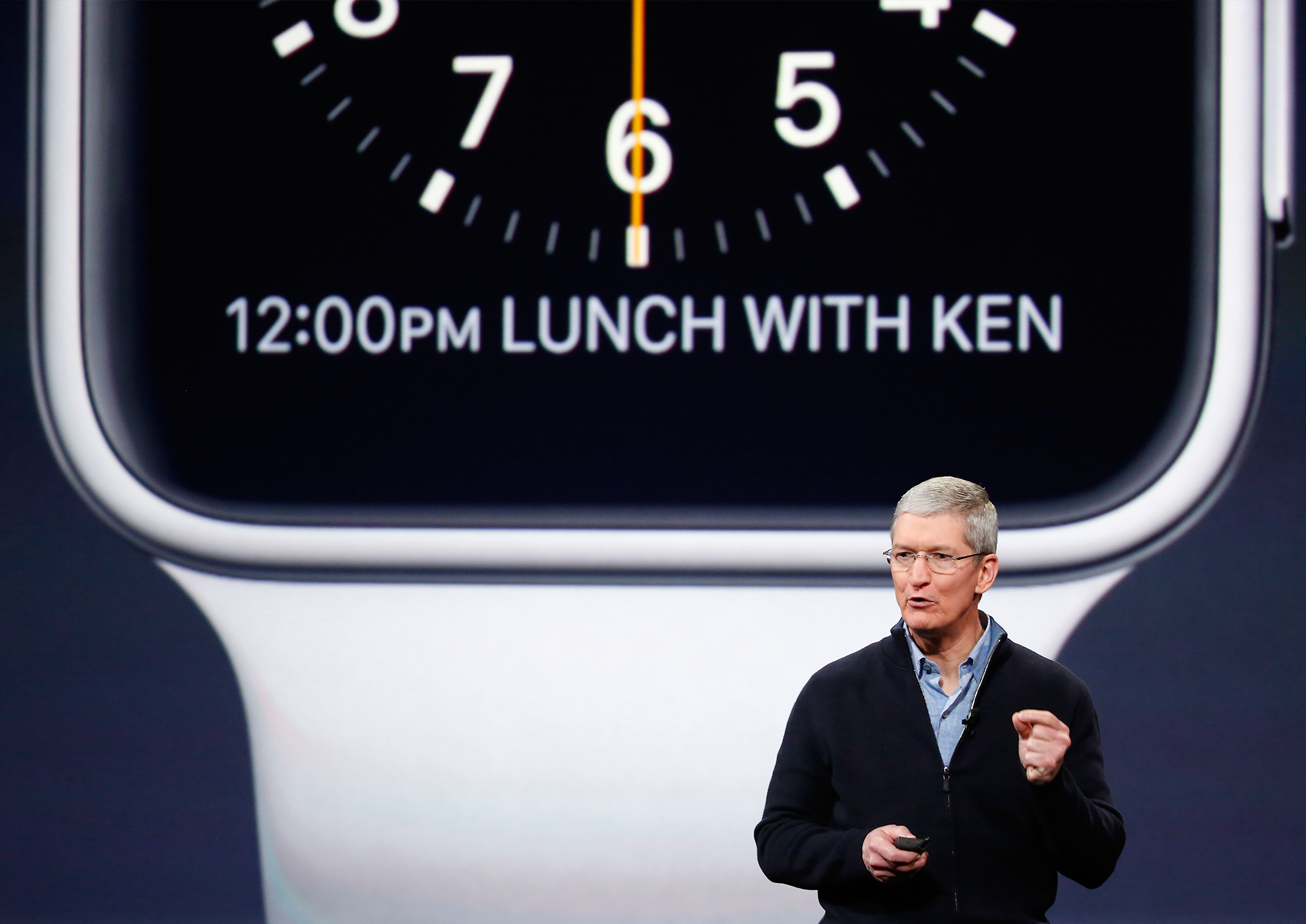
New San Francisco font was made for the Apple Watch, with thinner lines and more clear and readable letters

Sign up to our free weekly IndyTech newsletter delivered straight to your inbox
Sign up to our free IndyTech newsletter
Apple might change the entire system font on its phones and computers to San Francisco, a typeface it designed for being readable on the tiny Apple Watch screen.
It would mean the company dropping Helvetica Neue on both iOS and Mac OS. Though the 32-year-old Helvetica Neue is well-liked for its aesthetics, it has been criticised for being difficult to read.
But San Francisco was designed with the aim of being clear and readable on any screen type or size. It has rounded features and space between the letters that mean that they can be pushed together without bunching up, and avoids the need for overly thin lines.
As well as making the text more legible, Apple executives hope that the change of font will help refresh the operating systems, according to reports. iOS 9 in particular is expected to focus mostly on improving performance and fixing problems, rather than introducing many new headline features.
If it is heading for iOS devices and Macs, it is likely to be revealed at the Worldwide Developers’ Conference next month. That will see it put inside iOS 9 and OS X 10.11, more features of which are set to be announced at the event.
9to5Mac, which first reported the change in the font, cautioned that the move could be called off before the June event. Changing the font can take some time — all apps, including those made by third-party developers, must be changed and then tested to ensure that the new font doesn’t mess up their functionality.
Helvetica Neue arrived on iOS when it was completely redesigned with iOS 7. It came to Mac OS last year, with the release of OS X Yosemite.
San Francisco was the first typeface designed by Apple for more than 20 years. At the time of its reveal on the Apple Watch last year, many said straight away that it also worked very well on Mac computers with retina displays.
The company has already started using it on products that aren’t the Apple Watch. The new MacBook uses the font on its keyboard, breaking with its traditional use of “Vag Rounded”, which has been on Apple keyboards since 1999.
Subscribe to Independent Premium to bookmark this article
Want to bookmark your favourite articles and stories to read or reference later? Start your Independent Premium subscription today.
Join our commenting forum
Join thought-provoking conversations, follow other Independent readers and see their replies