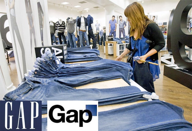
Gap stops thinking outside the box

For free real time breaking news alerts sent straight to your inbox sign up to our breaking news emails
Sign up to our free breaking news emails
If the purpose of a corporate rebranding is to create buzz, then Gap certainly succeeded. Unfortunately for the clothing group, that buzz came in the form of such a fierce backlash from Facebook and Twitter users that it pulled the new logo after just six days.
Gap had turned to New York agency Laird & Partners to overhaul the 20-year old branding which adorns its worldwide stores, to something technology website TechCrunch described as "American Apparel-esque".
Last Monday, with little fanfare, the group introduced the logo to its website. Marka Hansen, the president of Gap North America, said the move was to introduce a "more contemporary and current" design. Then the trouble started.
Ms Hansen said yesterday that the group had been swamped by an "outpouring of comments" online demanding the original logo be reinstated and admitted: "We did not go about this in the right way." She said: "All roads were leading us back to the blue box, so we've made the decision not to use the new logo on gap.com any further."
Websites sprung up in which users could design their own new Gap logo, replacing the company name with everything from the sublime to the unprintable. Angry responses appeared on Gap's Facebook page, while protest and spoof accounts sprung up on Twitter.
Ms Hansen said: "We recognise that we missed the opportunity to engage with the online community."
Tom Blackett, the chairman of branding group Siegel+Gale UK, said: "This showed they did no research at all before releasing the new logo. The users of these sites are exactly Gap's target audience."
He added: "Gap does need to change things, but what possessed it to swap a design classic for something so bland? People would have liked it, if the logo was creative or dramatically different."
Rune Gustafson, a brand expert and founder of the Rebus Partnership, said it had been a PR disaster: "It is not clear why they felt it important to change. Any shift in the brand has to reflect a shift in the business strategy. It can't just be for the sake of it."
This is not the first time outrage from consumers has forced a company to ditch a rebranded logo. The fruit juice brand Tropicana was last year forced to ditch an expensive image overhaul following consumer ire.
Molly Flatt of 1000Heads, an agency which advises companies on interacting with clients in the age of social media, said: "A lot of good stuff comes out of social media; the key for companies is to listen. Gap may have been too quick to scurry away."
Subscribe to Independent Premium to bookmark this article
Want to bookmark your favourite articles and stories to read or reference later? Start your Independent Premium subscription today.
Join our commenting forum
Join thought-provoking conversations, follow other Independent readers and see their replies