Classic with a twist: new-look ‘Independent’ is on the way
Letter from the editor
Dear Reader,
On Thursday, The Independent will hit the streets with a brave and beautiful new look. Today I want to explain the reasons for the change, and why we’re so excited about this next chapter in our history. At the start of next week, I’ll provide some details of what we’re doing differently.
I spent several months this year buried in the archives of this newspaper’s first editions, founded by those heroes of modern Fleet Street, Andreas Whittam Smith, Stephen Glover and Matthew Symonds. What a gorgeous and radical thing that paper was! Bold, forthright headlines; superb photography used on a bigger scale than by our rivals; acres of international coverage; and no shortage of exceptional talent. The paper looked, to use Andreas’s memorable phrase, “classic with a twist”. It also had a spirit that captivated many of you: genuine political independence, with an editorial line that was of no party or faction; shameless championing of Enlightenment values, fierce scepticism, a sense of mischief, and stubborn optimism.
In my years here, I have been in no doubt that this spirit lives on. But I want a design that better reflects it, differentiating us both from other newspapers and our hugely successful sister paper, i. I also want a clear identity and reason for being in paper form, adapted to, rather than eclipsed by, the digital age.
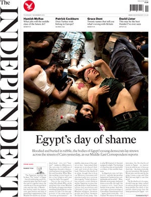
Below, you can get a flavour of what the new paper looks like. The first thing you’ll notice is that the masthead is vertical rather than horizontal – so do please look out for this on Thursday.
We’ve done this for several reasons. First, it looks beautiful and elegant. Second, this newspaper has always dared to be radical, and been at its best when at its boldest, whether that be in downsizing to compact form, or launching i. Third, we want to create the feeling of a broadsheet in compact form, and by making the masthead vertical, we create much more height on the front page. Fourth, with the use of a font that is similar to our first masthead, this is certainly – and literally – classic with a twist. Finally, rather than being the same as everyone else, I want your newspaper to be different. As, I know, do you.
Everything we will do is about giving you more of the outstanding journalism that you and we so love. Your favourite writers will be given more prominence, not less; and your favourite themes and subjects will get the treatments they deserve.
We at The Independent don’t take your continued commitment to this great British institution lightly. I am convinced that you will adore the new design just as we do. Look out for it on Thursday. Please don’t be afraid to let us know what you think – and tell others about it too.
Join our commenting forum
Join thought-provoking conversations, follow other Independent readers and see their replies
Comments
Bookmark popover
Removed from bookmarks