Euro 2020 kits: Every home and away shirt ranked and rated
The football shirts of Euro 2020 ranked from best to worst
Euro 2020 is finally in sight, a festival of football which we hope brings plenty to enjoy after a largely forgettable year or so. As ever, a major tournament brings with it a bin-bag full of fresh international kits, and we’ve decided to cast our eye over the good, the bad and the ugly.
You almost certainly won’t agree with our order, in which case please add your own assessments in the comments below, but we hope you enjoy perusing these sartorial delights. It should be noted that North Macedonia are yet to release their kit, so they will be added to the list at a later date.
Ranked from worst to best, here are the football shirts of Euro 2020:
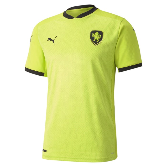
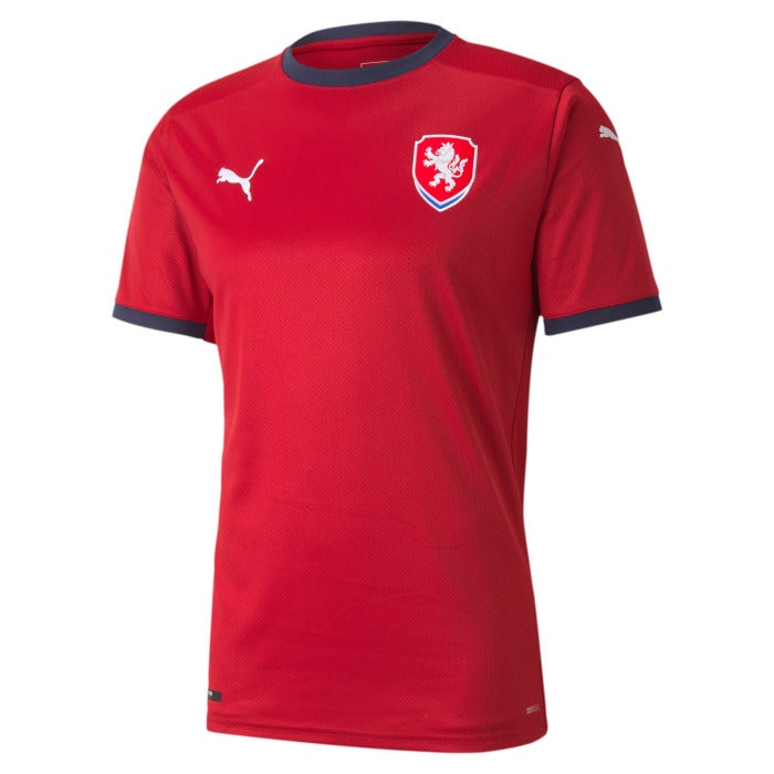
Czech Republic away: “We’ll be bibs.”
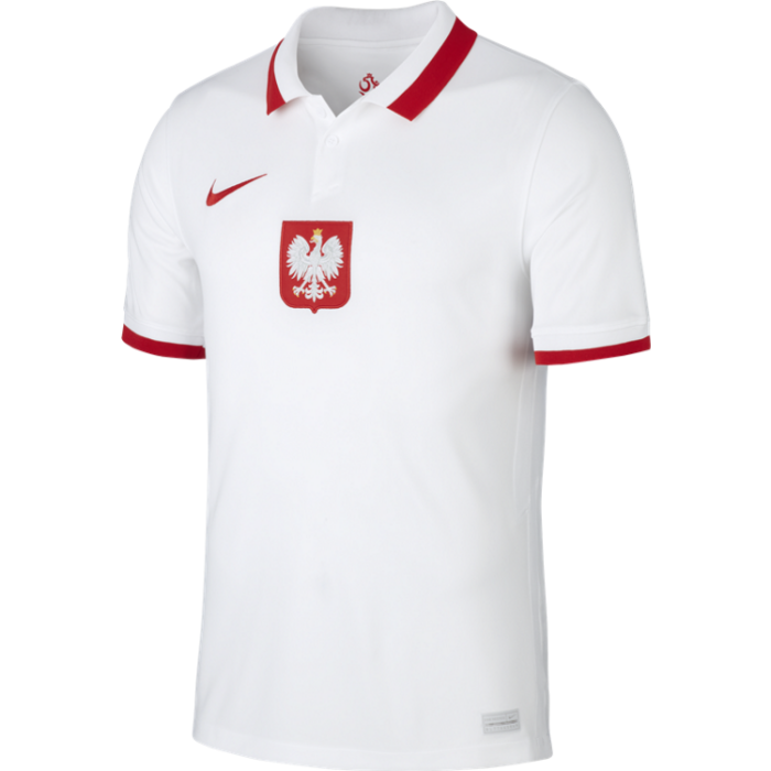
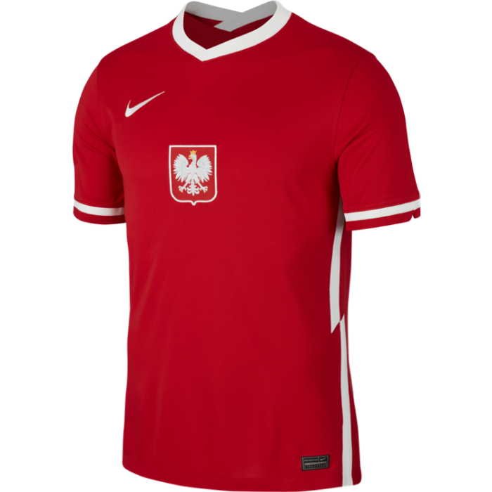
Poland home: This is almost brilliant but then, at the last minute, the designer dragged the national crest from the left breast to the centre, and they ruined it.


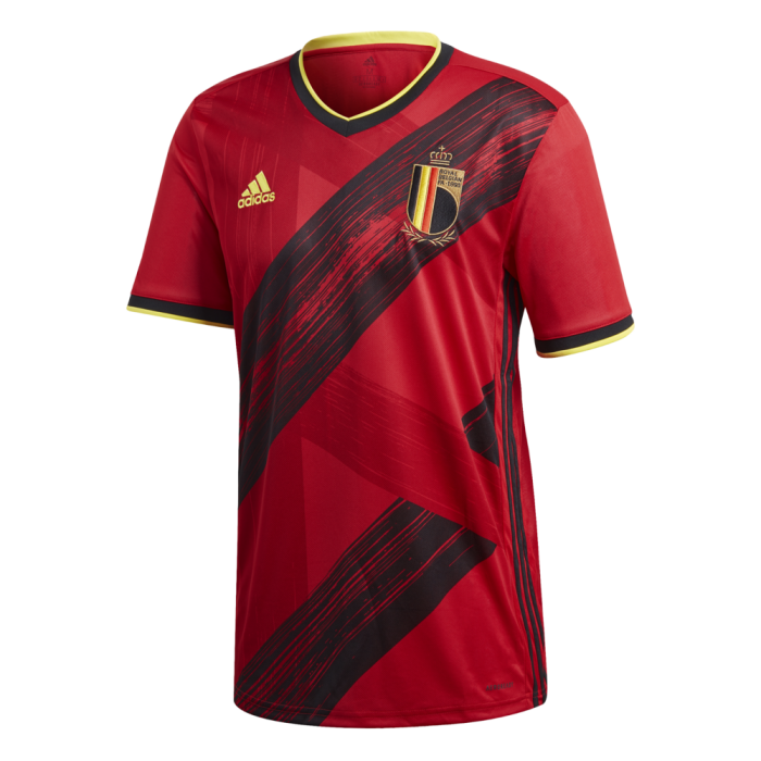
Belgium home: We think some people will like this kit and we think they’re wrong. The heavy streaks across the body make it look like an advert for Continental tyres.
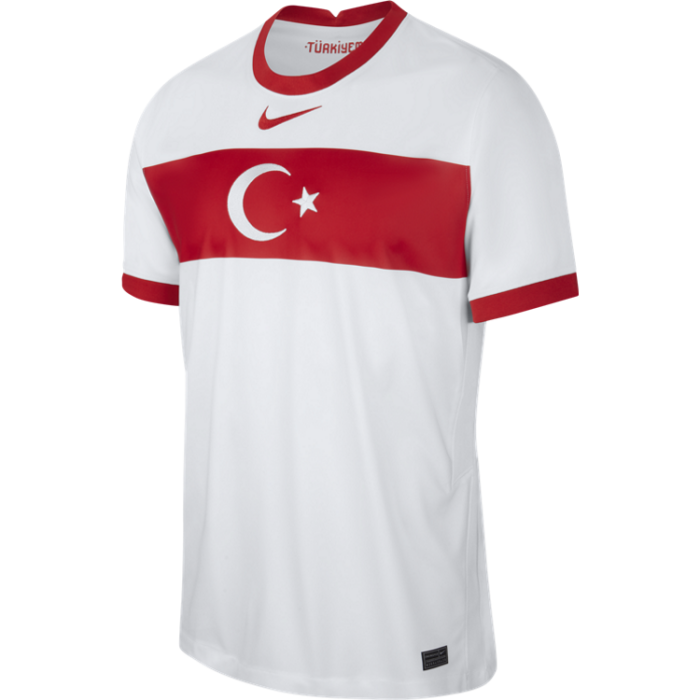
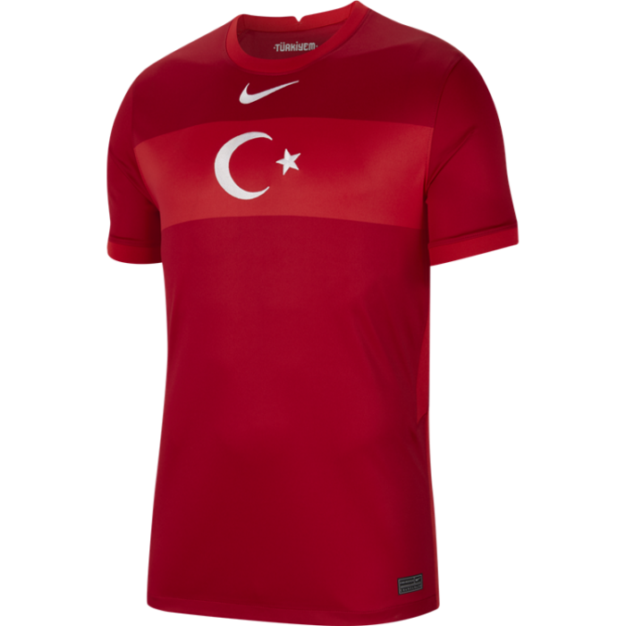
Turkey home: Simple, perhaps too simple? A bit Pro Evolution Soccer.
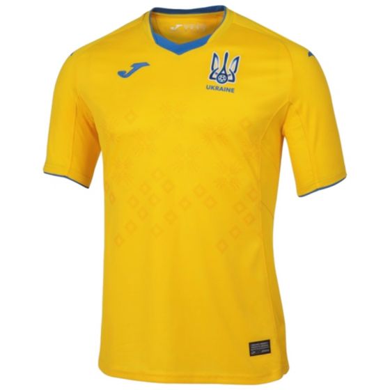
Ukraine home: The good people at Joma have had a decent crack at this, and the end result is broadly palatable.
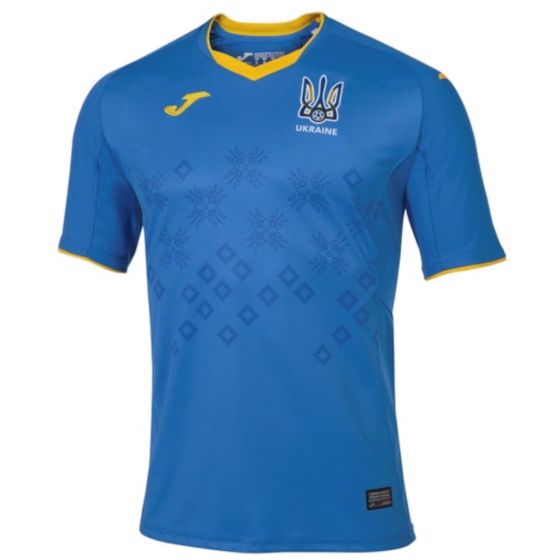
Ukraine away: Thanks for coming, Joma.

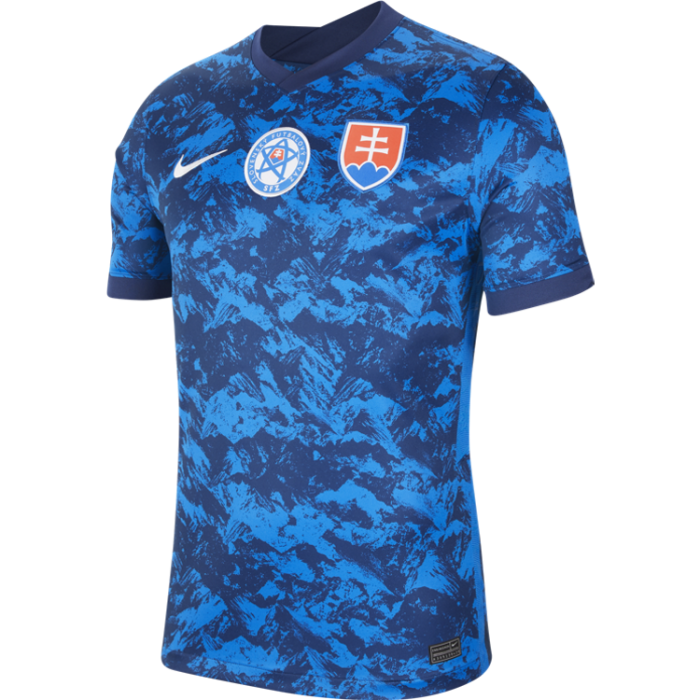
Slovakia away: We assume Slovakia put so many man-hours into designing the home shirt (coming later) that they forgot entirely about doing an away version, and knocked this up in five seconds flat.
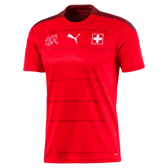
Switzerland home: It’s a bit… red. Nothing to get excited about here. The Swiss FA logo also seems an unnecessary addition. Next.
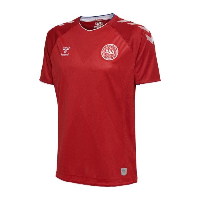
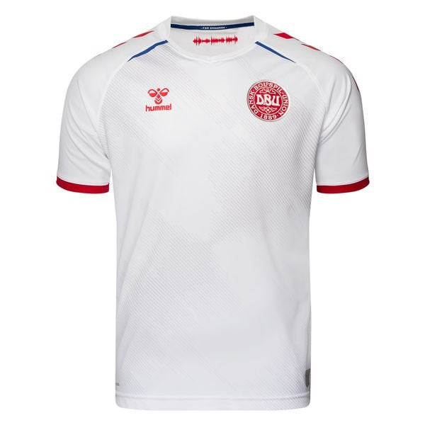
Denmark home: Looks like a generic kit you buy from prosoccerUK to play five-a-side, but the iconic Hummel chevrons save it from full disaster.
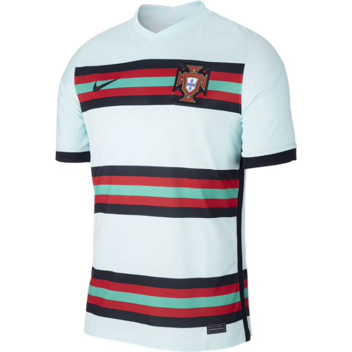
Portugal away: Fun, colourful, eye-catching. A useful reminder to brush your teeth.
Czech Republic home: Much better than the away edition, and that is all we have to say on the matter.
France away: We can’t decide if this is a lovely, crisp, clean kit or so empty of detail as to be a bit boring, the sort of kit you design for your Euro 2020 fantasy football team called something like ‘Giroud Let The Dogs Out’. It would look good on Giroud, come to think of it, but then even Czech away would look good on that man. The sturdy jawline, the coiffed hair, those dreamy eyes… what were we talking about?
Poland away: We mentioned how the crest was moved to the middle and looks weird, but somehow it looks much better on the away kit than the home. Tidy, if a little unexciting.
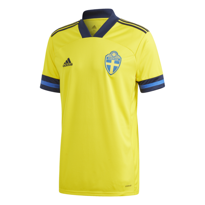
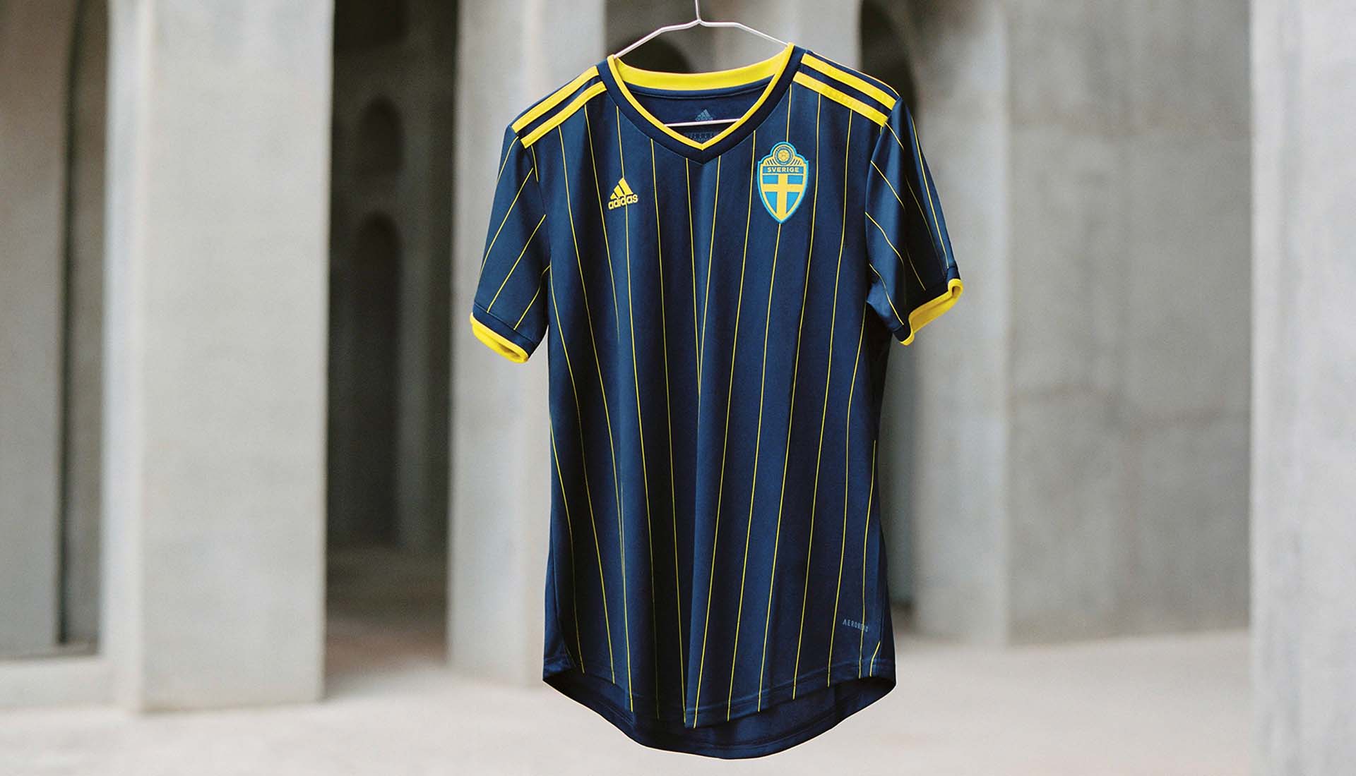
Sweden home: It’s a bit… boxy. The sleeves, the collar, everything is just a bit chunky and obvious and, crucially, it fails to stir memories of Tomas Brolin and Henrik Larsson at USA ‘94. Do better, Sweden (they do).
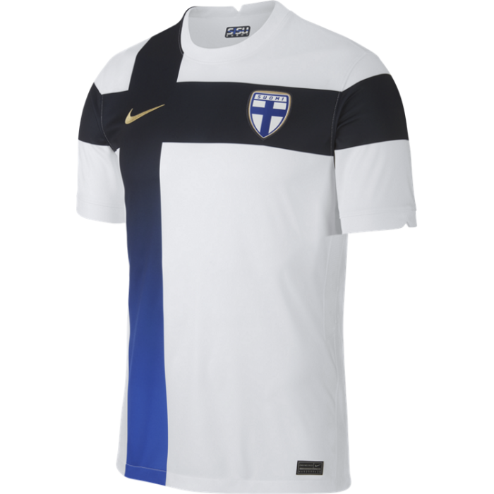
Finland home: When the printer runs out of ink.
Turkey away: Absolutely adequate. Cheers, Turkey, have a good one.
England away: Firstly, England’s second kit should be red. Secondly, this is the most intense blue we’ve ever come across. It’s eye-burningly blue. We like this but it’s a lot to take in. The collar with two buttons is lovely, the lion print is fine, the red tints work nicely. The whole shirt reminds us of Dominic Calvert-Lewin, which is absolutely a positive. But boy it’s blue.
Denmark away: Fine. Nice. Nice and fine.
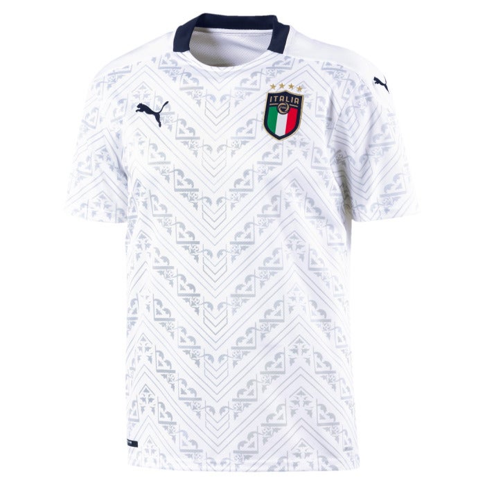
Italy away: Hard to muster anything to say about this shirt either way. It’s fetching enough, but the fact that pretty much any side in the tournament could wear it as an away kit is a minus point. A dash more Tricolore required.
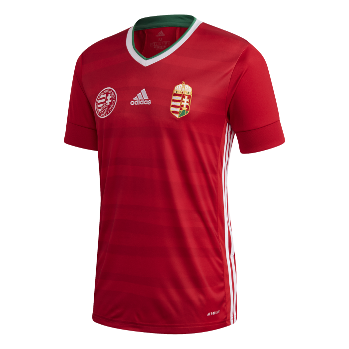
Hungary home. Mmm, nice. Could have added some skinny white and green trim to the sleeves, if we’re being fussy, which we are.
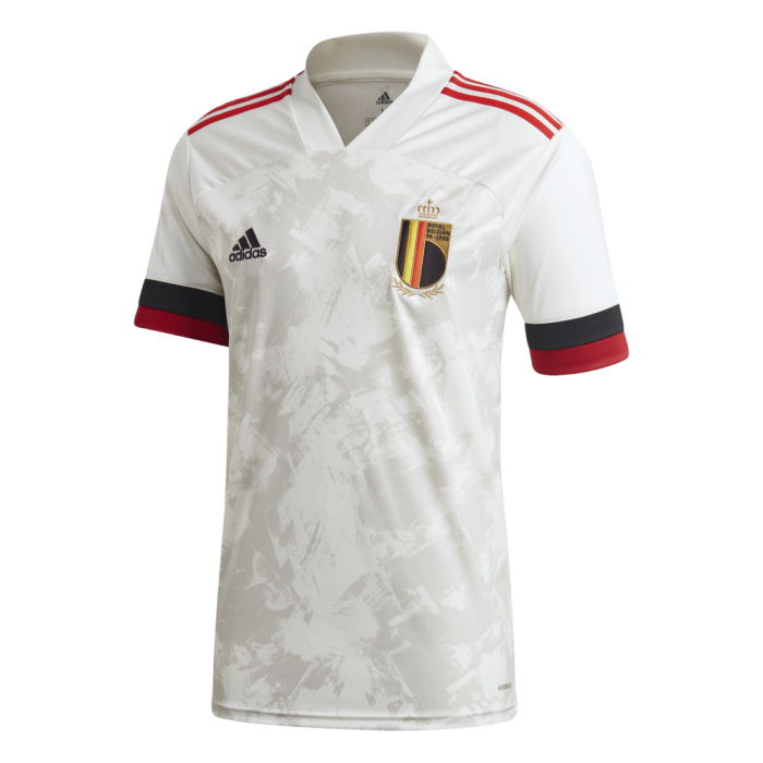
Belgium away: Another one of Adidas’s boxy editions but this one seems to work a little better, perhaps because the collar seamlessly blends into the shirt itself. Nice sleeves, perfectly acceptable abstract background, and a crest with a crown over it is just objectively cool. We don’t make the rules.
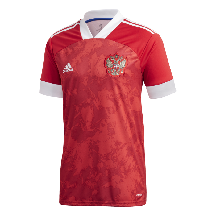
Russia home: Fine kit. Next.
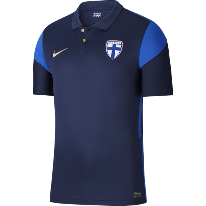
Finland away: We’re fairly sure Rory McIlroy wore this at The Open but, golf aesthetic aside, it’s a lovely shirt. The buttons, the shoulder trim, the simple dark blue finish. We like.
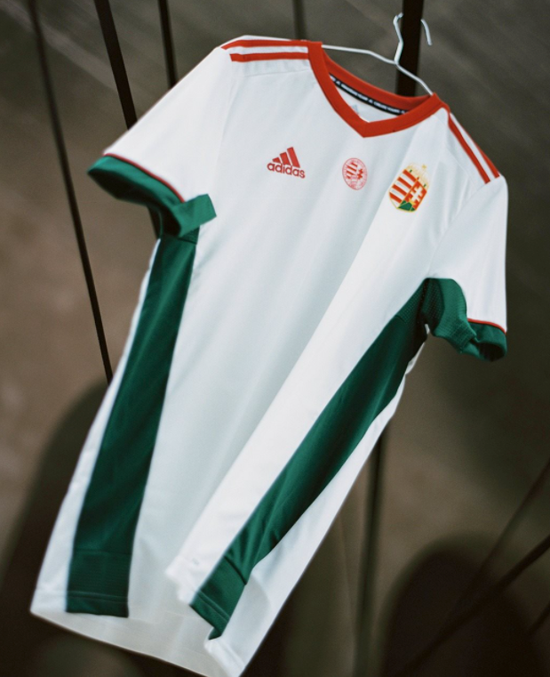
Hungary away: We enjoy the separation of red on the shoulders and neck, and green on the sleeves and sides. Why is it hanging suggestively from a metal railing? That’s not for us to say.
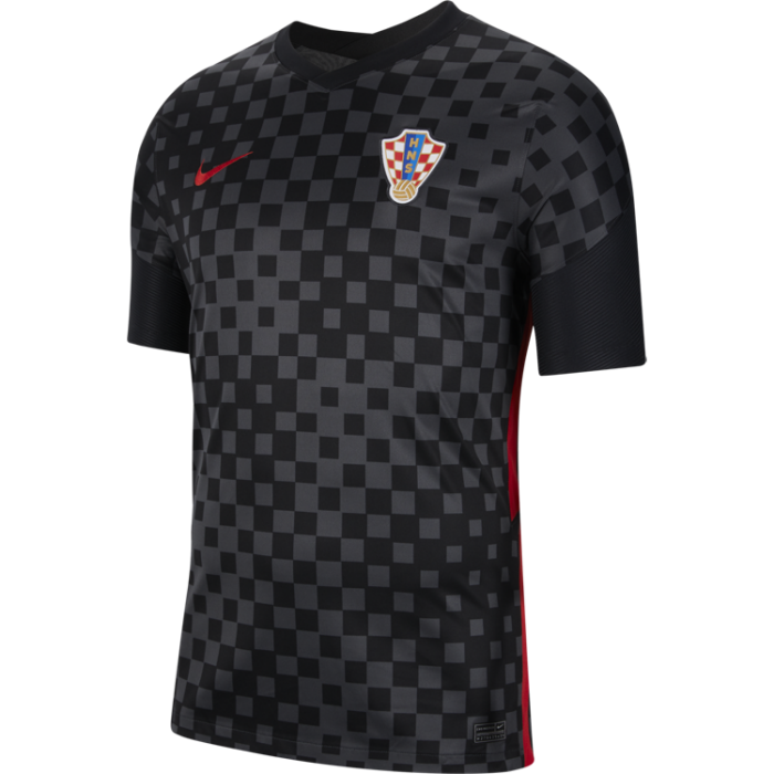
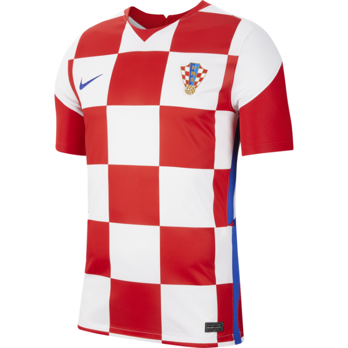
Croatia away: Black kits need to be menacing and this one is. Smart design with a simple trim. Well done to all involved.
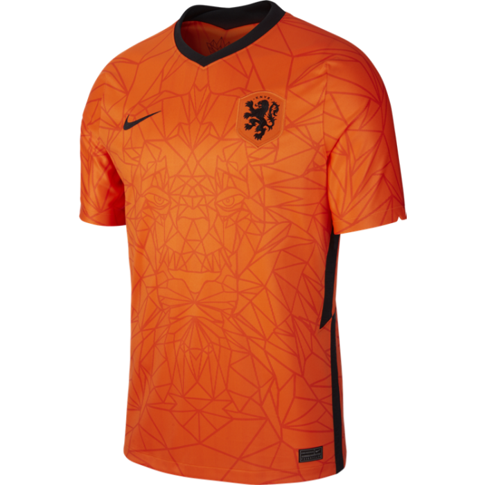
Netherlands home: At some point in time the Dutch pivoted away from white trim to black trim and only when this is rectified will we be truly happy. Saying that, Dutch kits are always nice because orange.
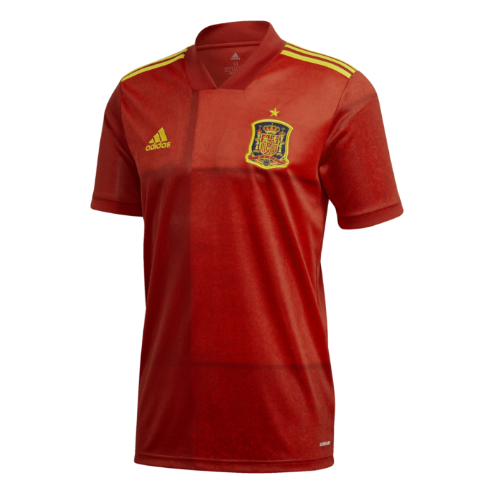
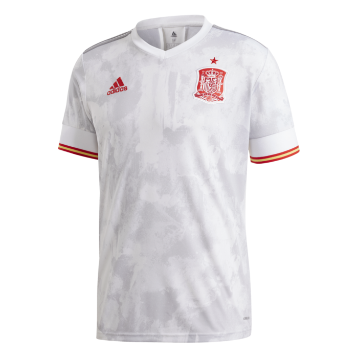
Spain home: It’s hard to get too excited about this but it’s simple and effective. Looks a bit like the curtains you get in villas at Centre Parks, which needn’t be a bad thing.
Slovakia home: Psychedelic. Slovakia normally wear white as their home colour so this is bold and controversial, but we’re broadly fine with it.
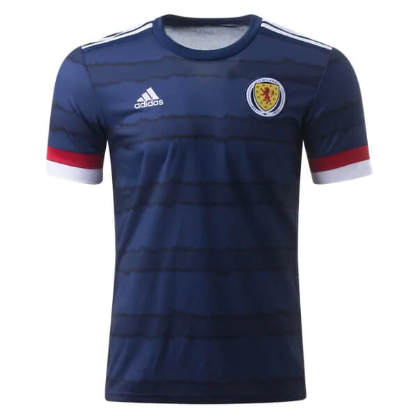
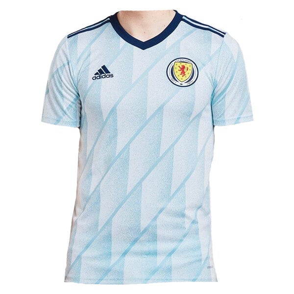
Scotland home: Good solid shirt, although the watercolour splurges across the middle are a bit weird.
Spain away: Clinical, with one of the best sleeve trims around, just enough to remind you who you’re up against.
Croatia home: It is hard to make a Croatia home kit look bad, in truth. This is lovely, though we’d prefer lots of little squares to these big chunky ones, or some innovation like the wavy number Davor Suker and co wore at France 1998.
Scotland away: This is great if only to evoke the feeling that Argentina are playing in the Euros. We also appreciate a circular crest when we see one. Why this image was cropped with Scott McTominay’s neck left in (yes, we’ve checked, it’s him) we’re not sure, and frankly now we’ve noticed it we can’t stop looking. Let’s move on.
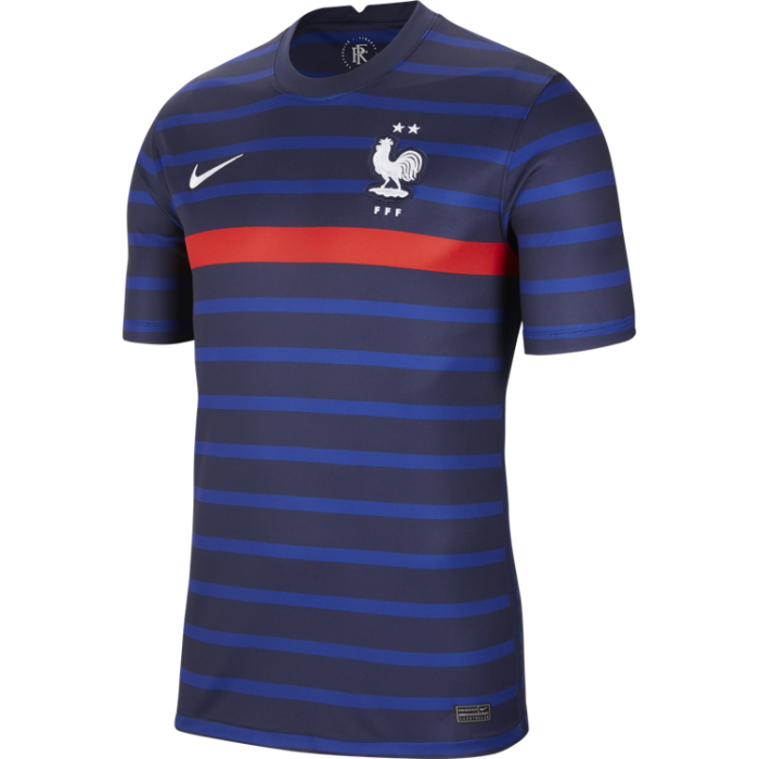
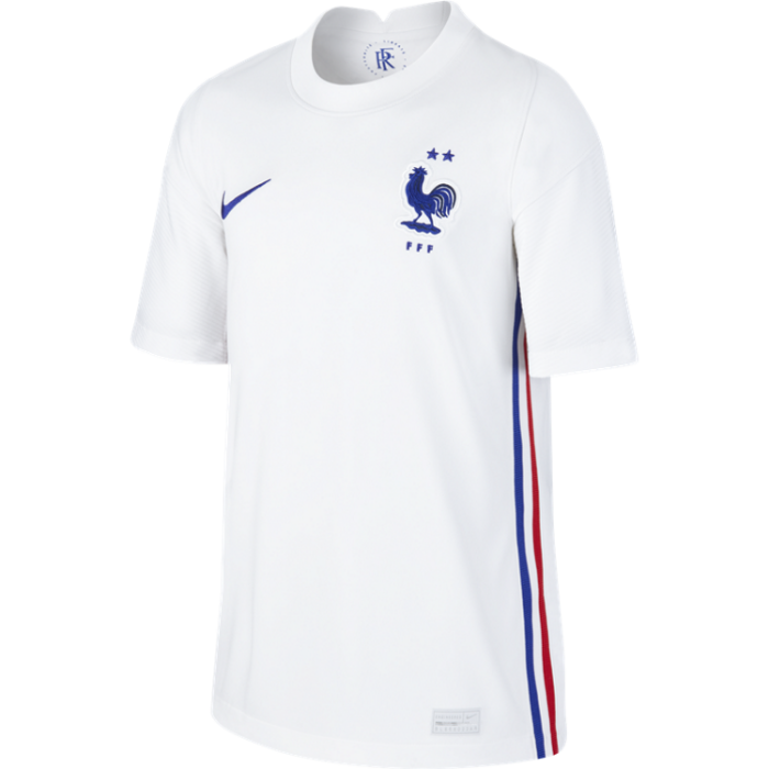
France home: The horizontal stripes work, the red flash is lovely and the two stars above the cockerel remind you who you’re dealing with. They’re probably going to lift the trophy and they’re going to look good doing it.
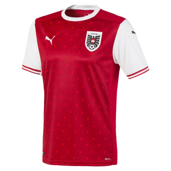
Austria home: Very nice indeed. Lovely clean collar and sharp sleeve trim, and the pattern is weirdly mesmerising. For some reason all we can see is Tomas Rosicky playing for Arsenal during Arsene Wenger’s “thanks for the memories” years, but we don’t hold that against it.
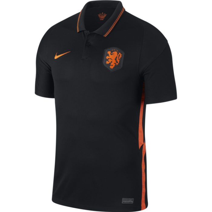
Netherlands away: Another black kit and another good one, enhanced by the flashes of orange and the fact it commits to only two colours. The collar is sharp too. We like this.
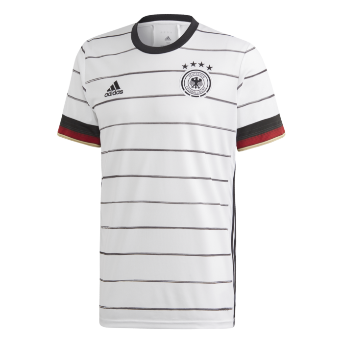
Germany home: Germany have often had great shirts and while this doesn’t live up to their golden period in the 90s (see home 1996, home 1992, away 1990), it’s a big improvement on recent tournaments. The horizontal stripes are simple but effective, the sleeve trim adds colour and the shirt collar is tidy. The four black stars on a white background standout and say ‘you’re going to need to beat us in 90 minutes because penalties will be futile’.
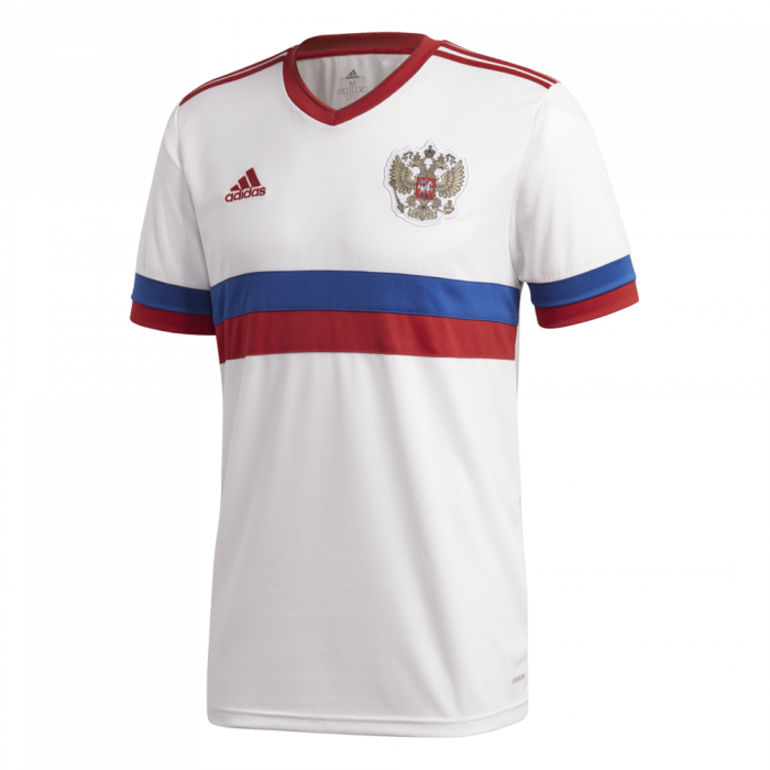
Russia away: This is one of the best white kits at the tournament, with just enough colour to make it interesting. The blue and red lines cutting across the chest and arms are a thing of beauty, and the red neck and shoulder trim ties in neatly with the Adidas logo.
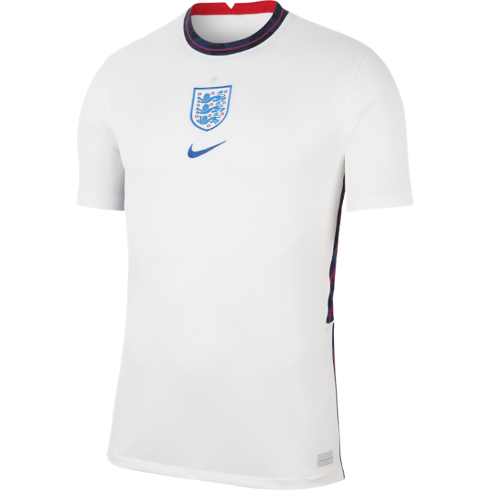
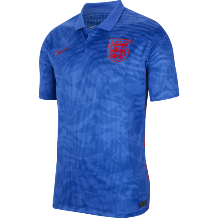
England home: The centralised crest and swoosh is nice, the collar is exquisite and the detail down the sides adds a certain something something. A minimalist masterpiece.
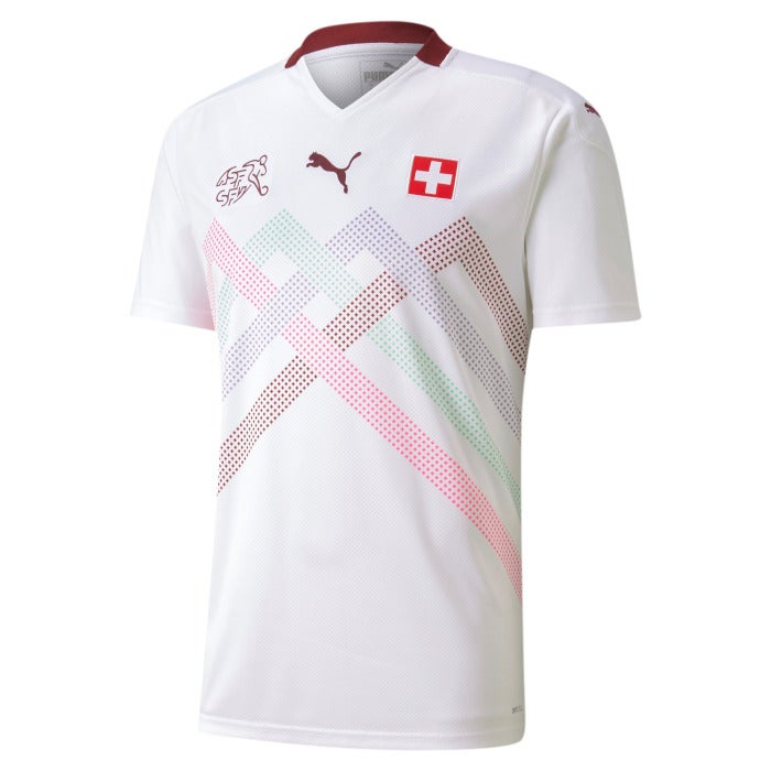
Hello there, Switzerland away. We see your cheeky reference to the Alps and we like your “vivid graphics” (Puma’s words). We still don’t see the need for the Swiss FA’s logo on your shirts, but this is fun and we want one.

Wales home: Simplicity + sleeves is such a trusty combination and Wales nail it here. That shade of red is pitch perfect. The crest, the collar, the shoulders: everything is neat and smart. And then those sleeves. Phwoar. Mmhmm. Yep. Even though they do scream Aldi.
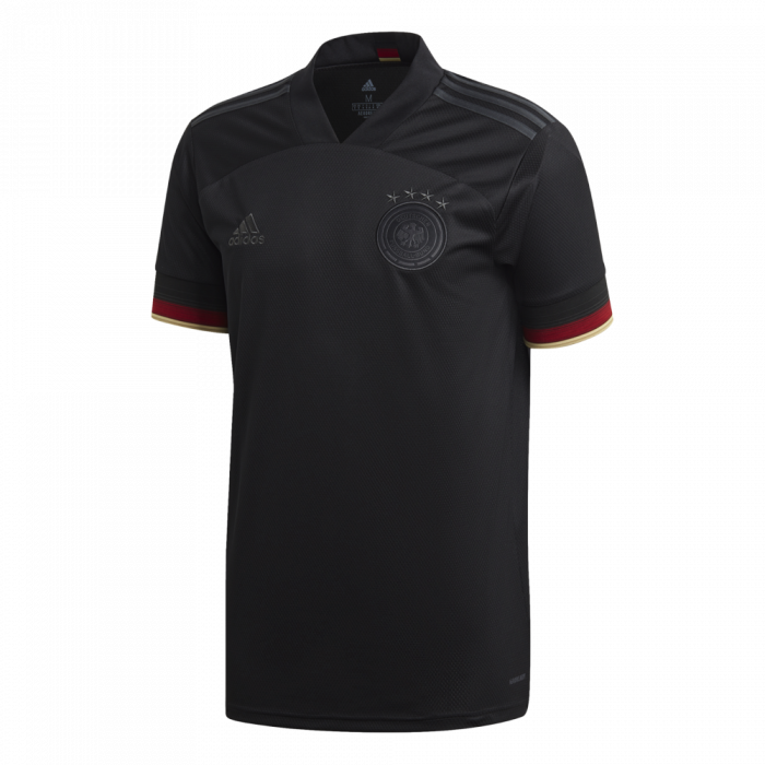
Germany away: This is an absolutely ferocious kit. It sends a shiver down the spine. If you tried to fight this kit you would lose and it would a be a painful and humiliating defeat. The crest and logo lurk in the shadows like assassins, and the sleeves’ hint of colour is just right. My word.
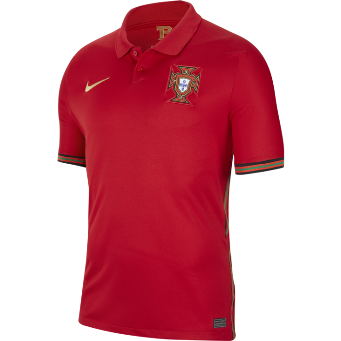
Portugal home: The deep red is beautiful but it’s the flash of green trim on each sleeve and down the sides which really elevates this shirt into elite territory. A golden Nike swoosh is a lavish touch which we also enjoy. Very, very satisfying.
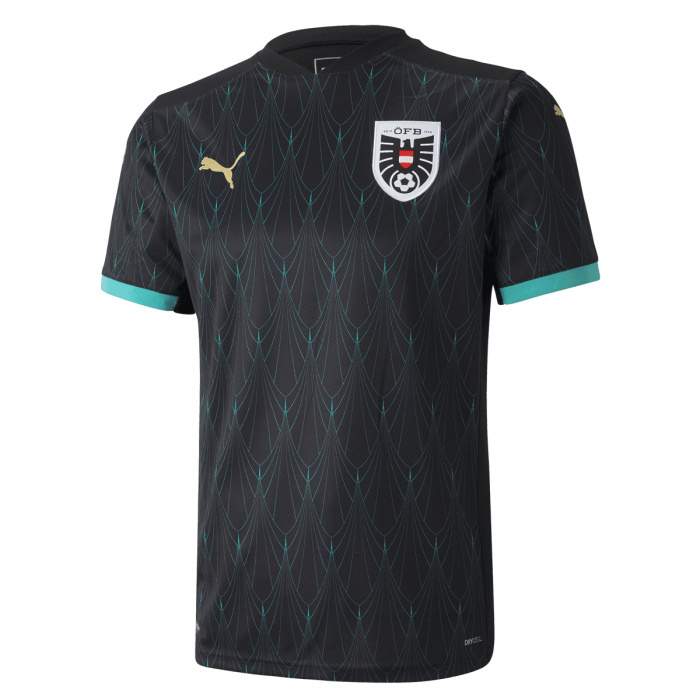
Austria away: Lord yes. The golden Puma. The black which runs right up to the shoulders and neck line. The pattern which can only be described as ‘turquoise chandelier’. Beautiful, exquisite, almost perfect, except… they forgot to do the back.
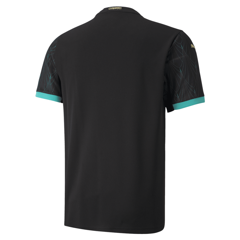
Oh, lads.
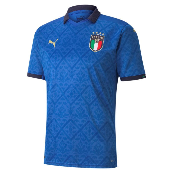
Italy home: Woof. The closest thing Italy have made to the 1994 World Cup kit since, erm, 1994. This shirt evokes memories of Roberto Baggio’s ponytail and Franco Baresi’s half-bald head, golden days. Aesthetically clean and sharp lines, a classic colour palette and a heavy dose of nostalgia. What more can we ask?

Wales away: The yellow is just a great colour, but the way that deep green frames the crest, sits on the shoulders and ties in with the Adidas logo is gorgeous. The only thing that might enhance this kit is flash of green on the sleeves or the side of the body, but we’re nitpicking. Tremendous.
Sweden away: Wow. The pinstripes are beautiful and terrifying all at once against a moody, intense dark blue. The V-neck works well and the ratio of yellow flashes to shirt is perfection. A king among loyal subjects. A deity among mortals. A royal robe among mere football kits.
We have our winner.
Join our commenting forum
Join thought-provoking conversations, follow other Independent readers and see their replies
Comments
Bookmark popover
Removed from bookmarks