Facebook reveals new logo to ‘make F stand apart’ – but can you tell the difference?
‘Isn’t this Facebook’s old logo?’
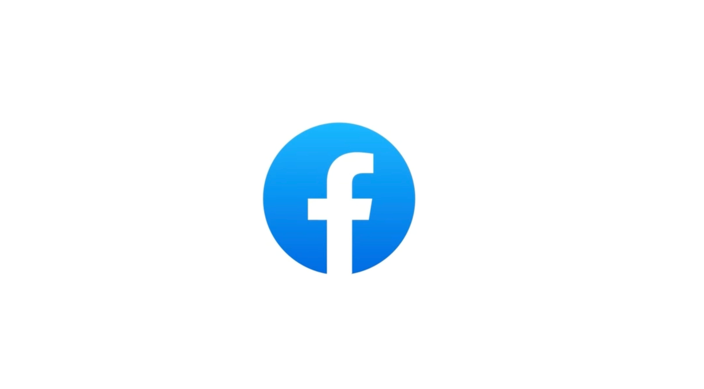
Meta is revamping Facebook’s logo to a darker blue with a few small tweaks to create what it claims is a “bolder, electric and everlasting” design.
The “subtle” logo change – which at first glance may seem barely noticeable – incorporates a “more confident expression of Facebook’s core blue color,” the social media company said in a blog post.
Facebook says the logo change to the lowercase “f” is more visually accessible in the platform’s app with “stronger contrast for the ’f’ to stand apart”.
“We wanted to ensure that the refreshed logo felt familiar, yet dynamic, polished and elegant in execution. These subtle, but significant changes allowed us to achieve optical balance with a sense of forward movement.” Dave N, director of design at Facebook said.
The social media giant highlighted three “key drivers” behind the evolution of its logo, including a push to “elevate the most iconic elements” of the brand, and to create “an expansive set of colors” anchored in blue.


Over the years, the social media platform’s logo has undergone a number of changes, starting from one that had square boundaries to the current circular design.
The new logo, the company says, uses its custom typeface – Facebook Sans – and a redesigned wordmark and logo to “create a consistent treatment and improve overall legibility.”
The new design has led to some being left puzzled on social media.
Some users, however, described the design changes in a little more detail.
Facebook says it has also developed a new colour palette with a new set of hues, tones and contrast ratios.
“The deep tonal range of secondary blues allows for flexibility while providing balance as a single expression of our brand identity,” the company said.
It said more changes to the platform’s “reactions, typography and iconography” are to be rolled out in the future.
“All of these refinements will create a more consistent, personal and seamless experience for the billions of people who interact with Facebook daily,” the company said.
Meta likely has more changes planned for the brand’s design in the coming days, with the company describing the latest tweaks on Wednesday’s blog as “the first phase of a refreshed identity system” for the app.
Join our commenting forum
Join thought-provoking conversations, follow other Independent readers and see their replies
Comments
Bookmark popover
Removed from bookmarks