Huawei P10: Chinese smartphone aims to stand out in 'colour of the year'
'People want to go out to immerse themselves into the beauty of the natural world'
Chinese electronics company Huawei is now the world’s third-biggest mobile phone manufacturer – though it’s still a brand many people don’t know well.
Its latest releases, the Huawei P10 and P10 Plus, build on last year’s P9 by lavishing improvements all round and adding a notable extra focus on colour.
While it’s become common in recent years for premium phones to be presented in metallic colour variants (gold, silver, rose gold), it’s been left to more affordable handsets, usually clad in plastic casing, to go for bright hues. Think the Apple iPhone 5C or models from HTC and, until recently, Microsoft.
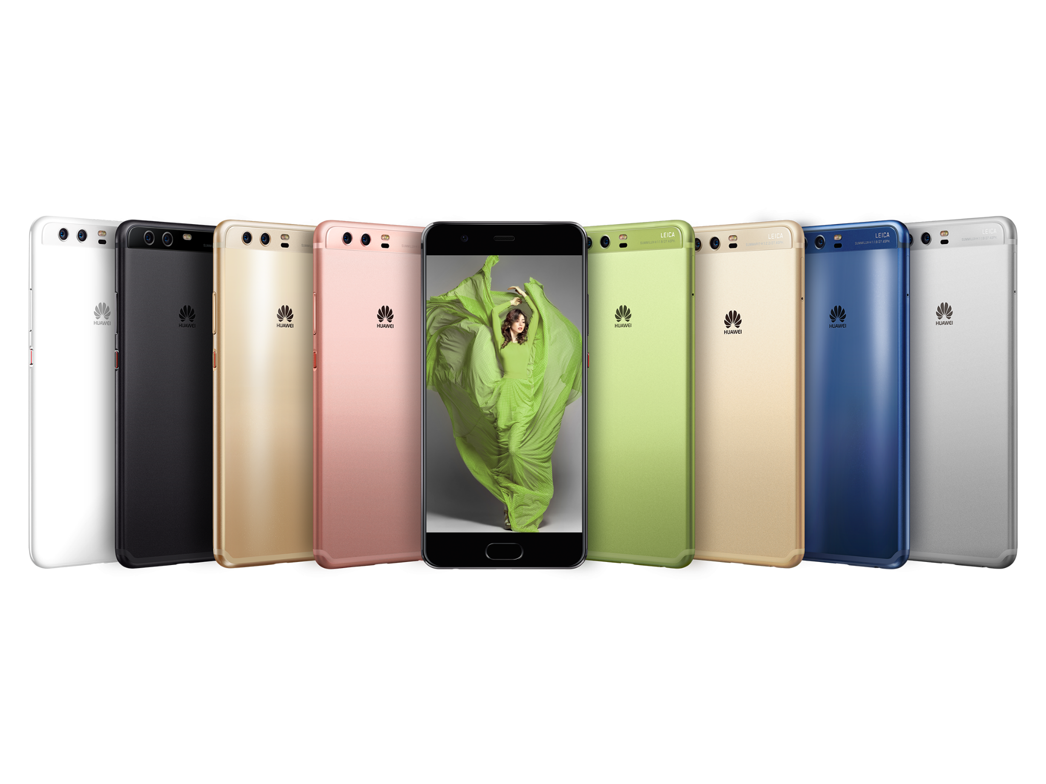
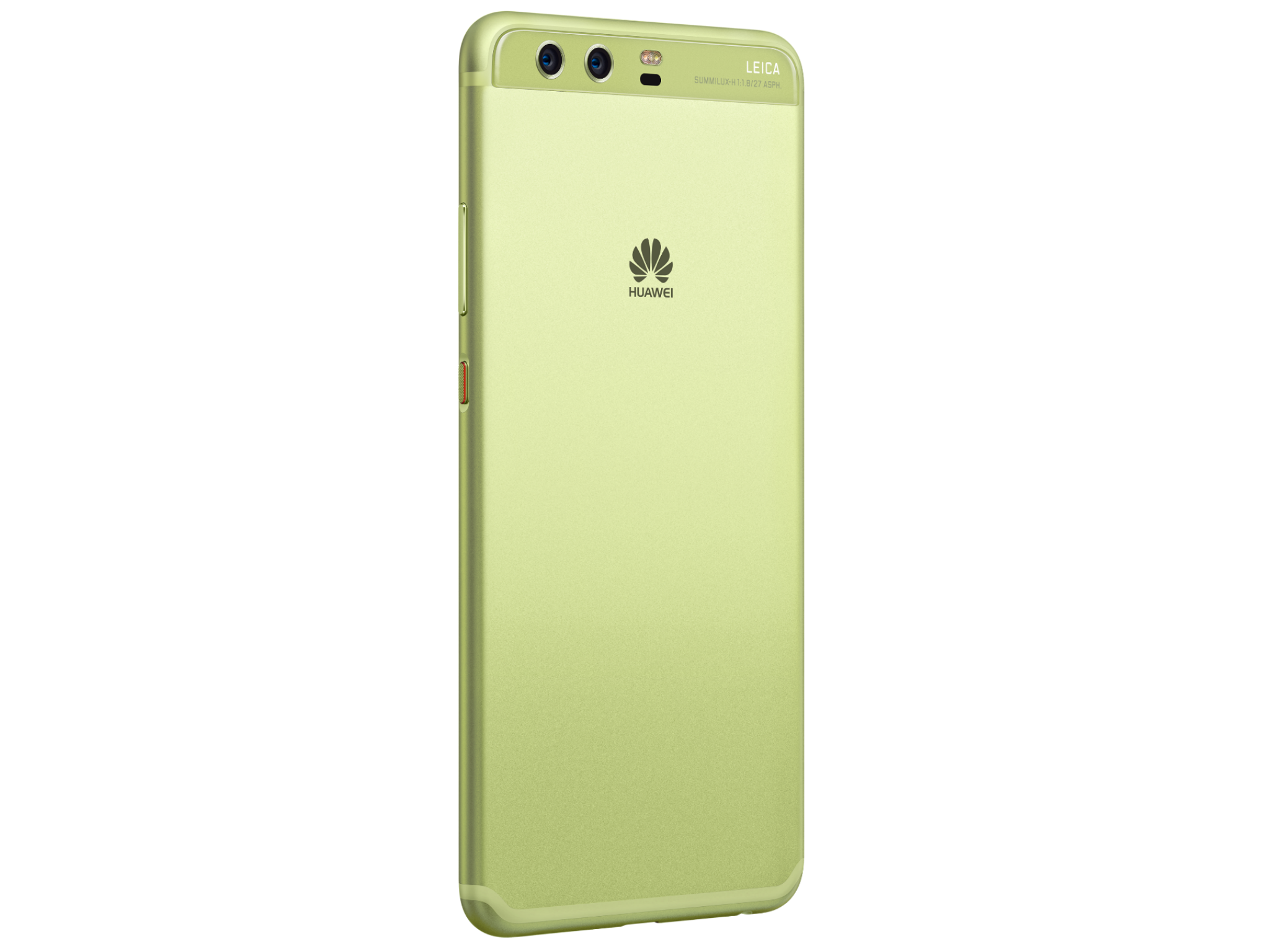
Huawei has gone further, producing its top-of-the-range P10 in eight shades, yes eight. One of them, rose gold, will only be available in China. The others are, as Huawei names them, Dazzling Gold, Prestige Gold, Mystic Silver, Graphite Black, White, Dazzling Blue and Greenery.
During the last week I’ve been trying out the P10 and P10 Plus, testing the camera and marvelling at the colours. I’ll come back to the camera separately, but first impressions are extremely good.
Anyway, colour. Dazzling Blue and Greenery were designed in collaboration with the Pantone Colour Institute, which also created specific wallpapers to match the handset's colour.
Dazzling Blue (the name came from Huawei, not Pantone) is very attractive. It’s not dissimilar to the blue chosen by Sony for its Xperia XZ, but here it’s in what’s called a Hyper Diamond Cut finish, which has a subtly textured finish. Run your nail along it and it almost squeaks. And the diamond cut gives a more matte finish which mostly banishes fingerprints. It’s classy and demure, though still stands out from the standard matte black.
Greenery is the shade the Institute has picked as colour of the year for 2017, and the name for this colour is the Institute’s own. I spoke to Laurie Pressman, vice president at the Institute, about the choice.
“The colour for 2017 is Greenery. It’s a yellow-based green which is a less typical green shade than we’ve seen in the past. There are so many things that fed into our decision to select Pantone Greenery as the colour of the year. First was this desire to disconnect. We’re living in the era of technology and people are realising the importance to pull back. They are realising they need a way to revitalise, to renew. So, pulling back from technology has been important.
“Instead people want to go out to immerse themselves into the beauty of the natural world. We all feel overloaded. So nature’s greens help you to restore and replenish. Greenery is a colour that’s symbolic of new beginnings. So you walk away from that walk in the park feeling refreshed and ready to face the world, so to speak.”
All of which makes sense, though it’s interesting that a tech company has been inspired by the need to disconnect. Technology has moved beyond the drab beige computers and silver cameras we’re familiar with, for sure. But does colour really mean that much or do we just want gadgets that are black and shiny?
“Colour affects us physiologically and psychologically. What’s so interesting about the effect the colour has on us is that 95% of its impact happens outside of our conscious awareness. We don’t realise that if we’re sitting in a room where the walls are painted orange that we’re eating more because it’s driving us to eat more. Or if we’re sitting in a room that’s painted green that we’re calmer. And if the walls are red, that makes us feel so closed in that we’re agitated and we just want to leave.
“Think of it this way, you’ve walked into a room in a home. And it could be, we walk in and immediately feel warm and protected and cosy and we look around and we can see the room is painted in earth tones. So right away we associate an emotional reaction to the colours that we’re seeing whether it’s because of the trees in the forest that make us feel sheltered or we associate brown with the ground and it makes us feel grounded and sturdy and protected.”
But how much further can colour take us in terms of gadgets?
“I definitely think colour for technology is changing. Today, colour is about self-expression, let’s face it. And a phone is an accessory. Anything you’re carrying around with you is an accessory, when you look at how Beats changed the market for headphones. That was a whole game-changer.”
Beats, now owned by Apple, came up with headphones that appeared in colours rarely seen in such products before. Pressman believes companies responded to this.
“All of a sudden, Beats was shaking up the industry and causing other people to stand up and take notice, specifically Bang and Olufsen. I mean you saw them changing their whole approach – it wasn’t good enough to just be about technology. So what was so fascinating for the Institute in working with Huawei is that they realised that technology is critical.”
And what other colours are likely to feature in our gadgets soon?
“We are definitely seeing some more of the cosmetic-y shades: the pinks and rosier pink shades. It’s about being natural. We’re also still seeing some of the more classic metallic colours. But the finishes will be a little bit different. And there’s a growth in something like a fluctuating feeling of colour where colours can change, like they do in apparel. And I would also say the sour colours, acidic green, acidic orange and acidic yellow are going to become more common. I think the world is wide open right now with technology. I think you’re starting to see people wake up to how they want their phones to be seen.”
Join our commenting forum
Join thought-provoking conversations, follow other Independent readers and see their replies
Comments
Bookmark popover
Removed from bookmarks