As Twitter becomes X - Seven disastrous rebrands from Royal Mail to New Coke
Twitter’s new logo sparked comparisons to branding for a ‘ridiculous fragile masculinity subscription box service’ from 2019
Billionaire Elon Musk rebranded Twitter this week and replaced the iconic blue bird logo with a black X, in his latest effort to overhaul the social media giant.
The redesign ties in with Musk’s plans to build an “everything” platform –like China’s WeChat or PayTm in India – as he encouraged users to reimagine the “whole concept” of the app formerly known as Twitter.
On 24 July, the Tesla founder tweeted a picture of the new logo cast on the Twitter headquarters building in San Francisco, as workers were seen taking down the bird logo that has defined the platform since it was launched in 2006. Musk also redirected the website x.com to twitter.com, and announced that Twitter will soon only be available in dark mode.
But it wasn’t an entirely smooth rollout, as it was later revealed Twitter had failed to secure the required permits to change the building signage. Trademark experts also warned Musk could face legal action over his use of X, since rivals Meta and Microsoft both own intellectual property (IP) rights for the letter.
The site was reportedly blocked in Indonesia after Mr Musk unveiled the X logo because of the country’s laws on online pornography and gambling. User reactions were also mixed.


“The X logo looks like it’s for one of those ridiculous fragile masculinity subscription box services that would send you like an axe, a bottle of hot sauce, small batch coffee, and some beard oil every month in 2019,” one tweet – or is it an X – read.
As Twitter moves into a new era, on the heels of a controversial revamp, we look back on seven marketing fails:
Royal Mail to Consignia
In 2001 the Royal Mail was rebranded as Consignia, but it did not last long.
“The new name describes the full scope of what the Post Office does in a way that the words ‘post’ and ‘office’ cannot,” Royal Mail’s then-chief John Roberts unveiled the results of a £2m rebrand, adding that the “modern, meaningful and entirely appropriate” name was suited to the company’s aspirations of becoming an international postal operator.
The public did not agree and just 16 months later Consignia was renamed Royal Mail plc, reversing what is considered one of the most disastrous corporate rebranding efforts in recent history.
The strategist who led the Consignia rebrand later defended it in an interview with the BBC, explaining why the name was chosen.
Keith Wells, who was the director of Dragon Brands, said: “It’s got consign in it. It’s got a link with insignia, so there is this kind of royalty-ish thing in the back of one’s mind. And there’s this lovely dictionary definition of consign which is ‘to entrust to the care of’. That goes right back to sustaining trust, which was very important.”
Coke to New Coke
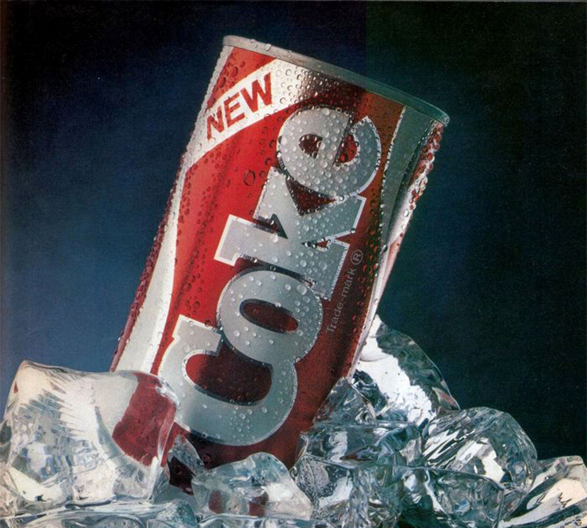
“New Coke” remains the benchmark for bad product launches, nearly 40 years after the Coca-Cola company infamously decided to change its secret recipe to gain a competitive advantage over then-up-and-coming Pepsi Co during the cola wars of the Eighties.
The decision backfired, as passionate Coke drinkers were devastated by the new taste of the beverage – even launching grassroots campaigns across the United States to bring back the old Coke.
“It was the people against the corporation – only in America,” CBS News reporter Bob Simon said in 1985. “Coke said it was committed, so were the people. In California they collected signatures, in Seattle they set up a hotline.”
Delighted by their rival’s blunder, Pepsi released an advertisement featuring a girl who asked: “Somebody out there tell me why Coke did it? Why did Coke change?”
Coca-Cola eventually buckled under the pressure and announced it would bring back the original taste of Coke, with the company’s then-president saying: “The simple fact is that all of the time and money and skill poured into consumer research on a new Coca-Cola could not measure or reveal the depth and abiding emotional attachment to original Coca-Cola felt by so many people.”
Facebook to Meta
Mark Zuckerberg’s Facebook became Meta in October 2021 to signal its future as a “metaverse company”. A metaverse is defined as “a digital reality that combines aspects of social media, online gaming, augmented reality (AR), virtual reality (VR), and cryptocurrencies to allow users to interact virtually.”
While the tech billionaire insisted the rebrand had nothing to do with the PR crisis during what is now remembered as Meta’s worst year ever.
From claims the US Capitol riots were organised on the social media platform to employee-turned-whistleblower Frances Haugen’s allegations, Facebook’s reputation took a severe beating in 2021.
And the new name didn’t help.
According to a report from The Harris Poll, public trust in Zuckerberg’s company significantly dropped after the announcement that it was going to be known as Meta. PR experts also told Insider Meta would have to do “fundamental work” to win back this trust.
PwC to Monday
One of the Big Four accounting firms, PricewaterhouseCoopers confusingly changed the name of its consulting arm to Monday in what is widely considered a big branding blunder.
“Monday is a new identity on which to build our company’s future, and it will have meaning and stand for something,” the company’s then-CEO Greg Brenneman said, announcing the new name that, apparently, conjures images of “fresh thinking, doughnuts, hot coffee”.
However, the brand name was a flop as it failed to capture the essence of PwC’s work, and caused widespread confusion – and derision – from members of the public as well as the press.
“The day of the week formerly known as Monday would like to announce its name change to distance itself from PWC Consulting. Forthwith it will be known as Tuesday Eve,” one person quipped.
Reporting on PwC’s new name, CNN Money said a spokesperson from Wolff Olins, the agency that led the $110m rebrand, “could not immediately be reached Monday—the day, that is.” The rebrand was eventually rolled back.
Hershey’s new logo
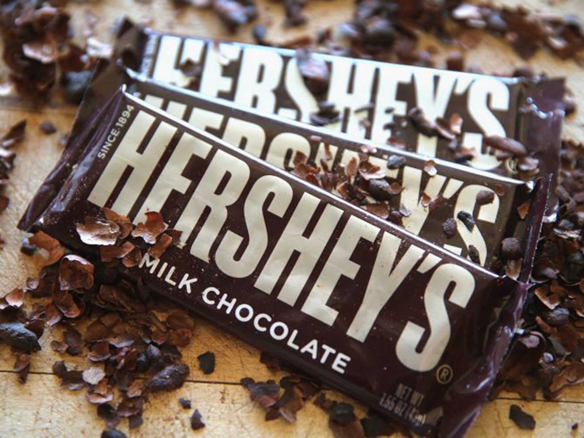
The well-known chocolate company in 2014 unveiled a logo that resembled a “steaming pile of s***” as the abandoned design continues to amuse TikTok users nine years later.
When Hershey’s set about trying to create a fresh and modern interpretation of its beloved Kisses icon, it replaced a photograph of their silver Hershey’s Kiss with an animated, brown version and a gray curlicue to represent its packaging.
“The new branding will impact all visual aspects of how The Hershey Company presents itself,” the company said in a statement at the time, “from consumer communications to websites to the interior design of its office spaces and the look of its retail stores.”
Amused customers were quick to point out the logo had ended up looking like a poop emoji instead, an unsavoury association to make with a chocolate brand.
Sunny Delight
The orange soft beverage launched in the UK in 1998 was once considered a threat to Pepsi and Coke. However, a poorly-timed advertisement amid regulatory scrutiny brought grey storms for Sunny Delight, as the drinks sales fell from a record high of £160m to a measly £6.8m by 2010.
The Food Commission launched a campaign against Sunny Delight, claiming it was bad for children after it was reported that one child in Wales turned yellow from drinking 1.5 litres of the drink.
“This is excessive consumption and consumption on that scale would lead to a yellowing of the skin because of the beta carotene, in the same way as drinking too much carrot juice or orange juice would,” a spokeswoman for the company said at the time.
The girl’s condition, caused by betacarotene which gives the drink it’s colour, emerged at the same time as Sunny Delight was running an ad campaign featuring a pair of snowmen turning orange. Consequently, the popularity of Sunny Delight reportedly halved, as consumers lost their appetite for the bright yellow, sweet drink.
Cardiff City’s football kit
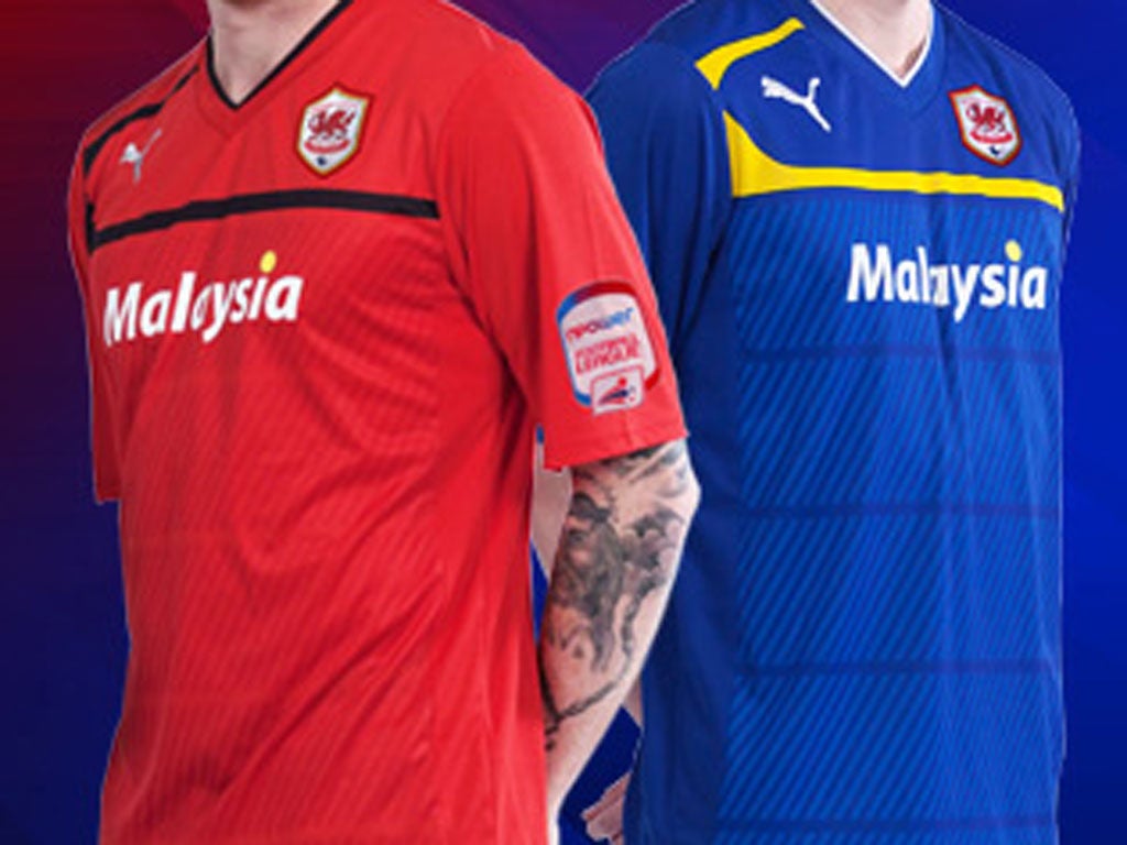
In 2012, the club’s then-new owner gave the kit an ill-conceived makeover.
He decided to put the team, nicknamed the Bluebirds, in a red kit and changed the logo from a blue bird to a red Welsh dragon.
“The change of colour is a radical and some would say revolutionary move which will be met with unease and apprehension by a number of supporters, along with being seen as controversial by many,” ex-chief executive Alan Whiteley said. “To those I would like to say that this was not a decision that has been taken lightly or without a great deal of thought and debate.
Fans retaliated and the blue kit was restored, with approval from the club’s owner Vincent Tan.
Join our commenting forum
Join thought-provoking conversations, follow other Independent readers and see their replies
Comments
Bookmark popover
Removed from bookmarks