Maps don’t always reflect the world, but they can change it
Harry Beck’s map, as almost every Tube traveller except the forlorn stranded tourist knows, is definitely not the territory


Sign up for the View from Westminster email for expert analysis straight to your inbox
Get our free View from Westminster email
With an ear for a pun and an eye for cartographic history, the British Library once entitled an exhibition about maps “Lie of the Land”. Or, as the historian Jerry Brotton more generously puts it: “Maps offer a proposal about the world, rather than just a reflection of it.” This week saw more evidence of the dependence of that “proposal” on the view of geopolitics upheld by map-makers – and map-users.
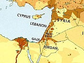
The Catholic weekly The Tablet revealed that, in English-language editions on sale in the Middle East, the atlases published by HarperCollins simply omit Israel. Jordan stretches to the sea; the West Bank and Gaza stand out boldly; but as for the sovereign state recognised in 1948: zilch; nada; nix; diddly-squat. As Dr Jane Clements, of the Council of Christians and Jews, commented: “Maps can be a very powerful tool in terms of delegitimising ‘the other’.” You may erase a name, and a line, because you ultimately wish to wipe a nation off the map in every possible way.
That part of the world has, in any case, always sown geographical and cartographical confusion. No doubt the three gift-bearing wise men of St Matthew’s Gospel – whose arrival in Bethlehem to pay homage to the infant Jesus is celebrated at the feast of the Epiphany on 6 January – needed that guiding star on the way from the east. At the start of the first century AD, Judaea, Samaria and Galilee had been sliced and diced as Herod the Great and his descendants (all, confusingly, called Herod) carved out their fiefdoms as clients of a far greater empire to the west. Not much change there, then.
Whatever HarperCollins’s motives in its selective atlas, it confirms Brotton’s hypothesis that maps act, if not as “malevolent tools of ideology”, then at least as “a series of ingenious arguments” about the world. I would dissent from just one phrase in his magnificent book A History of the World in Twelve Maps, when he points to the human agents behind every coercive cartography and states that “it is not in the nature of maps meaningfully to change anything”.
Not in themselves, maybe – but when overlooked by watchtowers, patrolled by sentries and inscribed above the earth in stone and metal, they may still mark out the edge of human hope. I have been driven around the militarised alphabet soup of the occupied West Bank. Pretty soon, one loses a grip on the arcane distinctions between Zones A, B and C, gets heartily sick of the sight of the so-called “Separation Barrier”, and begins to dwell gloomily on the human propensity to convert lines on paper into wire and concrete that blights lives.
Once it has an army to consult and enforce it, a map can surely change the world. The post-Ottoman carve-up of the Levant between France and Britain, plotted in 1916 by Francois-Georges Picot and Sir Mark Sykes, continues to draw a line in blood as well as (the title of James Barr’s gripping study of their pact) “a line in the sand”. Pressed by Arthur Balfour about his plans, writes Barr, Sykes in a fateful gesture “sliced his finger across the map that lay before them on the table. ‘I should like to draw a line from the ‘e’ in Acre to the last ‘k’ in Kirkuk’.”
From the Syrian to the Iraqi ends of their stitch-up, the Sykes-Picot deal has begun to come apart at its bloody seams. During 2014, the jihadis of Isis made the obliteration of 1916 lines an explicit war aim. The sect’s self-styled “caliph”, Abu Bakr al-Baghdadi, boasted that “this blessed advance will not stop until we hit the last nail in the coffin of the Sykes-Picot conspiracy”.
Maps have always plotted the world-views of their makers and marked the limits of their vision. The earliest cartographic diagram we know, a Babylonian tablet dated to around 500BC, moves out from the Euphrates at its centre. True to the faith-based cosmography of its time, the late 13th-century Mappa Mundi in Hereford Cathedral has Jerusalem at its heart; what Brotton calls “a giant theological cog”. Christ sits in judgment at the top of this theocentric world.
As comedy more than as creed, an egocentric cartography endures. A much-imitated cover of the New Yorker magazine in March 1976 carried cartoonist and illustrator Saul Steinberg’s “View of the World from 9th Avenue”. In the foreground, every dog and doorway of central Manhattan has its pin-sharp place. Looking east, across the Hudson River, the Jersey shore recedes into tiny patches such as “Kansas” and “Nebraska”, distinguished by stray outcrops of rock. Beyond the Pacific (just a shade wider than the Hudson), loom the vague outlines of China, Russia and Japan. I suspect that an infographic picture of the perspective of most UK media – the view from Southwark, Shoreditch or Shepherd’s Bush – would today reveal a distinctly Steinbergian vista.
Many wise heads warn us not to confuse the graphic with the ground. The Polish-American engineer-philosopher Alfred Korzybski put it most succinctly in his aphorism: “The map is not the territory.” Maps create, distort, propagandise or command: the “lie of the land”. For Brotton, “there is simply no such thing as an accurate map of the world, and there never will be”.
Yet relativism is not enough. Without new maps, or rival maps, we can never know when old maps mislead. Brotton tells the fascinating story of the polemic stirred in geography and politics alike by the “Peters Projection” of 1973. Arno Peters, whose family had fled Nazi Germany, tried to correct what he saw as the “Eurocentric” bias of maps and atlases based on Gerardus Mercator’s 1569 projection. In Peters’s brave new world, the global south – above all, Africa and Latin America – appear massively elongated. Conversely, Europe and North America look – to the Mercator-trained eye – drastically squashed. Peters claimed superior authenticity in the representation of land-mass compared with imperial map-makers. Professional geographers scorned his methods and trashed his premises. Yet by 1987, Peters projections were used by 25 out of 42 major development NGOs in Britain in their material. None of them, however, voiced much faith in the objectivity of the projection.
Mathematics apart, his map had in many circles won the ideological argument. For Brotton, Peters made “unsustainable claims for greater accuracy”. Nonetheless, he had successfully asked “both cartographers and the general public to confront the fact that all maps are in some way partial and, as a consequence, political”. In Britain, we should know that. The Ordnance Survey itself arose not from disinterested topography but from the need, after the crushing of the Jacobite Rebellion of 1745, to monitor the insurgent Highlands.
Around this time of year, as millions set off on short, dark days along unfamiliar routes, they sometimes collect irritating new proof that “the map is not the territory”. The alleged digital infallibility of satnav, with its co-ordinates broadcast by the 24 GPS satellites from a height of 20,000km, repeatedly leads the driver to cliff edge, rutted track, deep bog, brick wall, rushing river and (literally, in several reported cases) up the garden path.
Many people have their favourite satnav misdirection tales. I like the £96,000 Mercedes-Benz sent, with that robotic self-assurance that sets the teeth on edge, straight into the River Sence in Leicestershire. Some have a folkloric quality. Did Lady Katya Spencer, Princess Diana’s niece, really take a taxi in error from Althorp, not to Chelsea’s football ground in west London but to Stamford Bridge in Yorkshire? That has the flavour of an urban myth to relish but not to credit.
GPS fiascos underline that, however sophisticated, every mapping system must quantify reality and so simplify it. All practised map-readers know that. And those initiates include millions who – although I’m betraying a Steinberg-like parochialism here – will have such an interpretative graphic very close to hand. Harry Beck’s map of the London Underground network, first sketched in 1931, had its origin in the engineer’s knowledge of electrical circuit diagrams. The credit on current variations elegantly calls them an “evolution” of Beck’s original. This map, as almost every Tube traveller except the forlorn stranded tourist knows, is definitely not the territory. Yet, as an evergreen classic of Modernist design, it has few equals anywhere. Maps may tell essential truth without pretending to give a complete picture. The land does not have to lie.
Beck has filled a whole map-room with variants, parodies, tributes. Best-known is Simon Patterson’s mind-bending lithograph The Great Bear, now in Tate Modern, with Tube station names replaced by litanies of scientists, saints, artists, film stars, footballers and so on. I work close to René Descartes on the highly philosophical Circle Line, between Bertrand Russell and Plato. Russell also sits on the Central Line of power, with Rupert Murdoch the next stop. Gary Lineker’s symbolic position at the hub of Green Park has puzzled me for years.
Sometimes, Patterson’s surreal map looks superior to the real one. Why should Baker Street not be “Charles Darwin” instead of paying kitschy homage (as it does) to Sherlock Holmes? But I have a Tube to catch back to Thomas Telford. Whichever map you choose, I hope you find the best route through 2015.
Join our commenting forum
Join thought-provoking conversations, follow other Independent readers and see their replies